CLIENT CASE STUDIES
ROI and Good Looks.
What's Not to Like?
From AEC and small manufacturing to professional services and real estate, every rebrand is designed to do one thing: win work. These are the firms that trusted us to make that happen.
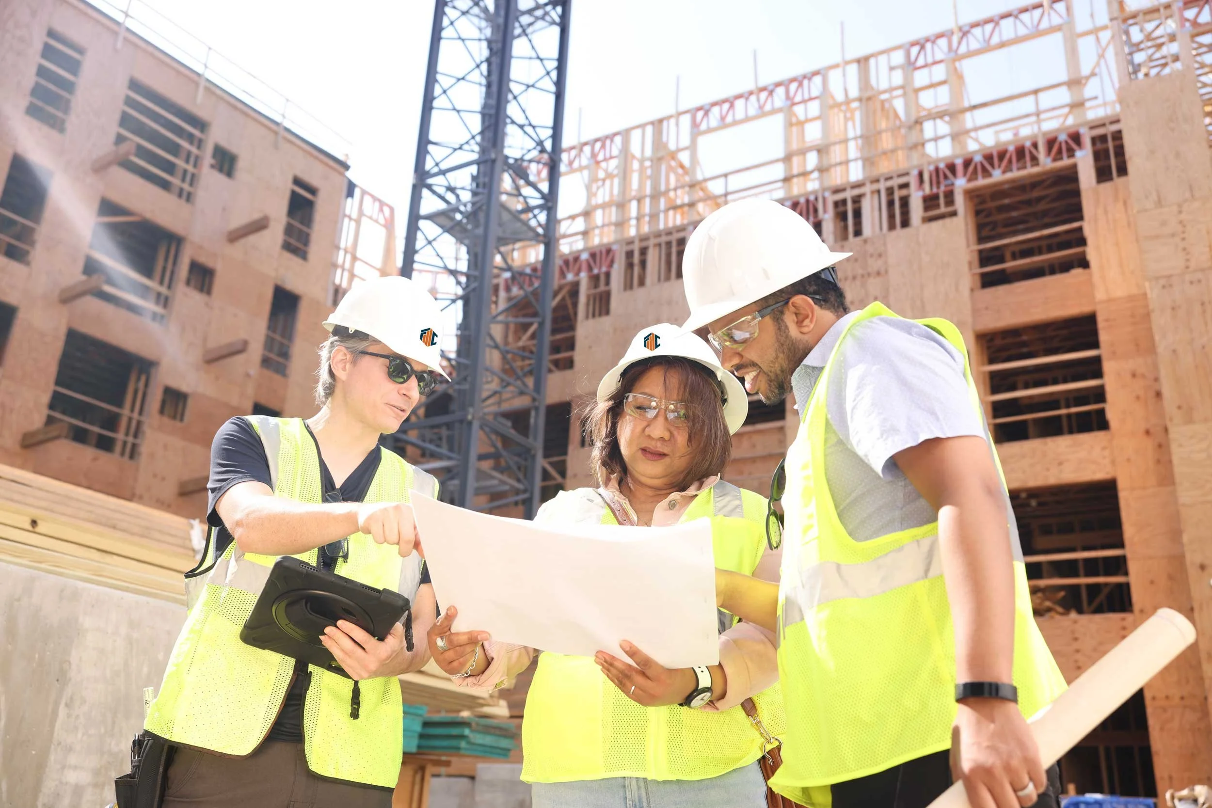
FMC Structural Engineering
228% more visits. 315% more unique visitors. 57% more page views.
FMC Structural Design Group, a structural engineering consulting firm in the DC metro area, had no independent web presence. They were borrowing their sister company's logo and handing prospects a PDF. We built a distinct visual identity, coordinated custom photography, and designed a website that organizes their portfolio and clearly communicates their expertise. Architects and developers now find exactly what they need to say yes.
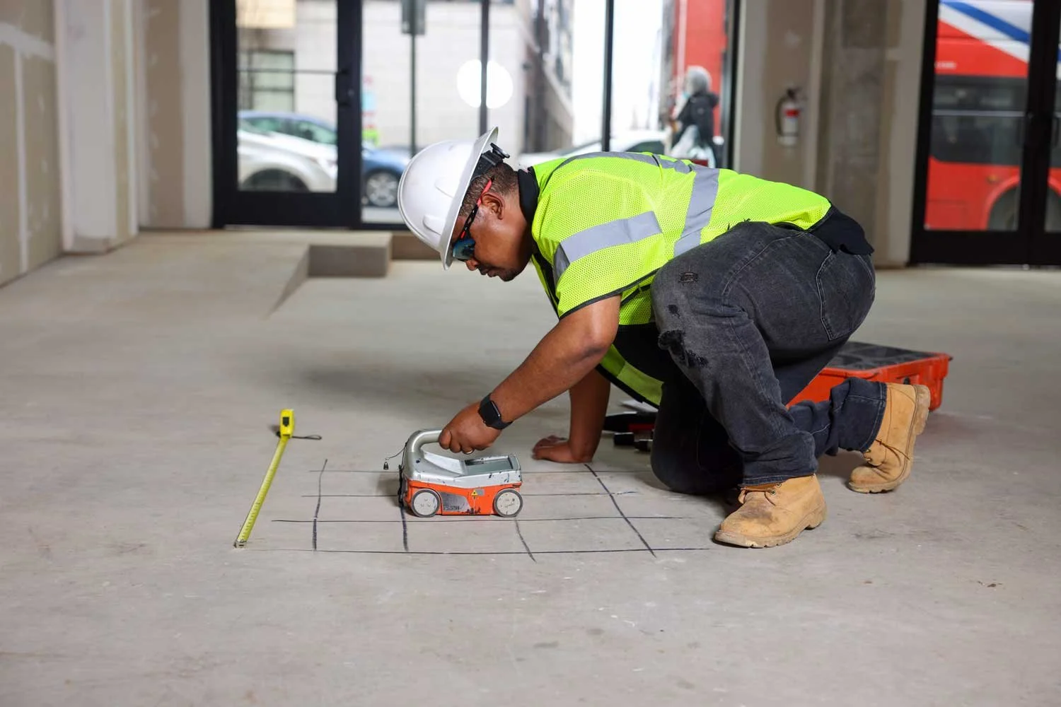
FMC & Associates Capital
73% more visits. 92% more unique visitors. 50% more page views.
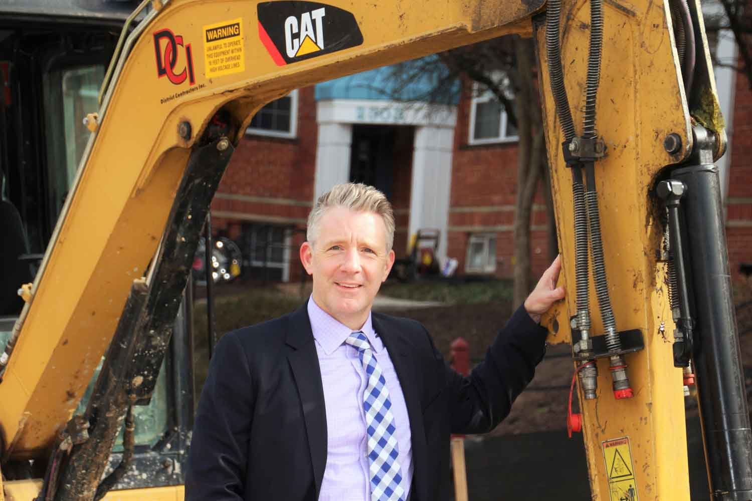
FMC & Associates Capital, an engineering consulting and construction materials testing firm in the DC metro area, had an outdated WordPress site that no longer reflected who they were or what they could do. We led a full rebrand, including logo design, structured content, custom photography, and a completely new website. They now show up online the way they show up on the jobsite.
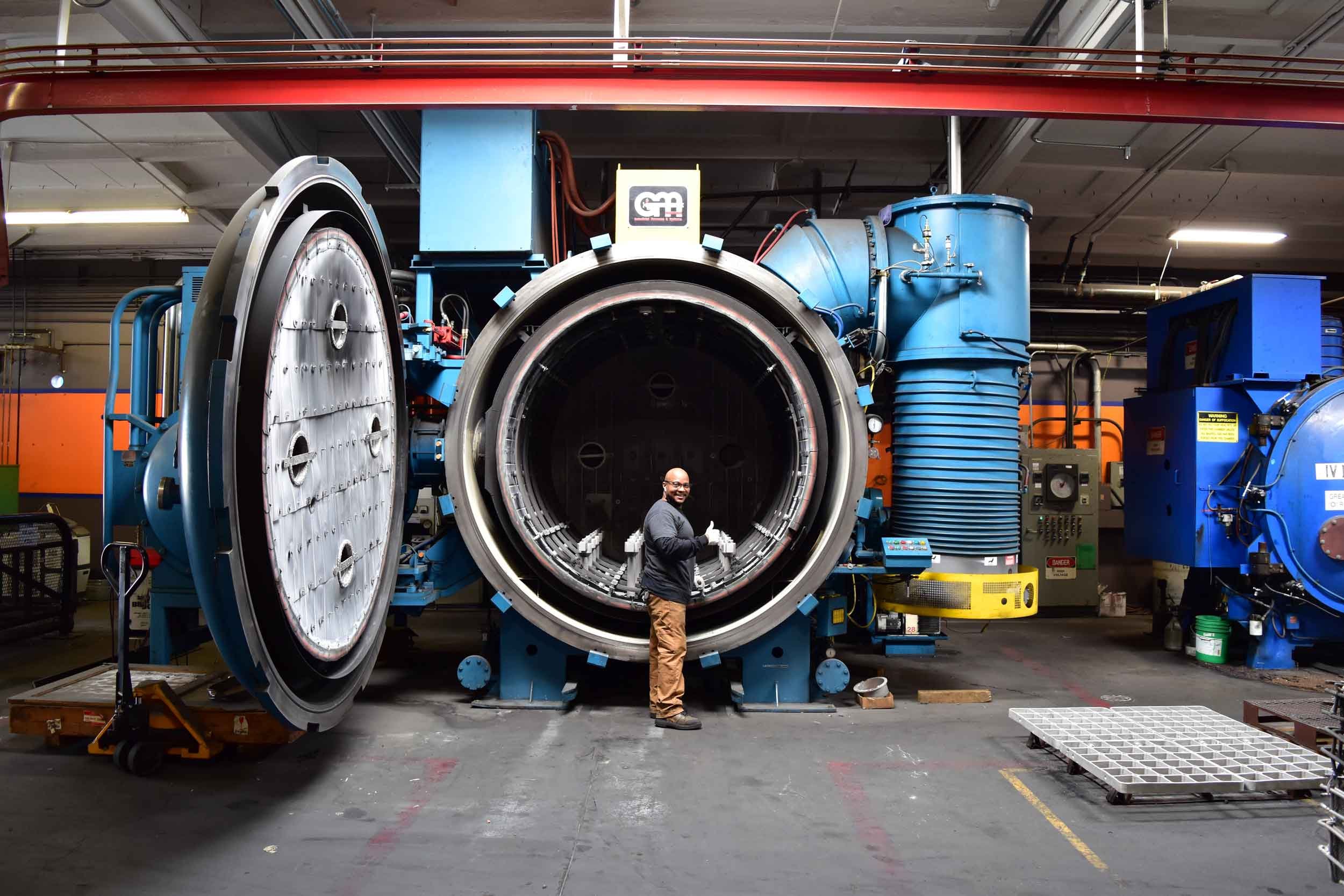
Byington Steel Treating
200% more visits. 209% more unique visitors. 125% more page views.
Byington Steel Treating, a third-generation NADCAP-accredited heat-treating facility in Northern California, had a website that didn't come close to reflecting its scale or technical authority. We developed structured content, refined their visual identity, and built a website that positions them as leaders in their certifications, specialized equipment, and decades of expertise. Manufacturers now know exactly who they're dealing with before they ever pick up the phone.
AFCO
#1 industry rank in AI. 638% growth in organic traffic. 800 monthly clicks.
AFCO, the market leader in on-airport real estate development, needed a digital presence that matched its reputation as North America’s foremost provider of design, construction, financing, and operational services for airports. AFCO approached us to build a website that would showcase three decades of aviation facilities management expertise.
We designed a new logo and visual identity, wrote website content, and managed images from over twenty photographers. The result is a dynamic custom WordPress site that elevates AFCO’s brand and provides a robust online foundation to impress both potential clients and investors.
All Case Studies
Explore our portfolio of rebranding and website projects across industries.

FMC Structural | Engineering

FMC & Associates Capital | Engineering

Byington Steel Treating | Small Manufacturing
AFCO | Airport Real Estate Developer
Bespoke Business Advisory | Finance

AElise Designs | Interior Design
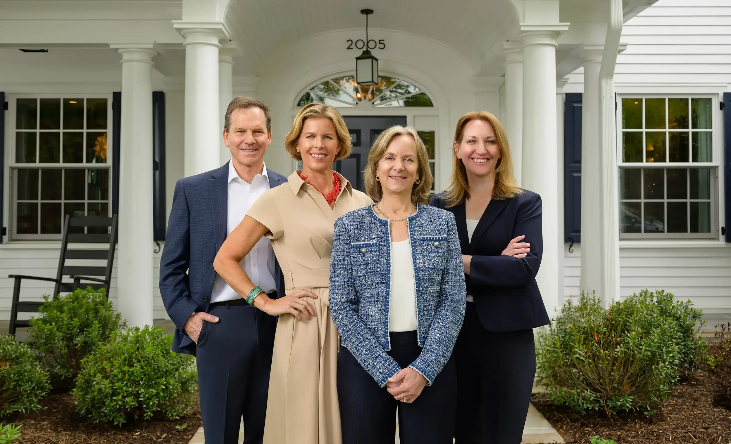
Beall & Rehill | Real Estate
Oliver Properties | Real Estate and Property Development
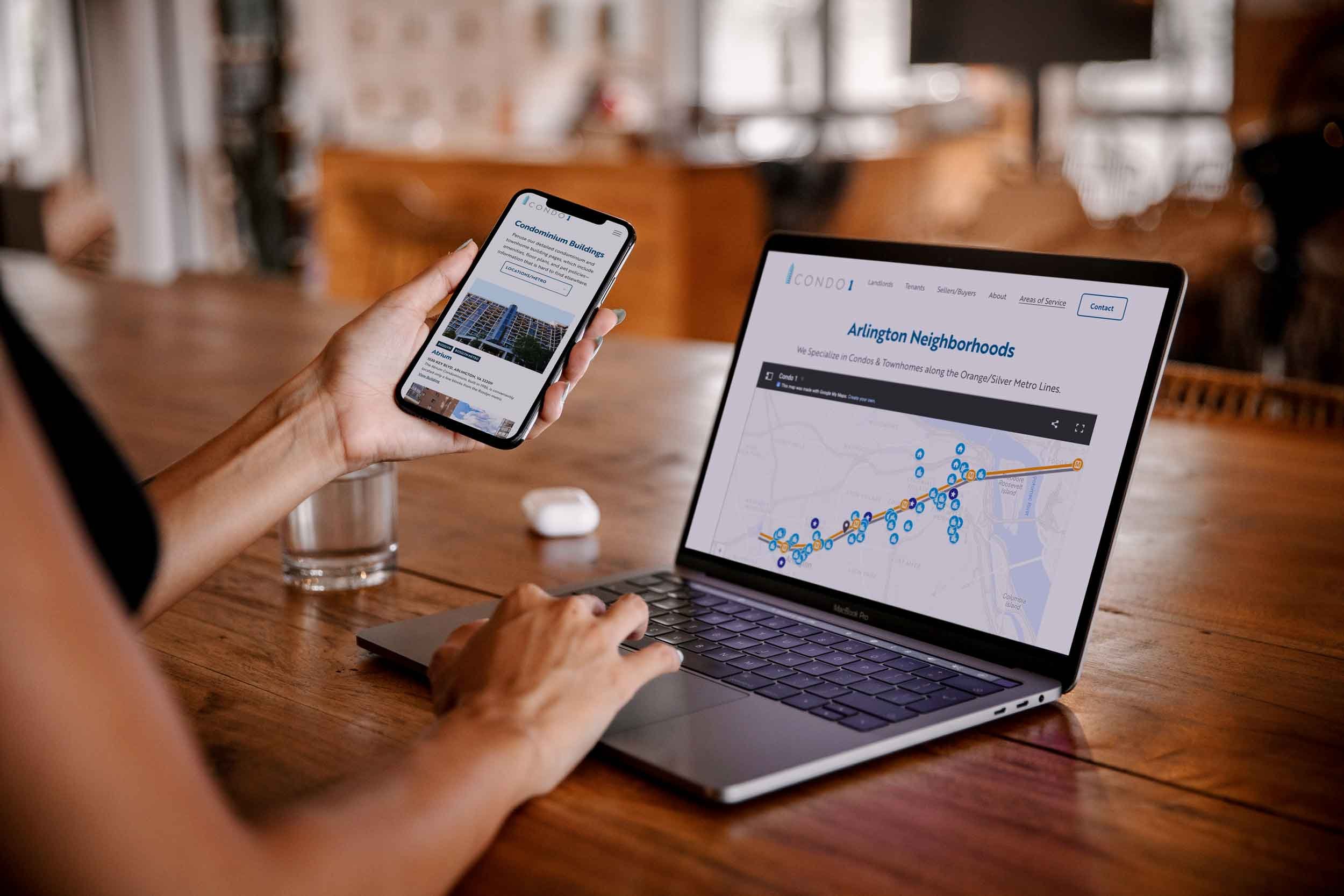
Condo 1 | Real Estate & Property Management

Ann Wilson Homes | Real Estate & Property Management

Patera Properties | Real Estate & Property Management

MGI Corporate Gifts | Consulting

Damato Search Group | Legal Recruitment
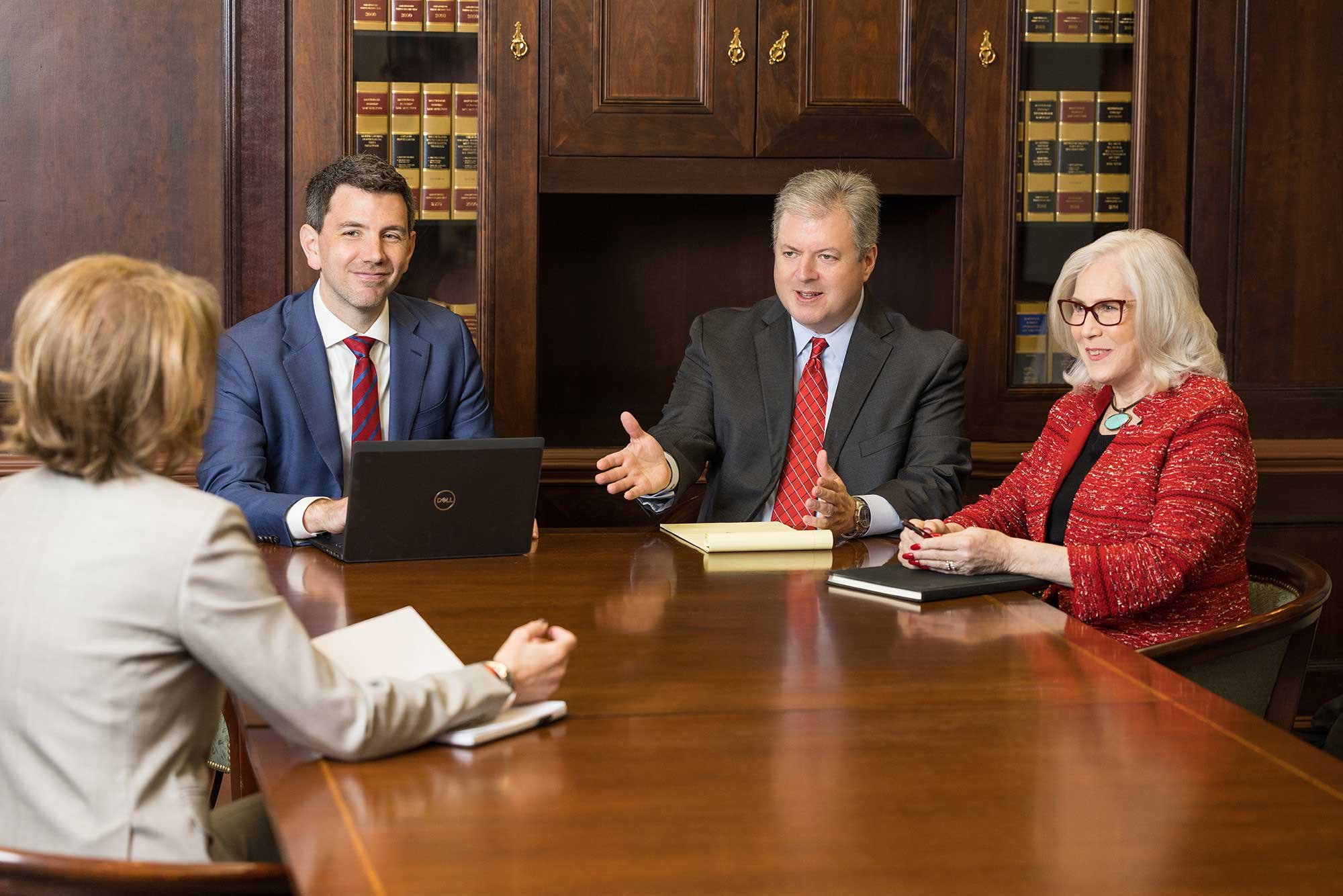
CullenLaw | Appellate Law Firm

Expand Psychology | Healthcare
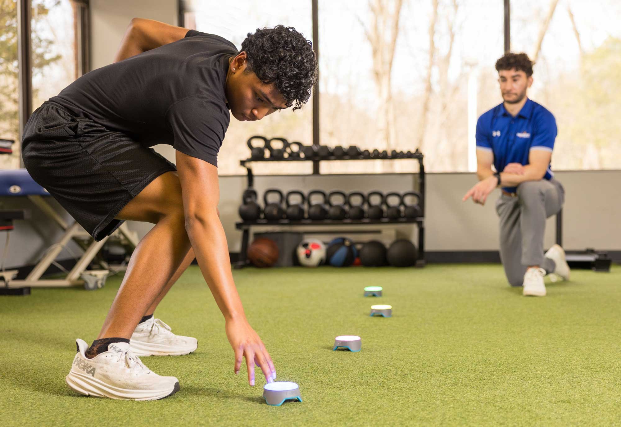
Resurgent Sports Rehab | Healthcare
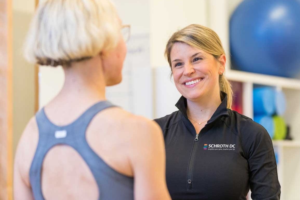
Schroth DC | Healthcare
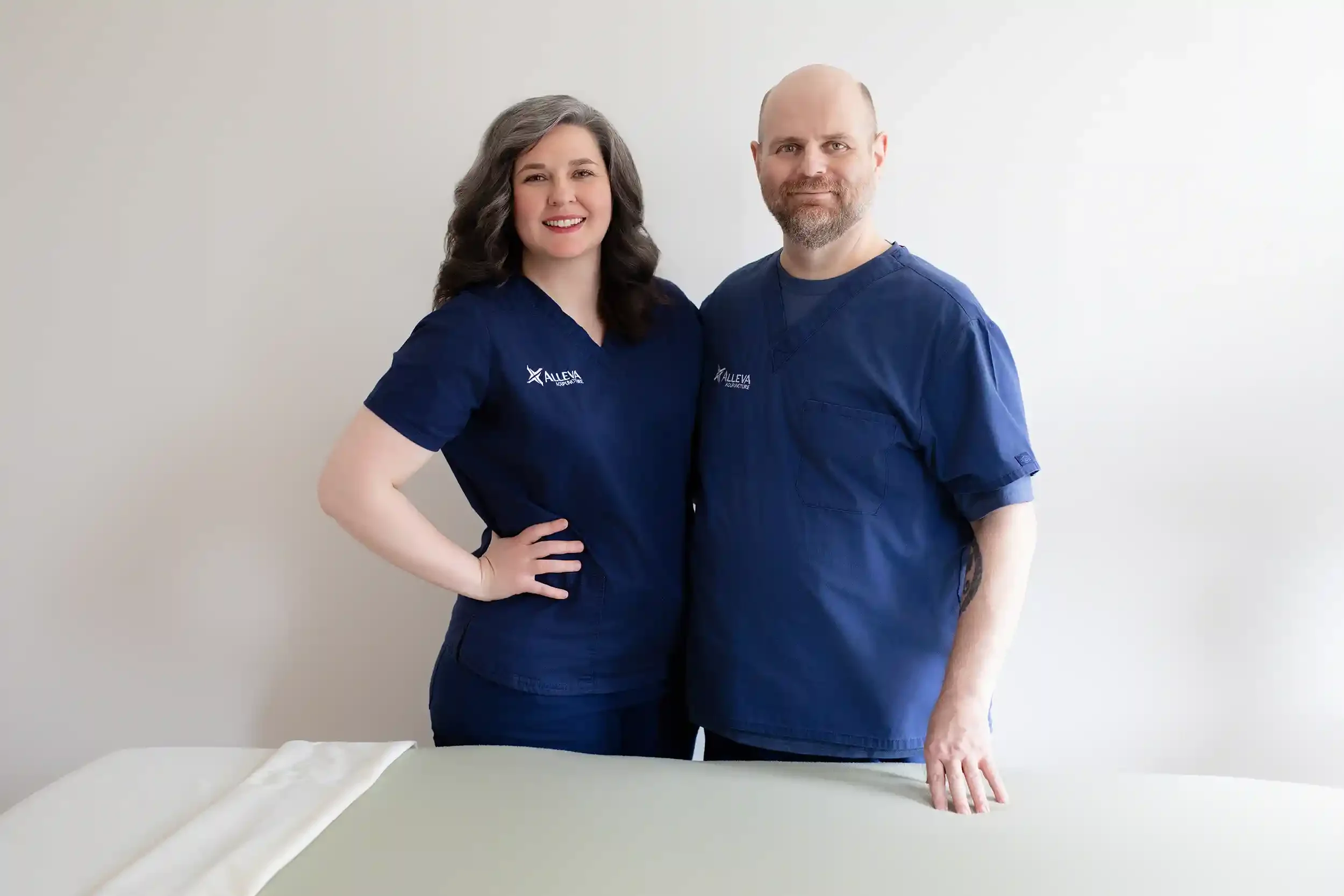
Alleva Acupuncture | Healthcare
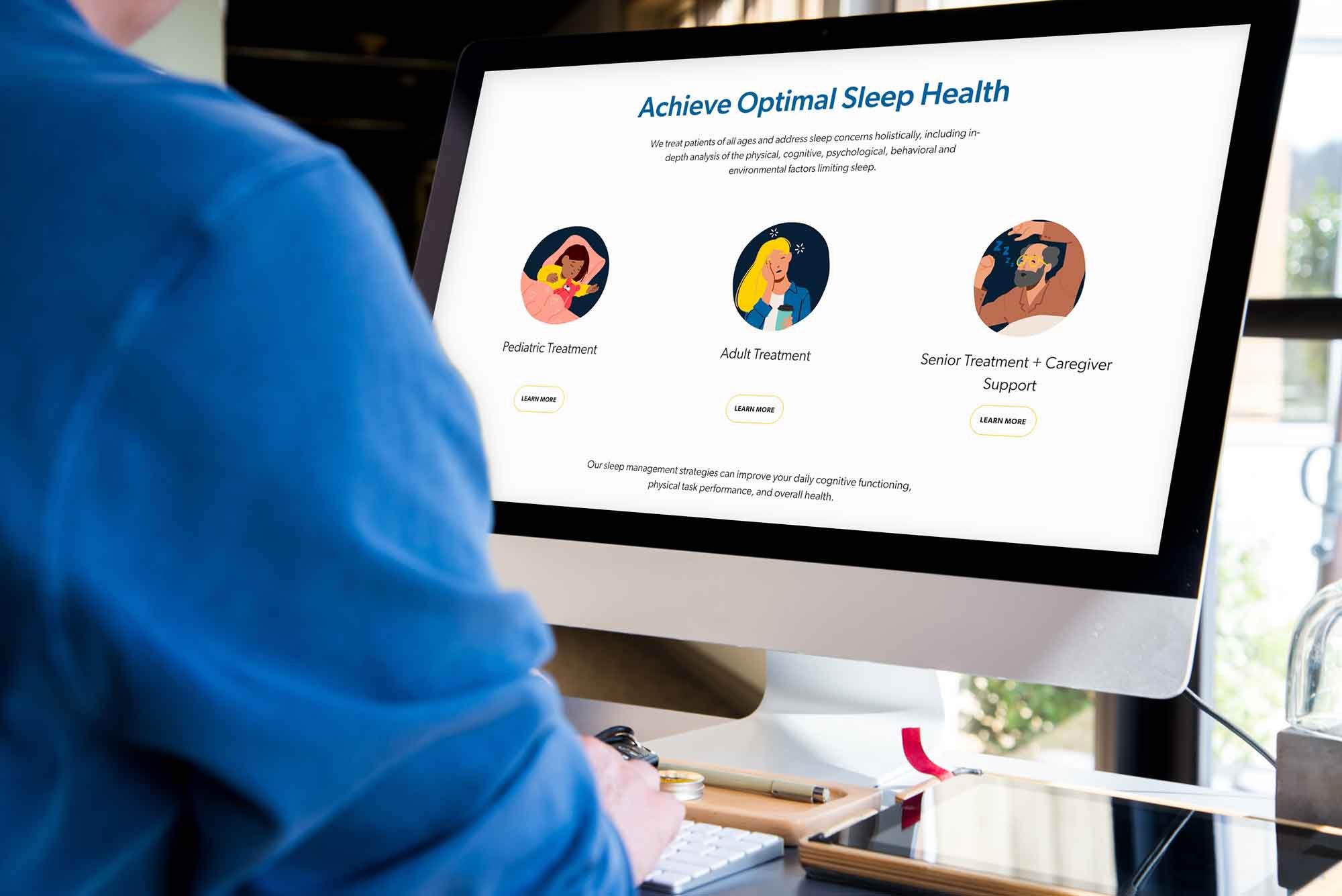
Carolina Sleep Therapy | Healthcare

Dr. Heather Sheets | Healthcare

The Hidden Narrative | Coach
Maura Fredericks | Coach

Ignite Motivation | Coach

Sky Whispers Astrology | Coach

Amy Brecount White | Writer

We're Good | Podcast
Logo Design
We design logos that are memorable and build brand equity.

