SCOLIOSIS AND SPINE SPECIALISTS
Schroth DC
Structured Content. Brand & Sub-Brand Identity. Website Design & Development.
Overview
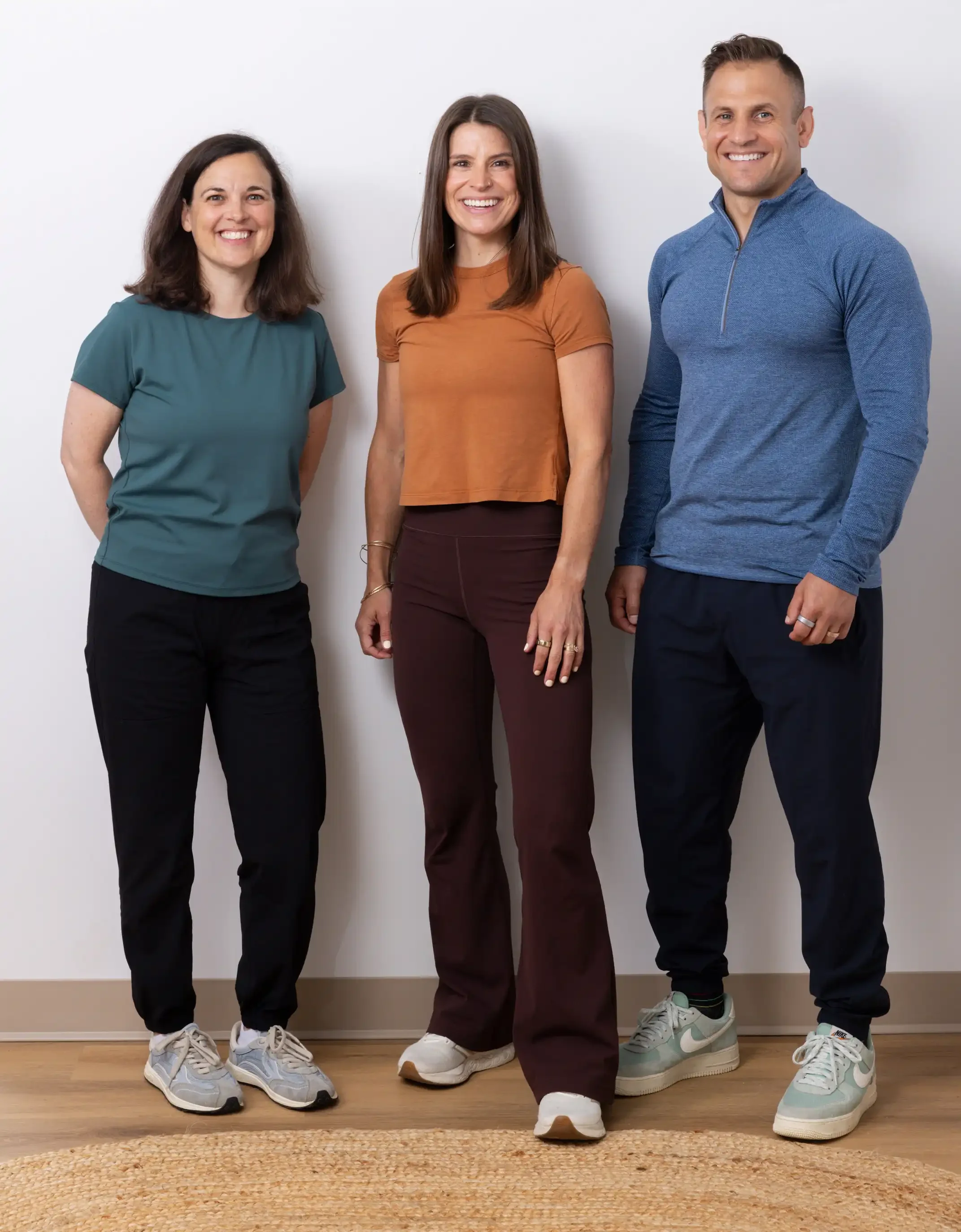
Schroth DC is a Northern Virginia physical therapy practice specializing in the Schroth Method, a non-surgical, three-dimensional approach to treating scoliosis, kyphosis, and other spinal conditions. Drs. Caroline and Eric Campesi, both DPTs with over a decade of experience, are trained in the Schroth-Barcelona Institute Method and are among a small number of practitioners offering it in the Mid-Atlantic.
We built their first website in 2021, when they were opening a single office inside the National Scoliosis Center in Fairfax, Virginia. Five years later in 2026, we rebuilt it for a practice that had grown into two locations, three therapists, an online program, and an international patient base.
Part One: The Launch, 2021
The Challenge
Scoliosis care isn’t discovered through advertisements; it’s sought out. Picture a parent whose twelve-year-old has just been diagnosed, searching late at night, still grappling with questions left unanswered by their doctor. If Schroth DC didn’t appear in those search results, for that family, it may as well not exist. That’s why the website isn’t just a brochure; it’s the entire business development strategy.
The audience is also vast: a teenager’s parent, an adult handling chronic pain, a senior worried about bone density, and someone recovering from spinal fusion all need the same practice… but arrive with entirely different questions. Having one generic services page would have failed all four.
The Approach
Content Architecture First
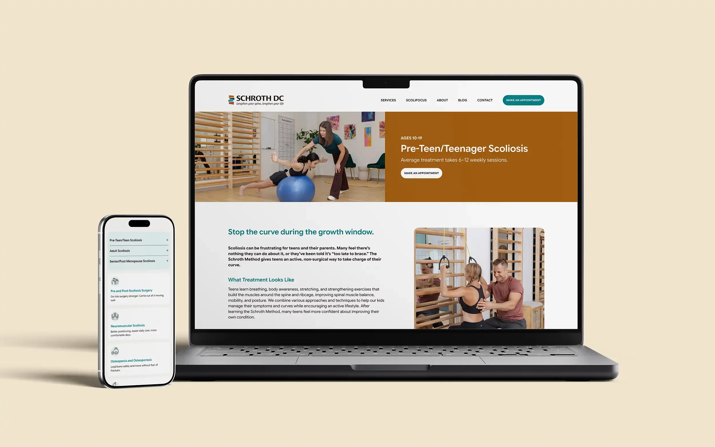
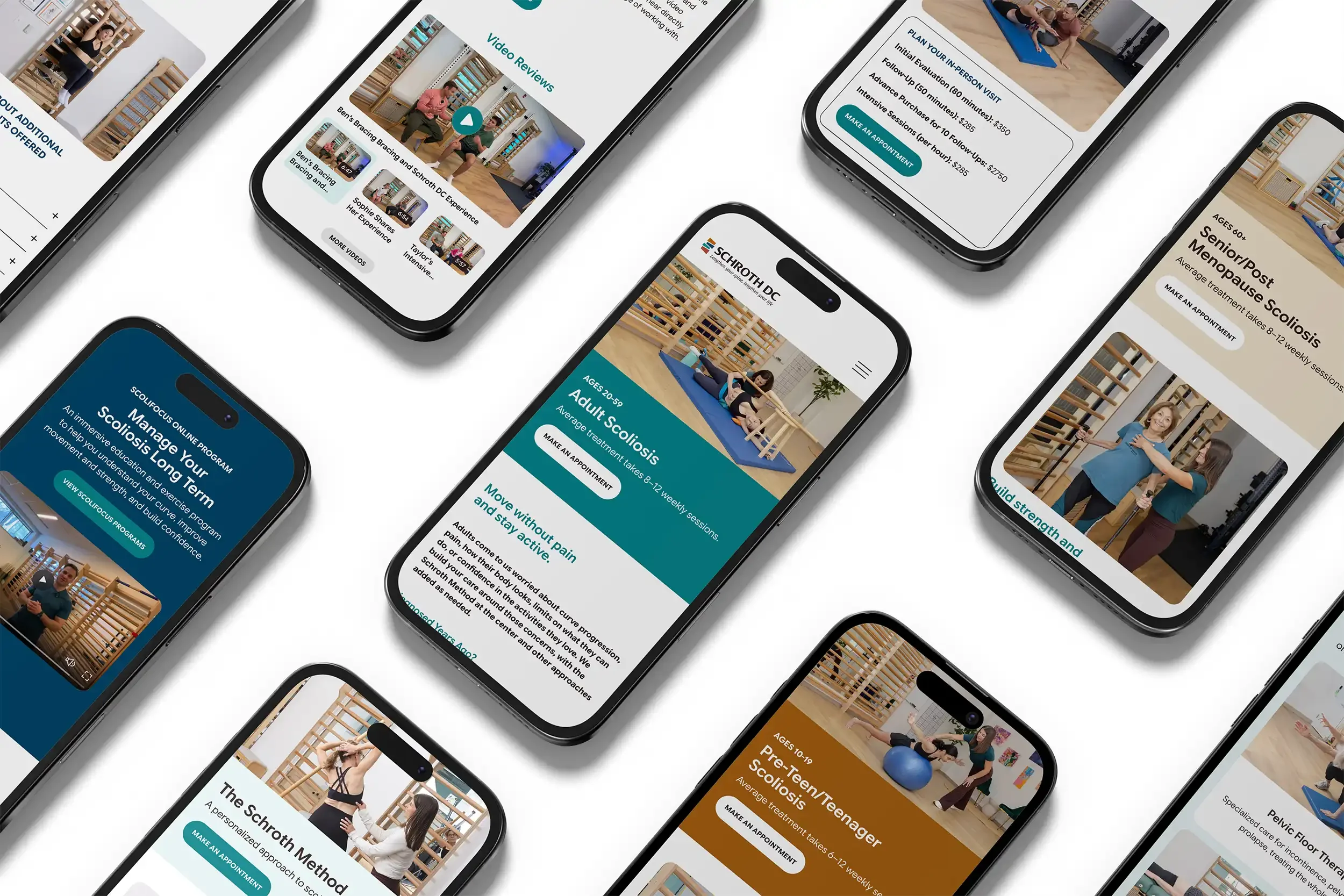
Rather than one services page, we built separate pages for pre-teens and teenagers, adults, seniors, pre- and post-surgical patients, neuromuscular scoliosis, and intensives. Each answered the questions that the audience actually arrives with. Visitors got a direct path to the page written for them, and search engines got distinct pages instead of one diluted page trying to rank for everything.
SEO-Optimized Content
We wrote the site, drawing clinical substance from Caroline and Eric and shaping it into language a visitor could follow. Page titles, meta descriptions, URL structure, heading hierarchy, and image naming were built in from the start. The FAQ section, still one of the most visited parts of the site, came from the questions the Campesis answer in person every week.
Logo and Visual Identity
We designed a mark built around color blocks that reference the Schroth Method’s postural correction diagrams, which are rooted in the method itself rather than in generic medical iconography. The logo also features saturated bright colors paired with a font that feels clinical.
Photography Art Direction
We recommended a photographer and art-directed the shoot: treatment sessions, clinic space, team portraits, and the before-and-after postural comparisons that are still among the most persuasive content on the site.
Location and Directions
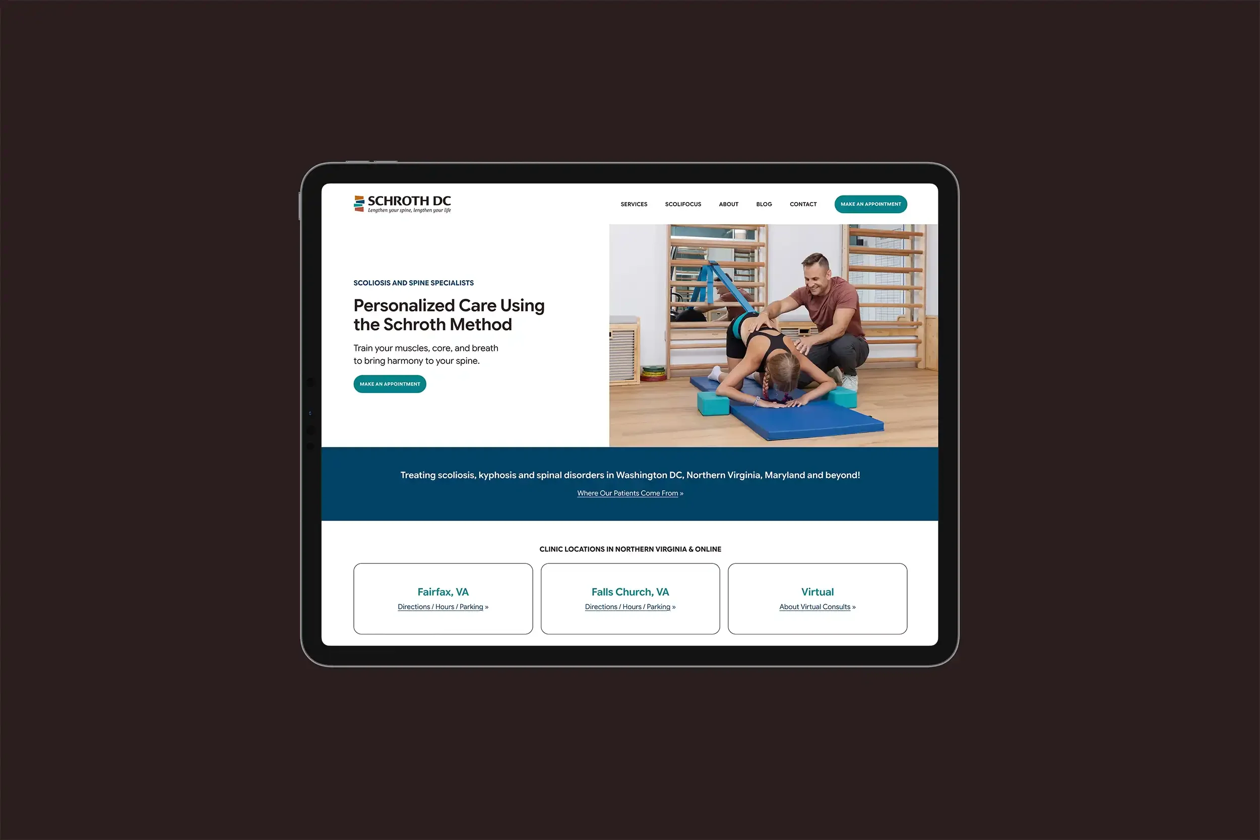
The Fairfax clinic is located inside the National Scoliosis Center building, so an address alone was not enough. We built location pages with directions, parking information, and suite-level details.
Analytics and Local Search
Google Business Profile, Search Console, and Analytics were set up at launch, so the practice had local visibility and real measurement from day one.
ScoliFocus
Eric developed ScoliFocus, an online program for continuing scoliosis and posture work at home. We designed a sub-logo that retains the color-block icon and brand typography, differentiated by capitalization rather than by a separate mark, along with a landing page for it.
Five Years of Results
In the twelve months before the rebuild, Google Search Console recorded 42,900 clicks. Organic traffic grew every year since launch. By the Campesis’ estimate, roughly 95% of their patients find them online, making the website their largest source of new patients.
The practice grew accordingly: a second clinic in Falls Church, a third therapist, the ScoliFocus program, and new offerings in group classes, virtual consultations, and strength training.
Part Two: The Refresh, 2026
Why Now
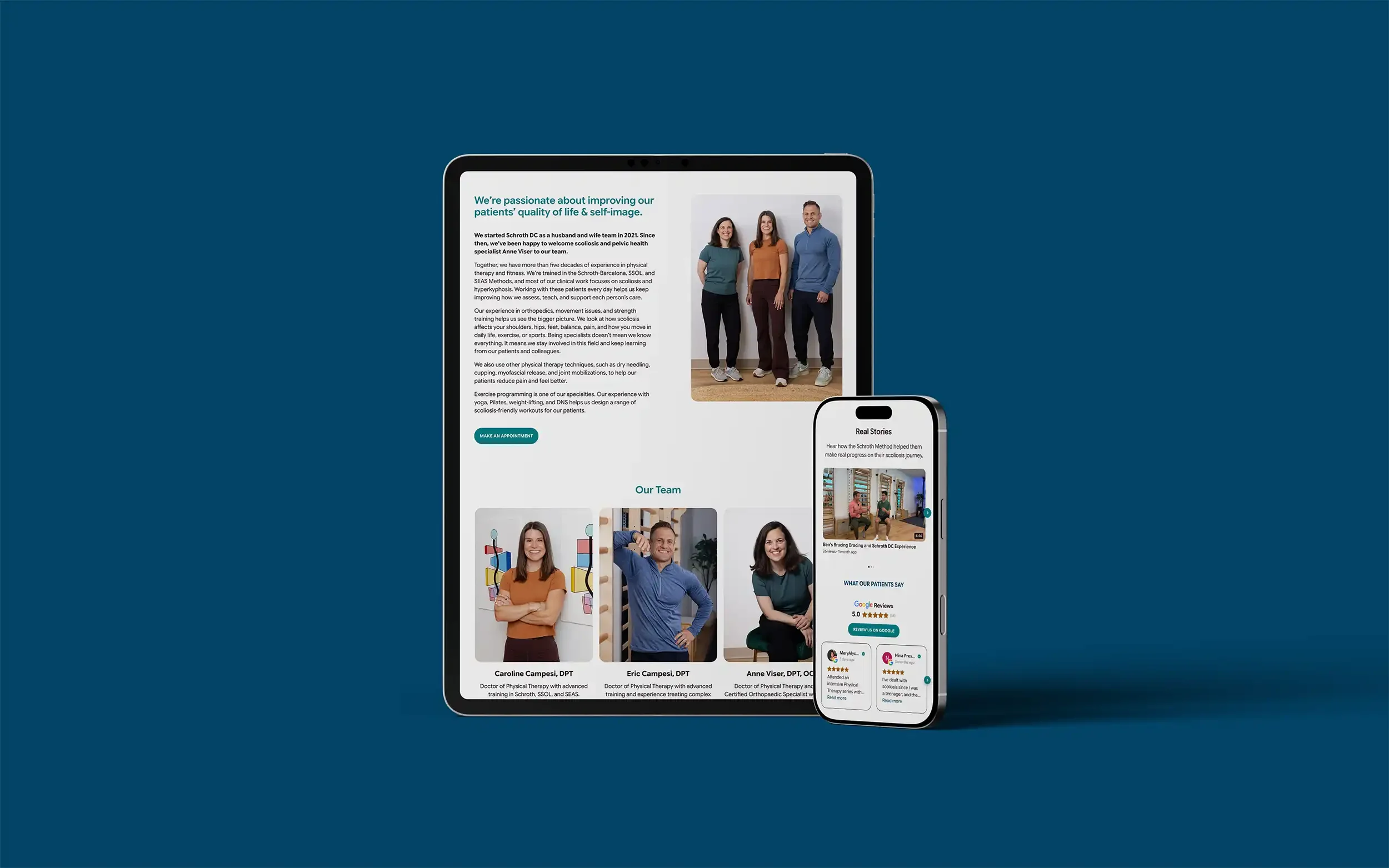
The issue wasn’t performance; it was accuracy. The website still described a two-person practice, even though the team had grown to three. They had recently invested in a custom brand photoshoot, showcasing their new autumn color palette, and now needed to update the site with fresh photos, new services, and a revitalized ethos.
Caroline was clear: she no longer wanted patients to simply manage scoliosis; she wanted them to thrive. People with scoliosis should be lifting weights, taking classes, and pushing back against the limitations they’d been given. None of that vision was reflected on the site.
The platform had evolved as well. The original site ran on Squarespace’s Classic Editor, relying on a third-party plugin to fill native gaps. Now, Fluid Engine offered far better control and built-in design options.
The Approach
A Website Review Before Design
We went through the site page by page, noting what was visible and what was buried, how content was ordered on mobile, where five years of added pages had made navigation hard to scan, and what Squarespace and Google were reporting on the back end. Eric had asked for an honest evaluation, not a cosmetic update, so the review came first, and the design decisions followed.
A Concept Mockup Before Approval
We do not usually design before a project is signed. However, Schroth relies heavily on their website for patients to make appointments and contact them, so the website could not be offline for too long while we were building. We made an exception because “swap out the photos” and “refresh the site” are nearly impossible to compare in the abstract. Seeing the difference is what made the decision easy.
New Photography
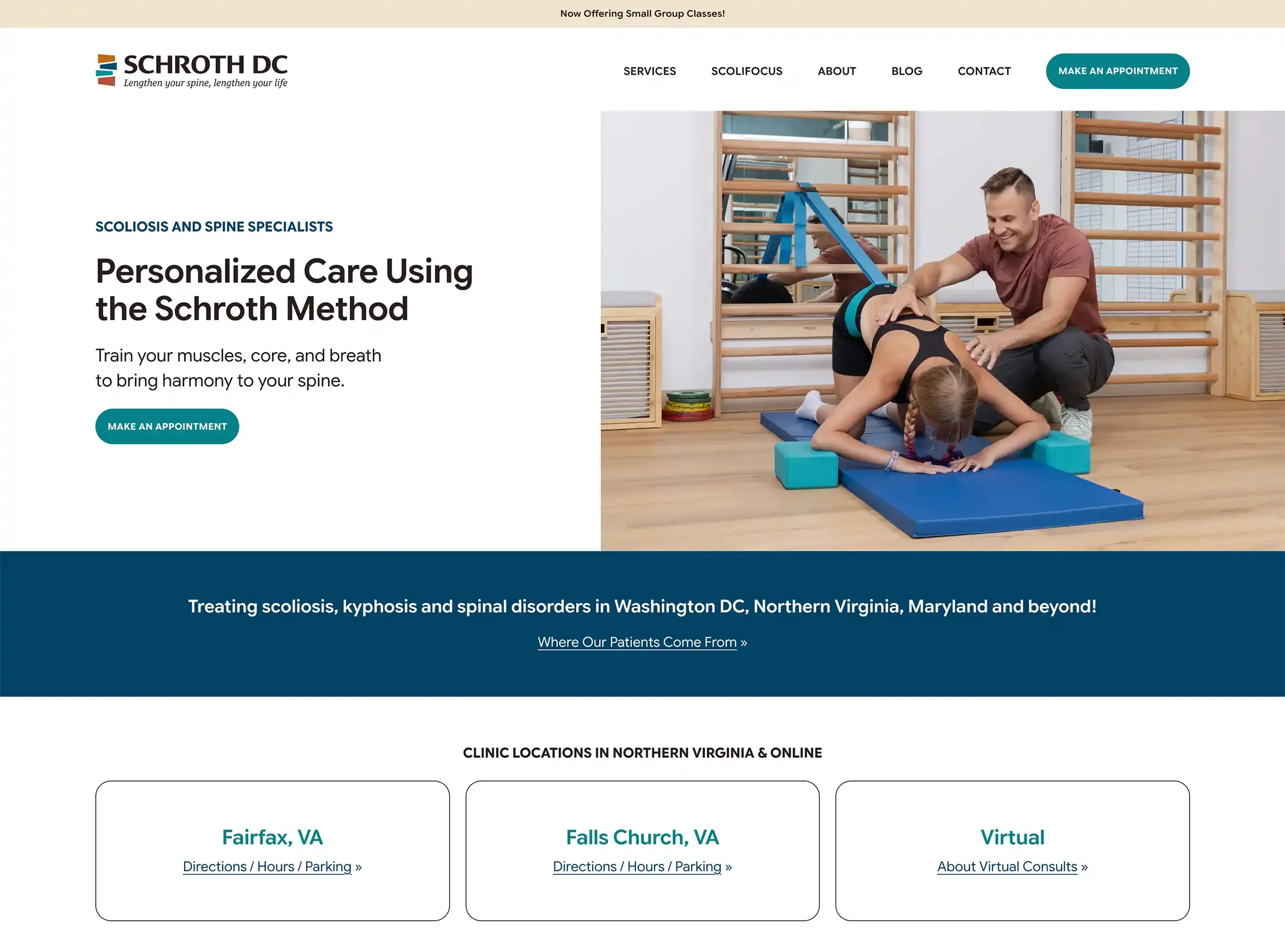
The Campesis commissioned a shoot with eleven models spanning the full age range the practice treats, including their new Fairfax space and demonstrations of the group classes they were about to launch.
A Color Palette From Photographs
Instead of imposing colors and hoping the photos would cooperate, we pulled the site palette directly from the new imagery, so design and photography read as one piece. We paired this with new screen-optimized typography chosen for readability across an audience running from teenagers to patients in their seventies.
Logo Recoloring and Brand Handoff
We recolored both the Schroth DC logo and the ScoliFocus sub-logo to the new palette, keeping the icon and the relationship between the marks intact. We delivered new files for both plus a prioritized list of every place the old mark was still live, including YouTube, LinkedIn, Google Business Profile, and their Jane App patient portal, so the brand updated everywhere at once instead of drifting across platforms.
Custom Development
Several things the site needed were beyond what native Squarespace offers, so we built them: a custom mega menu that organizes a now-substantial list of services into scannable columns; a secondary sticky navigation; custom pricing tables for ScoliFocus programs, each with its own rates; and custom data tables for structured information.
Rebuilt Information Architecture
We restructured navigation around how patients actually search, separating who they are and what they have from how the practice treats it. Services group by age, condition, and format. Treatments got their own section, giving hands-on and strength-based care a visible home for the first time. The Schroth Method page was moved from About to Treatments, where it belongs.
Site-Wide Content Development
Caroline wrote the clinical content for the new pages, which we edited and restructured into layouts built for scanning. We also restructured the existing pages, reordering sections so that information arrives when a visitor needs it rather than in the order it was added over the past five years. New pages: group classes, virtual consultations, strength training, manual therapy, pelvic floor therapy, a before-and-after gallery, and a comprehensive conditions page. Page titles and descriptions were updated or added if missing.
The ScoliFocus Landing Page, Redesigned
The program had changed substantially since launch, so this page was rewritten and restructured. It is also where most of the custom development landed: the secondary sticky navigation, the pricing table, and the data table all live here, letting a complex offering be compared and understood on one page.
Review and Video Widgets
Schroth DC has significantly increased their 5-star patient Google Reviews and YouTube testimonial videos. To showcase both their location-specific Google Business Profiles and YouTube content in a modern way, we implemented dynamic layouts, including carousel and grid formats, optimized for desktop, tablet, and mobile. Custom plugins made it possible to deliver an interactive, seamless experience directly on the website. As Schroth adds new content to their YouTube channel, the playlists update automatically, ensuring the site is always showcasing their latest videos.
Protecting Five Years of Search Equity
With 42,900+ annual clicks running through those pages, a careless restructure would have been expensive. We inventoried every URL before rebuilding, preserved the existing structure wherever possible, and set 301 redirects everywhere a path changed.
The site was offline for a total of 9 days. A full rebuild this complete means the site goes dark while building. We scoped it at one to two weeks and brought it back in nine days, which kept the search dip short.
Privacy and Compliance
We reviewed and updated their Termageddon policies and walked the team through what the site actually collects, including the high-risk tracking scripts in Google and Squarespace Analytics and what cookie consent needs to cover. Enforcement against small practices has grown noticeably more active, and they now know how to reduce data privacy risk.
The Outcome
Schroth DC relaunched in October 2026 with a site that matches the practice. Same URLs, expanded search equity, same clinical authority built over five years, now showing the full range of what they do and the conviction behind it.
-
![Caroline Campesi headshot]()
From my first call with Design Powers I was impressed. I interviewed 3 other website designers and they didn't stand a chance - Evelyn is passionate, encouraging, energetic, and understanding. Emily is equally as wonderful and has an incredible wealth of knowledge. I felt very listened to and very well taken care of throughout the entire process. I now have a beautiful and thoughtful website that I am so proud of. I would highly recommend this female power team.
— Caroline Campesi, Founder, Schroth DC

Website Before & After