RESIDENTIAL REAL ESTATE & PROPERTY MANAGEMENT
Patera Properties
Structured Content. Custom Photography. Website Design & Development.
Overview
Patera Properties is a family team! Founder Misty Scott established Click & Pick Realty back in 2004. Three years later, her sister, Muff Phillips, joined and unlocked the property management side of their business. Now, Misty’s daughter, Sarah Scott, is with them, too!
After almost 20 years as Click & Pick Realty, the team decided that they wanted a brand new image for their business, even down to changing the name! Together, and after careful consideration, we decided on Patera Properties. This name better reflects their growth, the energy they bring to the table, and conveys more fully their offerings and the depth to which they go to help their clients. The word Patera references Sarah’s architectural background and additionally communicates a sense of history and resilience with Misty’s business, combined with a modern perspective on real estate and home development.
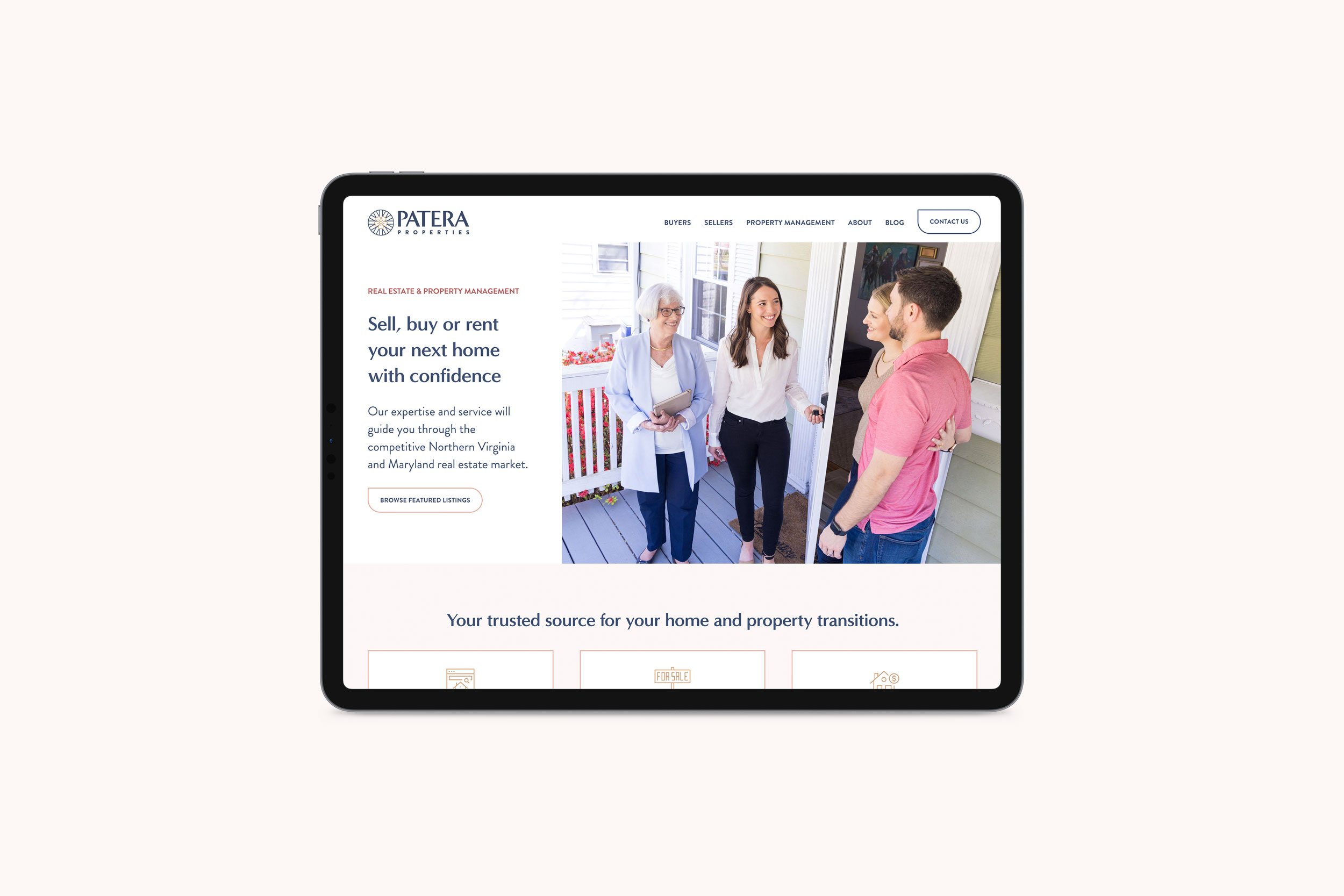
We hired Tamzin Smith, a local photographer, who did a fantastic job capturing the light, breezy essence of the new brand. We designed a simple but sophisticated logo and finally put it all together in a beautiful, streamlined website design. One of Patera’s specialties is working with first-time buyers and sellers, so we made some handy PDF guides that help people who are looking to sell or buy their house but might not know where to start!
This site doesn’t just have content that you can read; it has content that informs. Combined with a new name, a new logo, and gorgeous photography, Patera Properties brings a new and fresh approach to real estate.
Logo Design and Visual Identity
When we discussed logos, these ladies decided they wanted to ditch Click & Pick Realty and go with a new name and image that fully encompasses all the talents their team can offer their clients! Together, and after careful consideration, we decided on Patera Properties. The word Patera references Sarah’s architectural background and additionally communicates a sense of history and resilience with Misty’s business, combined with a modern perspective on real estate and home development.
When we were designing the logo, the Patera Properties team stated that they wanted something simple but elegant. A design that would make them stand out (but not for the wrong reasons)! For the icon, we drew a Patera, which is an ornamental circular embellishment typically found in Ancient Roman architecture. This highlights the history that they have as Click & Pick while ushering them into the new era of Patera Properties.
Website Before & After