FINANCE
Bespoke Business Advisory
Structured Content. Website Design & Development.
Bespoke Business Advisory provides comprehensive bookkeeping, controller, financial planning and advisory services. BBA’s mission is to empower small businesses by providing accurate and timely business information, insightful analysis and expert advice.
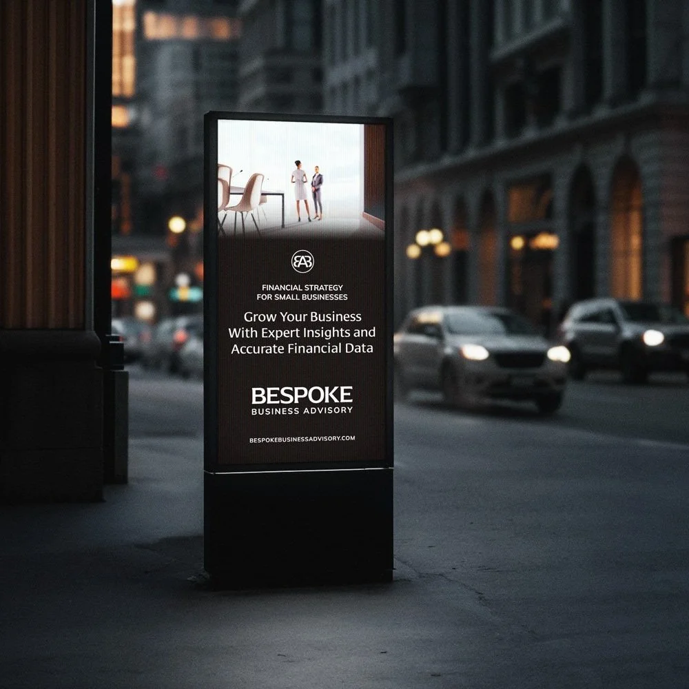
BBA’s founder sold their previous bookkeeping company of 20 years and wanted to rebrand their new business with a new name, logo, and website that positioned them as the go-to expert for financial business advice. We created a luxury brand identity that looks and feels professional, high-level, upscale, and classic.
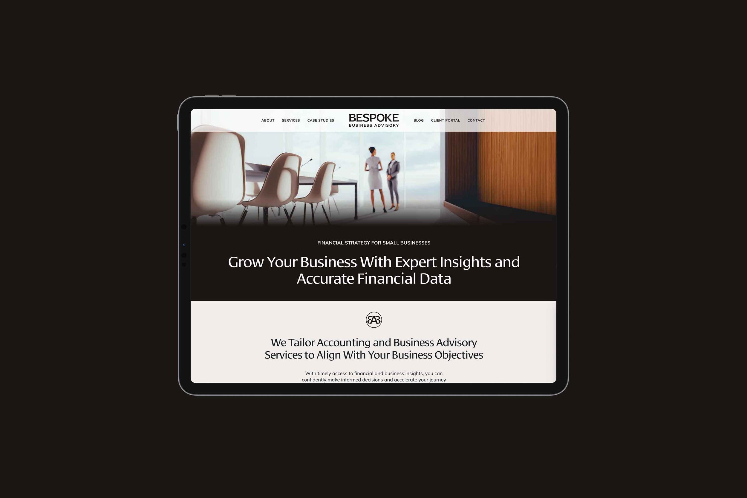
We created a clean typographic logo with letter spacing kerned to perfection that conveys an authoritative character with subtle and concise wedge serifs. Set in all-caps letters, its sophisticated quality and corporate tone of voice deliver a timeless, elegant style. The logo is designed to look premium and custom while also evoking the traits of a financial business, just like BBA’s tailored services.
BBA worked with our content writer consultant, Monika Jansen, to create new brand messaging for the primary and case study pages, and we wrote the SEO titles and descriptions. In addition, we encouraged BBA to ask for real client testimonials, which significantly strengthened their reputation and established trust in their services online.
A custom-coded centered sticky navigation was designed to highlight the logo with a symmetrical look and make the menu items easy to access. The navigation menu has transparency at the top of the page, giving the main header image an expansive feeling and transitioning into full opacity as you scroll for readability.
Primary pages feature thoughtfully curated warm-toned stock photography and large full-width banner images with smooth parallax scrolling. The images seamlessly transition into the following sections with soft gradients gently guiding users down the pages and contrasting the hard-edged sections and sharp-corner photos.
Additional visual elements include the icons on the services pages that match the line width of the outlined buttons and the logo monogram designed as a decorative ornamental logo sub-mark.
The neutral color palette consists of 3 grays of different tonalities: cool, steel, and dark warm gray, along with a bright white and off-white warm bone. The headline font is a versatile, highly legible sans serif font with some contrast. The headlines are set in title case to evoke a feeling of formality, importance, and professionalism. The paragraph font is a clean sans serif font that looks excellent on screens and fits the minimalistic web design aesthetic.
We formatted the blog posts, connected the domain name and their third-party client portal, set up website legal policies, wrote alt text, created a mailing list and visual style guide, and guided BBA with design direction and strategy.
We’ll soon set up a training, webinar, and video page to generate new leads and sales, as well as an automated email campaign and pop-up to continue BBA’s marketing efforts.
The website has a minimal, elegant design, is easy to navigate and comprehend the services, speaks clearly to its target audience, and motivates users to take action, whether that is to sign up for BBA’s newsletter or fill out their contact form to get started with top-notch accounting and advisory services.
Logo Design and Visual Identity
The firm's name communicates the types of services it offers, and it wanted its logo to convey that as well. The logo is designed to look high-end and contemporary, just like BBA’s premium tailored services, while also evoking the traits of an established financial business.
BBA wanted its logo to be a distinctive and luxurious word mark to attract more of its current clientele, which consists of high-achieving millennial business people who previously worked in corporate environments, started their own companies, and had early business success.
The logo emphasizes ‘Bespoke,’ as it’s the largest. It expresses BBA’s custom solutions and represents the consistent, high-quality value they deliver to their clients.
The typographic logo is assertive, clean and minimalistic. The primary font was handpicked for its authoritative and financial industry characteristics with subtle and concise wedge serifs that create a strong foundation. Set in all-caps letters, its sophisticated vibe and corporate tone of voice deliver a timeless, elegant style with letter spacing kerned to perfection.
The clean sans serif font for ‘Business Advisory’ complements and contrasts the stylized primary font, creating a balanced feel and tying together the font on the website to create consistency across all brand touch points.
The circular logo monogram of the firm's first letters, ‘BBA,’ is a symmetrical decorative ornamental logo submark designed to be used independently of the primary logo in special use cases, such as on printed merchandise, watermarks, social media profiles, and on the website, to highlight content with visual interest in a subtle on-brand technique.