SMALL MANUFACTURING
Byington Steel Treating
Structured Content. Website Design and Development.
Overview
Byington Steel Treating is a NADCAP-accredited metal heat-treating company in Northern California offering industry-leading quality, capacity, and consistency.
Founded in 1952 by current CEO Sean Byington's grandfather with $100 in his pocket, three generations later, the family business has grown to be the largest heat-treating company in the Bay Area.
The Back Story
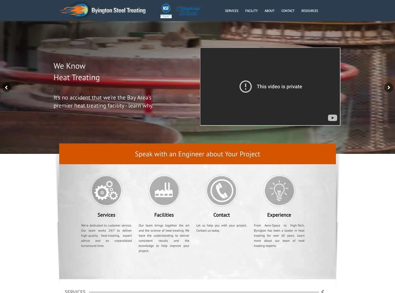
Sean originally came to us because we work on the Squarespace platform. Their site was built in WordPress, and he was frustrated with it. Plus, the site was antiquated with old images and content. They wanted a new, modern brand and website that visually communicated their company’s expertise, high-quality products and services. The goal was to create an elevated brand synonymous with quality material processing: a parent brand under which their additional companies could live and be connected.
Starts With Strategy
We evaluated the current website, documented content and page links, and spoke with Sean about website goals. We created a new site map and hired a B2B writer with experience in the manufacturing industry, as many industry-specific terms needed to be technically accurate.
Using our strategic site map and plan, the content writer wrote keyword-rich on-page and off-page content optimized for search. The writer did an excellent job spotlighting the brand story, history, equipment, services, and team bios. We made minor edits as needed, including rewriting and adding a few headlines for clarity and interest.
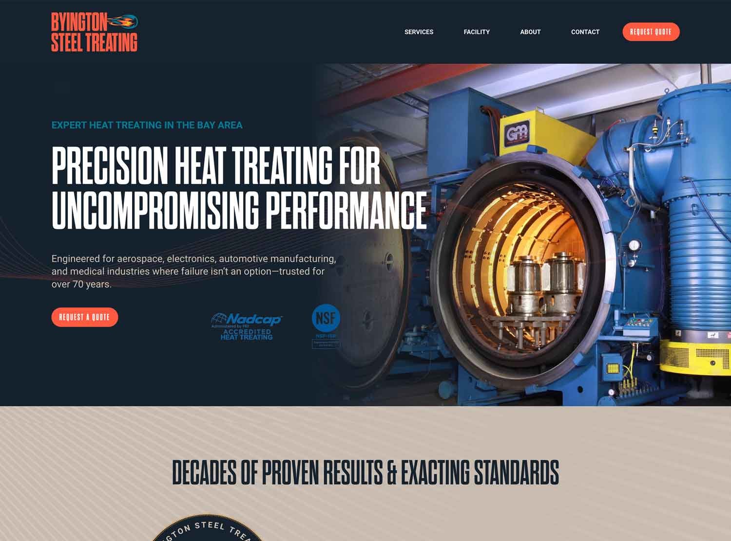
Sean provided facility and history photos that hugely showcased the area, building, warehouse, and on-site equipment. We needed to use actual photographs because the equipment is highly specialized and supplemented with stock.
We designed custom page headers, prominently displayed their certification and accreditation logos, created custom background section art, customized icons, and redesigned their old and new anniversary logos.
Their new site has a logical primary navigation, looks crisp and professional, has helpful features like FAQs and a glossary page, and, most importantly, consistently has calls to action for people to request quotes.
Their contact information is easy to access, their new forms have anti-spam capabilities (as their old WordPress forms would get spammed in mass daily), and their new legal policies are up-to-date with current data privacy laws, protecting their business from fines and lawsuits.
We implemented URL redirects and analytics, and the site is responsive across desktop, tablet, and mobile.
Their online presence is now upscale, with enhanced brand messaging. They leverage their photography and historical assets to tell a compelling story.
Logo Design and Visual Identity
The old logo was a fireball icon. Conceptually, we thought it was pretty awesome, but it desperately needed to be refined and vectorized. We created an elevated brand synonymous with quality material processing: a parent brand under which their additional companies could live and be connected to.
We redrew the fireball icon, elongated and simplified it in a modern, flat, illustrative style. The colors stayed close to the original art (their warehouse facility is painted orange and blue), but they were cleaned up to be less muddy and more saturated so that they pop out on a light and dark background.
Instead of positioning the icon to the left (with a destructive trajectory headed straight for the company name!), we repositioned the fireball to the right of the company name, showing the heat treatment coming from the company instead of into it.
This subtle shift makes the logo easier to read because we read from left to right in Western languages. It also visually distinguishes the design from traditional left-aligned icon logo placements in a lockup. Right-icon-alignment creates a unique, modern, memorable aesthetic, creating a compelling and distinct brand identity.
In conjunction with the type design and overall lockup, the fireball fits perfectly in the negative space next to BYINGTON. Their name is set in an antiquated sans serif font inspired by vintage wood type. Its masculine and retro qualities are a hat-tip to their historic brand story, evoking feelings of nostalgia.
The name set in all caps gives it impact and emphasis. The letters occupy more space, making the company name prominent and creating a bold and authoritative look. The logo also works brilliantly in a single color application or metallic treatment, making it adaptable in different contexts.
Their logo is now easily recognizable, highlighting the brand name and icon. It conveys a sense of confidence and credibility, which is highly appropriate for a family business with 73 years of experience that processes tools for aerospace, electronics, automotive manufacturing, and medical industries, where failure isn’t an option.
We also designed an anniversary logo badge they can use to celebrate how far they’ve come! We used it throughout the website as a graphic element; they can use it on staff t-shirts, and it can be updated each year going forward!
Website Before & After