Does Your Small Business Logo Design Tell a Strong Story?
“The strongest logos tell simple stories.”
LOGO-A-GO-GO!
Logo-a-Go-Go is our fun Friday social media content campaign. Evelyn got the idea for the name because she loves playful alliterations and she’s a fan of Chuck Brown, “the Godfather of Go-Go” who is a local legend in our home city of Washington, D.C. (Go-go originated in the ’70s and is characterized by a funk beat with an emphasis on call and response.)
A logo is the initial visual call that we respond to when sizing up a business. Paraphrasing Milton Glaser when we look at a logo we think “yes, no, or WOW! Wow is the one to aim for.” Always Milton, always.
Every Friday we feature one of our small business client’s logos on our Instagram page. The posts have created some buzz so we’ve been posting them on our Design Powers LinkedIn page too. Also, our site analytics show that anything to do with logo design gets a lot of attention. But why?
People love logos! 🤗
They love to look at them, wear them, trash talk them. A logo can, in an instant, define who you are, what you stand for, and who you love. Sports teams are the obvious examples of this but there are so many more.
Ever tried to draw a logo? Logos seem easy to create; choose your company name, decide on your color(s), pick your font, and BAM, you’ve got a logo. But it isn’t that easy to design a logo that has meaning and is memorable, even for designers.
Done is the new perfect…
…but not in the case of logo design. The logo gives your business a quick visual encapsulation of the quality of your services, how you interact with your clients, and your brand promise and your purpose.
“A logo is not a brand—it’s only a symbol for a brand. A brand is much more than a logo.” — Marty Neumeier
Missing the mark on your logo could convey and communicate aspects of your business that don’t align so ultimately it plays a part in your success. A logo has to stand out, it must be clever, but also clear, and designed to speak to your target market.
Since we tend to work with businesses that have been around for several years, often we see that the business starts out with a poorly designed logo. It’s understandable because when you’re starting out you don’t necessarily have the money for a thorough branding process. You think “If my business is successful, I can redo this at some point in the future.”
Then the business IS successful and grows and has invested time and money into creating an online presence (website, social media, etc.) printed collateral, merchandise, signage, and even storefronts with that poorly designed logo.
If you do the math, it would’ve been less costly to have started out with a strong brand strategy, story and logo design but often, it’s hard to convince new businesses of this.
What comes first, the logo or the story?
Logo design can be a representational or abstract illustration of a concept or a typographic treatment or both. If executed well, both illustrative or typographical can be effective. But, to create a memorable logo you must have a thoroughly researched idea of what the logo will communicate.
The story always comes first. Discovery, brand development, planning and marketing strategy are the start points.
Conceptualization guides the creative process. Every single decision is thought out and derived from the brand story and goals. It’s critical to developing a logomark that your ideal client associates feelings of positivity considering your services.
All our clients start their businesses because they have a strong brand of conviction. Their motivations and passion for what they do make it exciting and satisfying to build their visual brand identity and logo!
Our Small Business Client’s Logo Stories
Harper & Gray Talent Recruitment is a strategic consulting firm emphasizing diversity and inclusion first. We worked with Founder & CEO, Ginnette Harvey, to create a brand identity that embodies her purpose-driven mission, bold avant-garde style and target audience.
Because H&G focuses on hiring executives and skilled talent, we opted for a premium feel, high fashion look for the “HG” custom monogram. The monogram is useful for a variety of different lock-ups, both digital and print.
A bright, diverse color palette provides a distinctive upbeat modern corporate impression, helping tie into the trailblazing element of the brand. The logo is able to be seamlessly fit into a pattern and corresponds with the brand photography and overall aesthetic.
1115 Mobile Kitchen is a food truck located in Richmond, Virginia. Owner and Chefpreneur, Henry Fletcher, wanted the logo to embody his mission of serving BOTH plant-based and animal protein dishes. It’s uncommon for food trucks to serve both ‘traditional’ and plant-based food. 1115 Mobile Kitchen solves that problem.
The logo juxtapositions plant and animal, land and water, into a yin and yang symbol. It’s vital that the plant-based food isn’t commingled with protein-based food offerings – on the grill and visually.
The salmon-colored shrimp and the green leaf represent the two options of ‘traditional’ or plant-based. The colors are saturated and easy to discern. Since it’s on the side of a truck that is often in motion, comprehension and readability are important and besides, bright colors stimulate the appetite!
The circular shape of the logo communicates unity and bringing ALL people together, no matter what their dietary preference is. The outside circle containing the kitchen’s name is in the shape of a tire wheel because the kitchen is on the road and the inside circle represents a plate of food.
The font was selected specifically because it expressed a skateboarding and rebellious attitude that’s also reliable and highly professional, and aligns with the illustrative style.
And, as for why Henry named the truck 1115, that’s a whole different story! Next time we’re in Richmond we’re tracking down his truck for some tasty home-style vegan food.
Bewilderness Writing is an intimate freewriting practice community, created by Founder Ellis Elliott. Ellis has a passion for artistic creativity, freewriting, poetry and providing a supportive community space just for writing.
Ellis sought to build an inspiring, whimsical brand and website to house her many service offerings; she is a writer, dance teacher, yogi, artist, wilderness explorer and guide.
We reflect Ellis’ multifaceted background in deep indigo, using a slab serif typeface with an ample, circular x-height offsetting the ‘w’s’ of ‘wilderness’ and ‘writing’. The all-lowercase text communicates the approachability, openness, and informality of her writing groups.
The two twinkling gold stars represent the artistic wanderlust and the wide array of interests that is present within all of Ellis’s students and her writing community.
AElise Designs, led by Amber Bullock, is an award-winning interior designer in the Washington D.C. region who specializes in beautiful, customized kitchen and bathroom remodels for people who want to modify their homes for accessibility in style.
Her ideal client is over the age of 55 who wants to fit out their kitchen and/or baths to accommodate any current or future physical challenges. Her interiors are designed with independence, safety and peace of mind because we’re living longer and want to gracefully live in place.
AElise Designs logo was to create a singular mark that she could use as a stamp on design plans, as a subtle, repeatable pattern and a watermark for her custom photography taken by her incredibly talented husband, Jerry.
The ‘A’ stands for Amber and the ‘E’ for Elise—which is not only Amber’s middle name but a homage to Amber’s aunt who was very dear to her.
We used a serif face to convey elegance and sophistication, two things that Amber and her design solutions have in spades. Small caps letters are used so people understand the company name is pronounced “Ay-Ee-lise”.
The AE monogram is at once modern with a beautiful, optimistically bound turquoise color, but is also traditional in that it’s reminiscent of wax seals used back in the day.
These elements combined with the sans serif tagline create a versatile logo mark with different size variations for use in social media and print collateral.
Read more about AElise Design’s brand story here.
The Arlington Chamber of Commerce began as a non-profit in 1924. It’s an institution that occupies a vital role in connecting the business, nonprofit, investment, and philanthropic communities of this dynamic county.
Their previous 20 year old logo was antiquated and no longer resonated well with the current Chamber’s vibe nor did it work well in today’s media. The hierarchy emphasized the words “The Chamber” and the name “Arlington Chamber of Commerce” was crammed between it and the three-word tagline that is now considered passé.
Our logomark needed to solve the following issues; increase the prominence of the location ‘Arlington’, make the logo scalable and versatile, with an identifiable icon, read in one color, and use an optimistic and modern blue color palette. The varied blues are elegant and effective.
Read our blog post that goes into detail about the Chamber’s logo redesign process.
Awesome Women Entrepreneurs (AWE) is now a women-only networking program within the Arlington Chamber of Commerce.
The logo design for Awesome Women Entrepreneurs begins middle out. The “W”, with its diagonal arms extending out in celebration then rounding down, signifies an emphasis on ‘women’. The lowercase “a” and “e” express the informal nature of the meetings which are social first but can lead to business opportunities.
The exclamation point represents the excitement and energy of a room full of female founders—a concept that continues to grow in the modern business world. The flower pot in the original logo fits the nature of the group—we support each other to promote collective growth.
The intense fuchsia color promotes high energy, compassion, and support. Turquoise represents clarity of thought, harmony and communication. Gray is sleek, secure, complimentary, and mature.
Check out The AWE Show podcast to hear the amazing stories of bad-ass female entrepreneurs and the Arlington Chamber to join!
Clarendon Animal Care logo was a collaboration with Melissa Lew, a designer who had worked with CAC before. Our process was a bit in reverse because CAC already had a lot invested in its previous logo.
Evelyn recognized when beginning their website design, that the previous typography and the logo illustration needed some updating. We designed the website first and then the logo making both consistent.
The orange image to the left of the text includes a heart revolving around both a cat and dog, reflecting that the clinic is open to all kinds of animals (and deals with them equally!).
Turquoise text is often associated with a calming, refreshing, modern wholeness that contrasts well with orange — often regarded as a color of encouragement and being socially inviting. The words ‘Gentle, Caring, Awesome’ are the key values that coincide with being ‘socially inviting’ and echo Clarendon Animal Care’s mission—to provide quality care as an effective animal clinic.
The Chain Bridge Group (CBG) is a real estate team in the DC area, the name deriving from Chain Bridge, which crosses the Potomac River and connects Arlington with Washington D.C. (the first bridge opening in 1977). CBG requested that their logo be: distinctive, proprietary, scalable, and well-balanced.
This is an archetypal negative space logo. It utilizes the background of an image to create another image. It's a unique way to convey multiple concepts.
The deep dark teal and bronze colors create an elegant contrast to the red and gray of Keller Williams branding.
Jones & Rostant, PC is an all-female law firm that specializes in complex medical malpractice, personal injury, wrongful death and birth-related injuries.
Although our primary task was building them a new website we knew their logo needed some love too. They didn’t want to redesign it because it was printed on collateral and large signage at their office so we opted for a refresh to bring their branding into the modern digital landscape.
Maura Fredericks is an executive coach in Arlington, Virginia. We developed a typographic wordmark logo that reflects Maura’s ideal client, c-suite executives by using Rama Gothic, a tall sans-serif typeface. We chose a masculine warm grey combined with a bright copper and a sophisticated antique pearl.
Nice Work was Evelyn’s joint venture with Tara Claeys which provided WordPress web design and development for mid-size organizations, looking for high-level involvement in their online presence and digital marketing strategies.
The logo design itself was inspired by approachability and friendliness. We elected for the rounded geometric sans-serif with the lower-case ‘n’ nestled into the ‘w’, symbolizing how we become a team with our clients.
The typography is All Round Gothic using the colors lime green, and teal that looks harmonious together.
Patrick Kirwin is an expert muralist and painter. We worked with Patrick to reinvigorate and up level his brand in a way that it speaks to his target audience more succinctly.
The Google fonts Josefin Sans and rich colors were chosen because they communicate elegance and prestige. The moniker ‘PK’ is professionally interwoven.
The inspiration for the logo was his initials PK as a monogram for ease of use online and in print. The letterforms are reminiscent of a 12th century monk quietly inking out his prosaic tales of literature, mythology and religion.
Stephanie Mitchell Fitness is a personal trainer and wellness coach for women. Stephanie’s logo was based off our discussion during the Power Plan. Stephanie is a super bubbly southern girl who LOVES circles and pink. She gave us insight into what motivates and inspires her, hoping to incorporate it into her logo.
Stephanie had taken a story brand test and the results understood her as a ‘Lover’ › “…an individual most fulfilled by building relationships—naturally appreciative, passionate and committed, they enjoy creating consensus, motivating others to see and utilize their own special gifts”.
We try to translate these qualities into the logo itself—the initials (SMF) being interconnected symbolize relationship-building. The two contrasting pink colors harp on the camaraderie present when two individuals are fulfilled through successful relationships being built.
SMF also doubles as her business mantra, Strong Mindful and Feisty. Read more about Stephanie’s story here.
Jill Cruz, of Work with Your Nature Weight Loss (WYN —pronounced ‘win’), is a board-certified nutrition specialist who helps women lose weight in a sustainable and enjoyable way.
Our goal revolved around creating an illustrative icon that is feminine, curvy, and flowed like a river in harmony with nature. To match the icon, we picked a serif typeface that was bold, thin and all sizes in between to express nature’s ebb and flow, inclusivity, and celebrate women’s curvy nature.
The ligature mark is friendly, fun, and optimistic. It’s a condensed version of the primary logo and it’s used as a favicon on the website and on social media profile photos.
Learn more about Jill’s story and website development here.
Does your logo tell your brand story?
Logos must visually convey the essence of the brand. They must address the target market and represent the companies identity.
Build your brand by first identifying your business’s meaning and messaging. Define the story of your company. Why did you start it? Who is your ideal client? Who are your competitors?
These thoughtful considerations will help you develop a logo that both you and your prospects love.
Let us know in the comments if any of these brand stories stood out to you. Logo question? Ask away. Need a professional logo for your small business? Let’s chat!
Follow us on Design Powers Instagram for more Friday, Logo-a-Go-Go Posts!
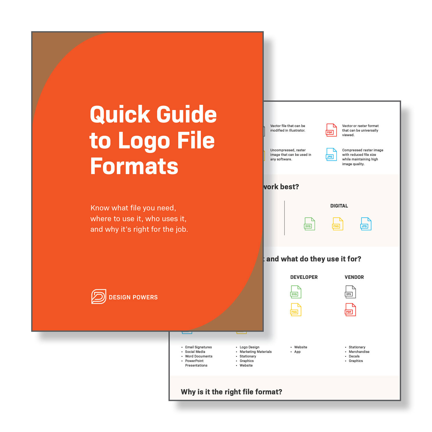
Quick Guide to Logo File Formats
Download our free Quick Guide to Logo File Formats to know what file you need, where to use it, who uses it and why it’s right for the job.

