Work with Your Nature
NUTRITIONIST & WEIGHT LOSS CONSULTANT
Brand Messaging and Identity / Website Design / Graphic Design

OVERVIEW
Jill Cruz of Work with Your Nature Weight Loss (WYN -pronounced win), is a board-certified nutrition specialist who helps women lose weight in a sustainable and enjoyable way. Her primary target market is women over the age of 40 who want to lose weight and keep it off for the long-term. We worked with her to redesign her messaging, logo, website, and landing page to promote her services and sell her program.
STORY AND CONTENT
Jill Cruz had a Squarespace website for her business Body Wise Food Smart and her old program, Food Boss, but wanted to re-name her company Work with Your Nature Weight Loss for her new program.
She needed help with copywriting using keywords and messaging that spoke to her ideal clients, cohesive branding that was friendly yet mature, a unique logo to make her distinctive, a professional website that communicates her expertise, capture leads, and sells her program.
We started out designing a distinctive logo and writing website content for her target market of women over 40 who are looking to lose weight for the last time.
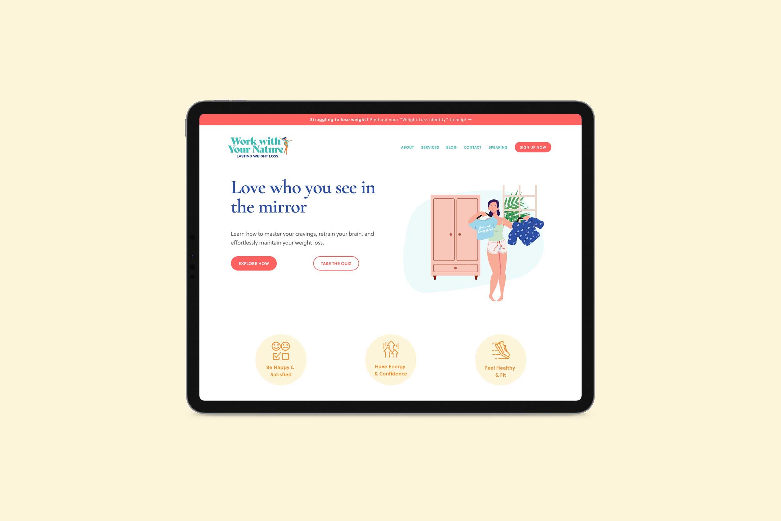
We developed the WYN branding with a cheery color palette, sophisticated typography, and friendly illustrations to build the foundation of visual consistencies to make her business look very professional.
We created her content to highlight Jill’s story and accreditation’s to build trust and empathy and clearly explain her process in a simple 3 steps so her potential clients have the confidence they need to buy. We added personalized testimonial quotes that provide social proof and we entice website visitors to get started with punchy calls to action. We also categorized and redesigned her blog to improve the overall user experience.
LOGO DESIGN
The idea behind the Work with Your Nature Weight Loss logo was to create an illustrative icon that was feminine, curvy, and flowed like a river and in harmony with nature. To match the icon, we picked a serif typeface that was bold, thin, and all sizes in between to express nature’s ebb and flow, inclusivity, and celebrate women’s curvy nature.
The ligature mark is friendly, fun, and optimistic. It’s a condensed version of the primary logo, and it’s used as a favicon on the website and on social media profile photos.
The primary logo.
The ligature mark / favicon.
COLOR PALETTE
For Work with Your Nature Weight Loss, we chose a medium-dark blue, bright turquoise, orange, coral pink, and gray. Blue and turquoise have a calming yet vibrant influence to promote freshness, trust, security and compassion. Orange and coral communicate enthusiasm, creativity, and success. These colors attract the eye without overwhelming us. Gray is soothing and provides a neutral color to ground any intensity. Overall the colors are fresh, energetic and eye-catching. Keep in mind these colors are used very carefully to not cause overwhelm and we use lots and lots of white space in the design. White space is what allows us to use so many bold colors together in harmony.
TYPOGRAPHY
We chose Cormorant Garamond Bold for the headings, a timeless traditional serif font that expresses sophistication and maturity. For subheadings and body copy we chose Soleil, a sans serif font that is very readable on the web and comes in many weights. This combination creates a perfect balance between elegance and modernism.
What Jill Says…
Before & After
Move handle left (after) to right (before).
Before
After
What our client says…


