Jones & Rostant, PC
TRIAL LAWYERS
Brand Messaging and Identity / Website Design & Development / Custom Photography
Committed to protecting injured families.
OVERVIEW
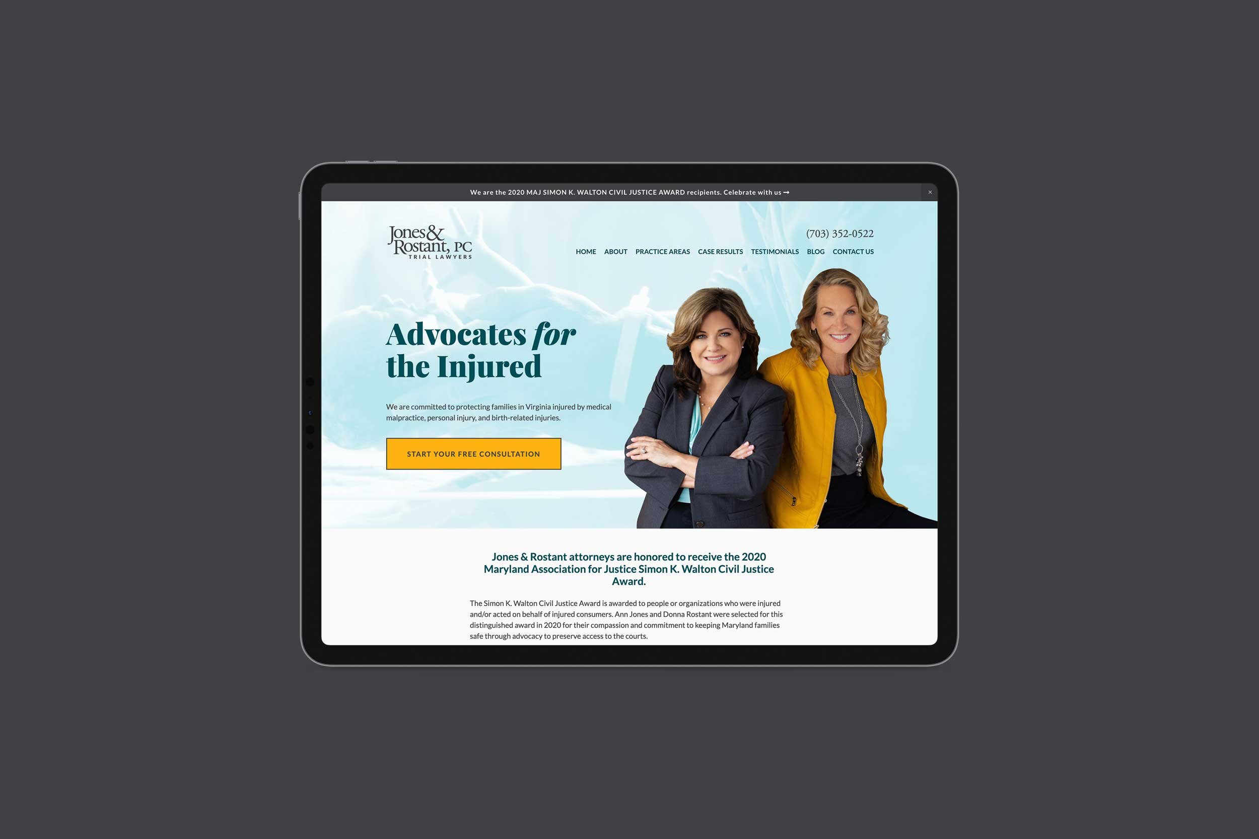
Jones & Rostant, PC is an all-female law firm that specializes in complex medical malpractice, personal injury, wrongful death and birth-related injuries. They had an outdated and unresponsive website. We worked with them to rebrand and build a modern website that clearly communicates their expertise and services.
STORY AND CONTENT
Ann Jones and Donna Rostant are successful trial lawyers in Fairfax, Virginia. They personify our ideal client. They’re really good at what they do and have been in business for fifteen years. They get a lot of word of mouth clients because of their expertise which is highly specialized. BUT judging them from their old website, you couldn’t glean the breathe of their expertise.
It’s not that the site was bad—it was simply dated and didn’t have a lot of the content and visual hierarchies needed for today’s successful, responsive websites.
Also medical malpractice is a very competitive field and the content writing had to hit upon the keywords that they niche in to be search engine optimized (SEO). We hired a content writer who writes only for law websites. Our next step is to help them with their content marketing which means getting them to write a blog post every now and again!
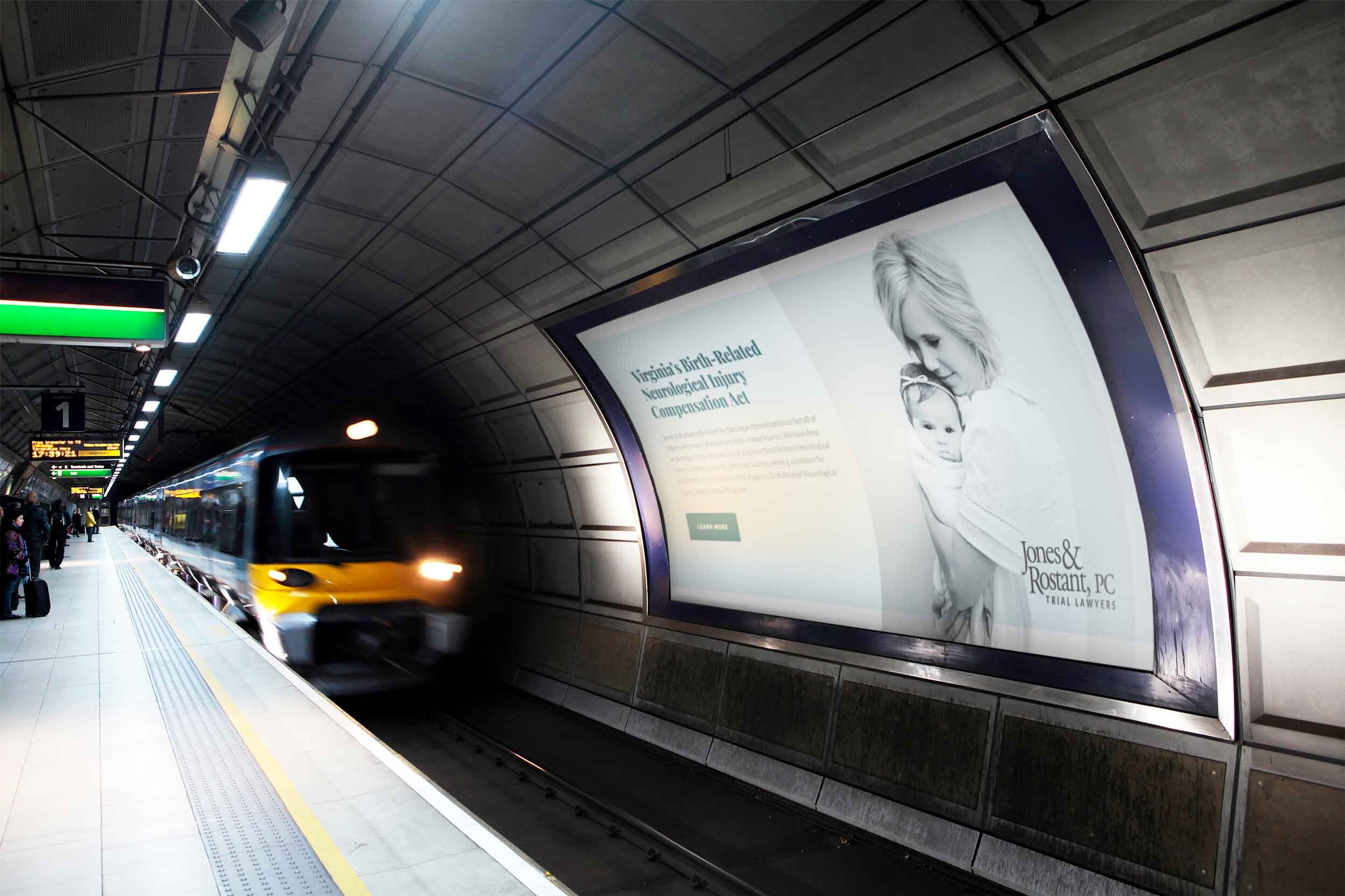
CUSTOM PHOTOGRAPHY
We hired Lisa Damico to do the brand photography in Ann and Donna’s office. Lisa guided them with what to wear based on their personalities and fashion preferences and had a hair and makeup stylist come out to style them both. Design Powers art directed shots and did a little staging.
COLOR PALETTE & TYPOGRAPHY
From the photo session, what emerged were two spectacular colors—that seriously bad-ass yellow leather jacket Donna wore and the deep cool colors that emphasized Ann’s empathetic, beautiful blue eyes. They became the base colors for the website design and a differentiator from the usual law websites, which can be depressing and dark.
The palette also played nicely with the kind of cases they handle that often deal with babies and mothers. Deep teal conveys sophistication and represents clarity of thought, while golden yellow conveys happiness and elegance. Charcoal gray communicates wisdom, and soft blue symbolizes creativity and balance.
You wouldn’t think we would have chosen the Google font Playfair Display for a medical malpractice law firm, but the reason we did was based on their ideal client. Although they have clients of all ages, we wrote and targeted their brand story to young mothers.
We wanted the typeface to be friendly and readable yet with character and warmth. The san serif Lato is a versatile humanist typeface that reads extremely well on mobile, which is very important on a site that has a lot of legal content.
What Ann and Donna Say…
We worked with Ann and Donna to rebrand and build a modern website that clearly communicates their expertise and services.
Before & After
Move handle left (after) to right (before).

Before

After
What our client says…