Condo 1
REAL ESTATE & PROPERTY MANAGEMENT
Brand Messaging and Identity / Website Design & Development

Condo 1 Real Estate
OVERVIEW
Condo 1 is a property management and real estate agency founded in 1993. They specialize in condominiums and townhomes, mostly within the geographic area of the Orange/Silver Line corridor in Arlington, Virginia.
Tom Meyer, CEO of Condo 1, has worked with us for over a decade and, this year, was interested in running Google Ads. We set up Google Ads that click-thru to his website, but there was an issue: his WordPress site had been corrupted with spam ads and irritating pop-ups. This can happen when the WordPress site theme and plugins aren’t maintained. The site was approaching six years old, so it was time for a rebrand/rebuild.
START WITH STRATEGY
Because the real estate market has changed considerably, we made sure the content on the new site accurately reflected the services that Condo 1 wants to focus on now and provide in the future. Before, the site was equally balanced between selling, buying, rentals and management. We focused mostly on property management because the current real estate market has so little inventory. It is their most profitable service, even before the market squeeze.
The iconic Condo 1 logo, IDX search functionality and some written content were transferred from the old site to the new one. We then created a new visual sitemap of the 75–80 pages we planned to build on it.
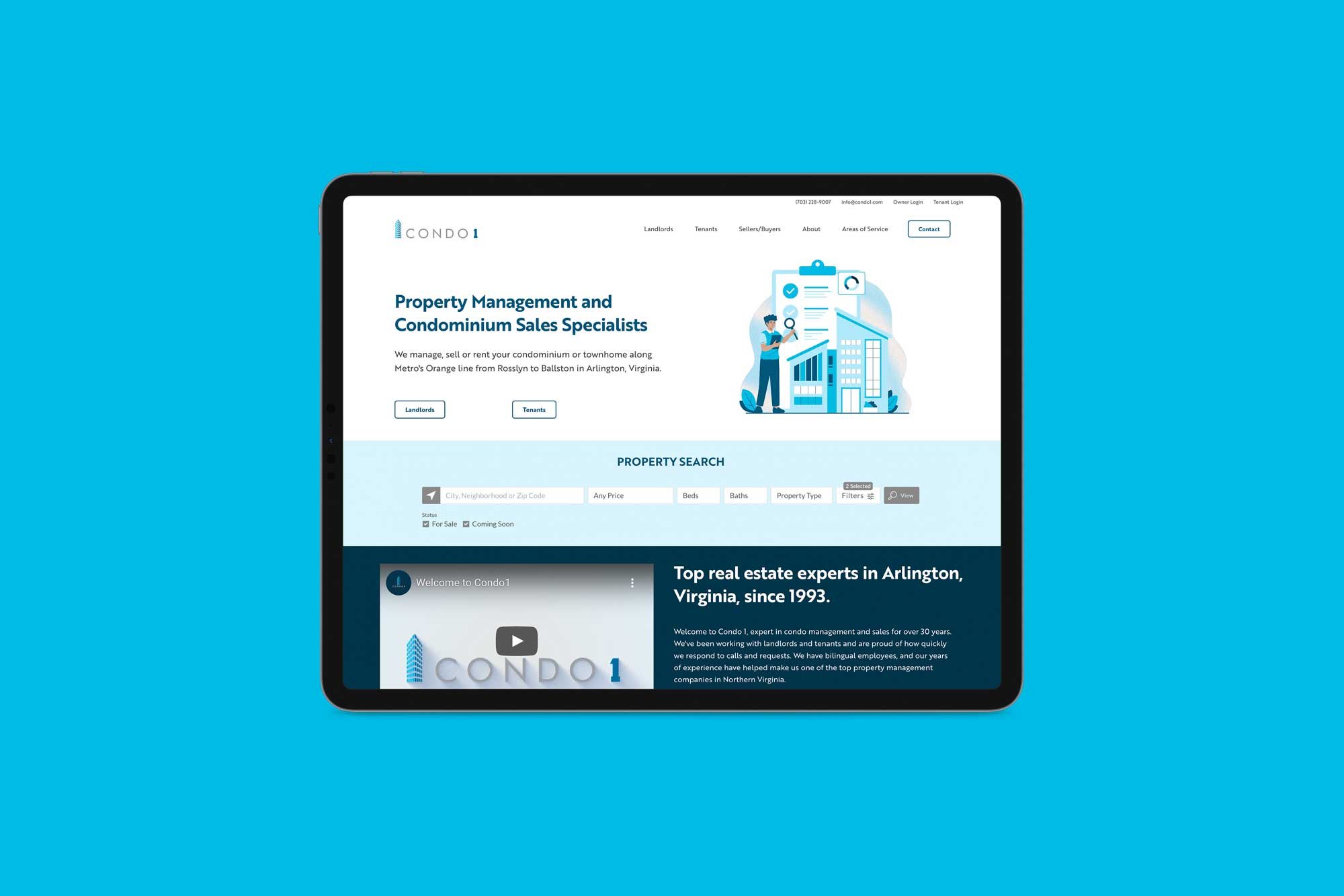
We designed two home page concepts. The first used customized stock illustration, and the other used local shots of Arlington. They loved the illustrative concept. We’re happy they went in this direction because it feels so modern and fresh!
CONTENT WRITING
First, we reviewed all the written copy to determine which quality content could be used on the new site. We then wrote new content and created keyworded page titles and SEO descriptions for all pages. We wanted it to be hyper-focused on five specific neighborhoods in Arlington where Condo 1 works. We highlighted the team’s expertise, comprehensive property management services, technology integrations, cost efficiency, and local network.
CUSTOM PHOTOGRAPHY
On the old website, Condo 1 used stock photography. Stock images are certainly acceptable and may be the only option, but often, they don’t convey the authenticity people want to see. They can feel impersonal and antiseptic. Evelyn and Emily headed to Condo 1’s HQ in Clarendon to take new photos.
We usually hire a professional photographer to take custom branded shots, but since we only needed updated team and headshots, and we had to be quick because Tom doesn’t stay in one place for long, we decided to streamline the process and use Evelyn’s iPhone 15 Pro. We gently applied filters and backgrounds and cropped the photos to ensure consistency. We used an organic shape for the home page team photo to match the illustrations.
Evelyn persuaded Antonio Melendez, a Condo 1 agent, to make a short welcome video. Afterward, we took shots of select buildings to be featured on the condominium building pages and the Arlington neighborhood pages. Several building photos on the old site were outdated, low-resolution, or too small. The new photos tie in nicely with the spot illustrations.
WEB DESIGN
We always start with the home page design because this is the main landing page and sets the tone for the rest of the website design. Color contrast, especially in typography, is important for readability and comprehension—the primary blue mixes nicely with light gray, icy cyan, and dark blue. Antonio only had one request—lots of white space—and we delivered. We love the minimal, techie yet friendly feel and easy navigation.
For the website fonts, their logo uses Futura, so we chose Brother 1618, a geometric sanserif specifically designed for all screen resolutions. The rounded outline buttons have a friendly, super-clickable feel, too.
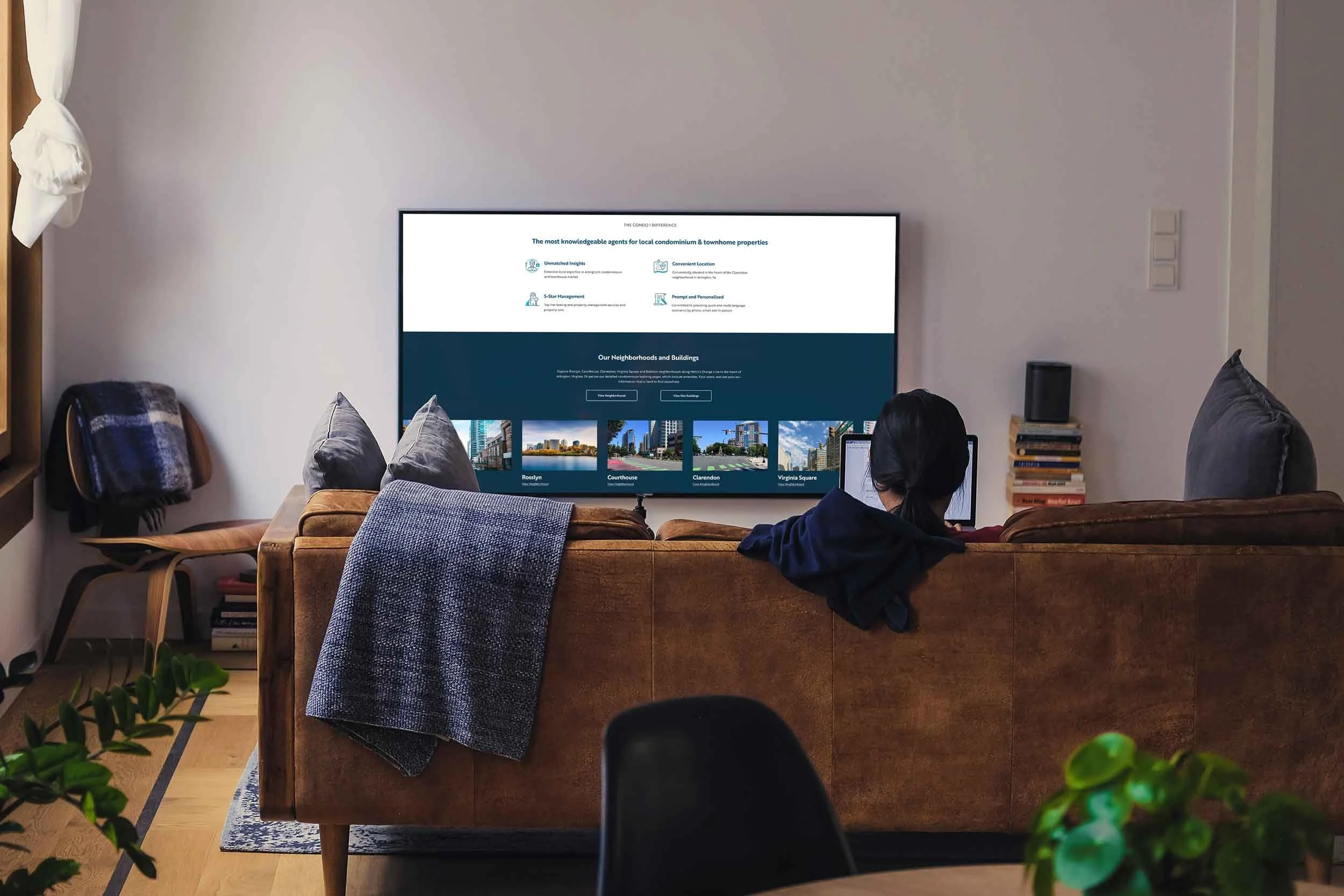
We then sourced and color-customized icons to pair with the written content, making the text blocks easy to scan and understand. Since we’re all so oversaturated and don’t read anymore, we wanted to make the content short and easy to digest by placing visually appealing icons next to the content.
WEB BUILD
We created forty condominium building pages, each with a featured image, neighborhood category and Metro category, address(s), excerpt description, custom link, a longer description, amenities list, pet policy, contact info, CTA button, floor plan gallery with captions, and properties listings. The most unique feature of the Condo 1 site is the detailed information on buildings, floorplans and listings for each building—this info is very hard to find elsewhere, and they are proud to showcase it.
Since Condo 1 specializes in a very defined area, we built out Arlington neighborhood pages to highlight its areas of service and expertise—a huge differentiator from other real estate companies. We created a custom Google Map and embedded it into the neighborhood page, which includes pins for the Condo 1 office, the five Arlington neighborhoods, Condo 1’s buildings and townhomes, and the Orange/Silver line metros. This powerful map search tool visually showcases where they work and is interactive!
Another custom feature of the website is the secondary navigation with helpful contact info and quick links to the owner and tenant portals. Other main pages include property management, AppFolio software, FAQs, tenant, condo selling and buying, team, review, and contact. The site footer includes a newsletter sign-up for Condo 1’s monthly Insider Report, all the navigation page links (including legal policies), and Buying Buddy’s disclaimer.
BUYING BUDDY IDX SEARCH
Condo 1 was using Showcase for IDX and CRM on their old WordPress website, but Showcase only provides widgets for WordPress, and because we build websites on the Squarespace platform, we had to find a new solution. Buying Buddy is an IDX and CRM plugin that provides custom widget code for any platform that can embed code.
We researched the software, asked other web designers, and called Paul Eastwood, the head of Buying Buddy, to ensure that the widgets could create Condo 1's desired functionalities.
Like any CRM software, Buying Buddy has a learning curve. Thankfully, it’s helpful knowledge base of tutorials could assist with the multi-step setup. We completed the installation by generating the Google Map API key, adding code, adding the foundation pages, requesting the staging domain, customizing the widget theme to match the site, and getting Bright MLS approved.
We tested the widgets using varied criteria, including ‘for sale,’ ‘for rent,’ ‘coming soon,’ and ‘under contract,’ Arlington, VA location, until we got the desired output. We drew a defined area around each building and neighborhood to ensure it was pulling the correct data.
The contact form feeds into Buyin Buddy’s CRM, an effective marketing and communication tool for leads.
The next step for the Condo 1 team is to set up the CRM and use it!
GOOGLE ADS
We’re thrilled the new website is live. The Google Ads will link to a beautifully designed website with best-in-class navigation, helpful content, clear services and benefits and effective calls to action.
Before & After
Move handle left (after) to right (before).
Before
After


