The Design Powers Blog
Insights on visual branding, web design, and marketing that build online authority—plus personal perspectives.
Posts by Category
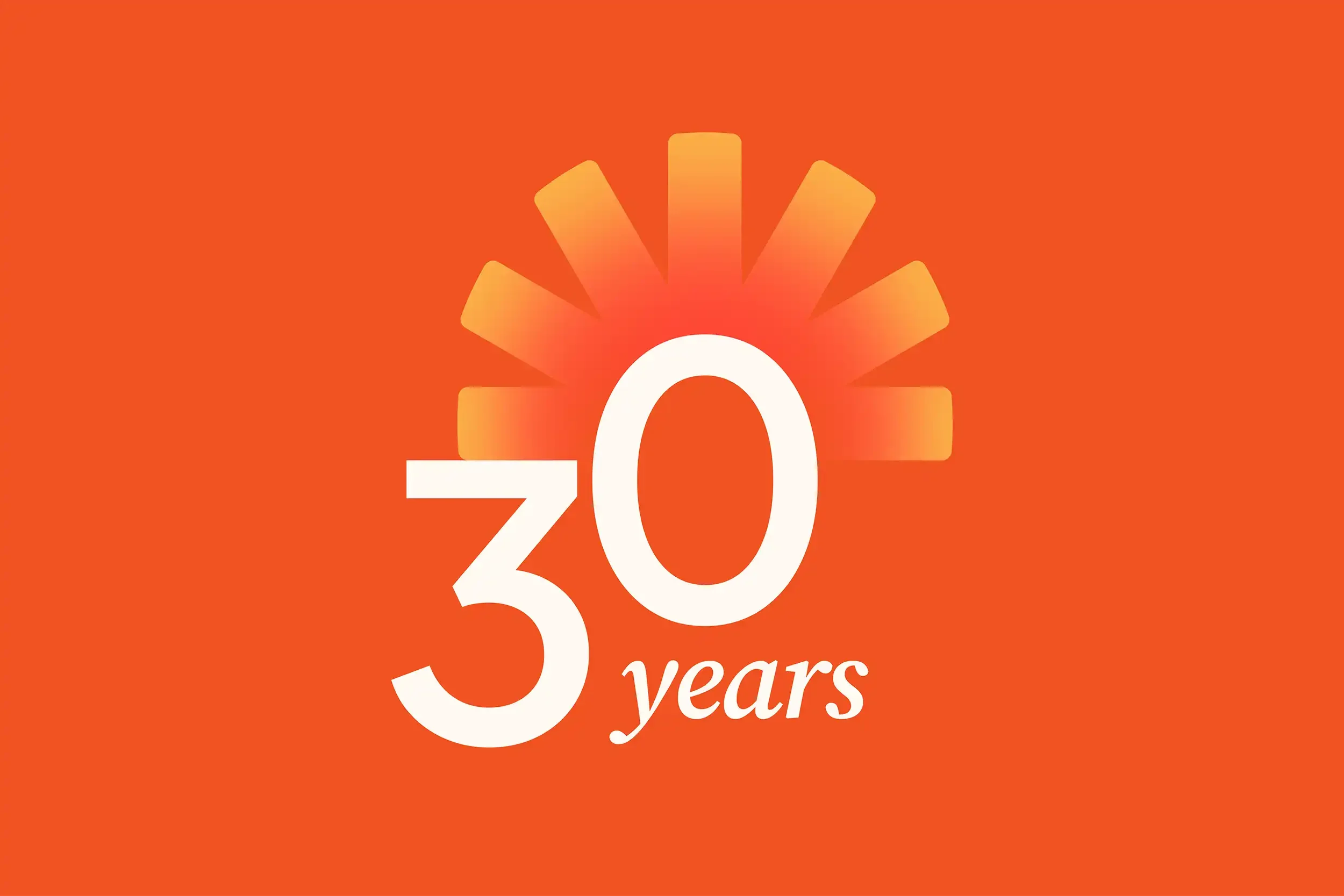
Milestone Branding: Why Anniversary Logos are a Smart Marketing Investment
An anniversary logo is more than a badge. When used strategically, it becomes a year-long storytelling and marketing tool that builds trust, credibility, and excitement around your brand.
DIY vs Professional Web Design: What’s Best for Building Your Small Business Website in 2026?
This guide breaks down the pros and cons of DIY and hiring a web professional. Read the post for information you need to consider to make an informed decision about which option is best for your business.

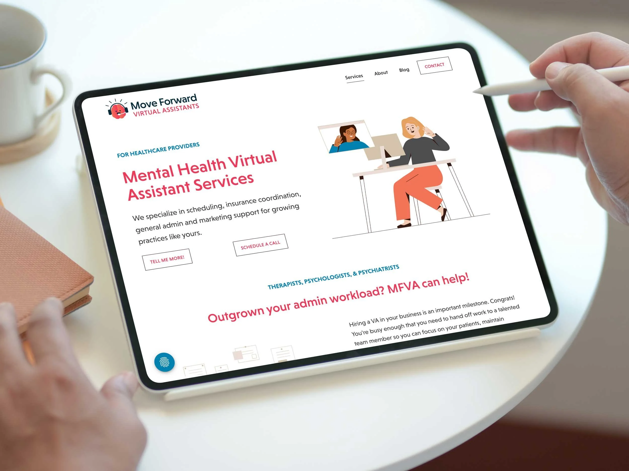
The Ultimate Guide to Planning a Professional Brand Photoshoot
In this behind-the-scenes guide, we share how we planned and carried out a custom photoshoot for Expand Psychology, from building a shot list and photo guide to staging therapy sessions with stand-ins. Discover how thoughtful preparation and flexibility can transform a busy day into a library of authentic images that strengthen your website and branded collateral materials for years to come.
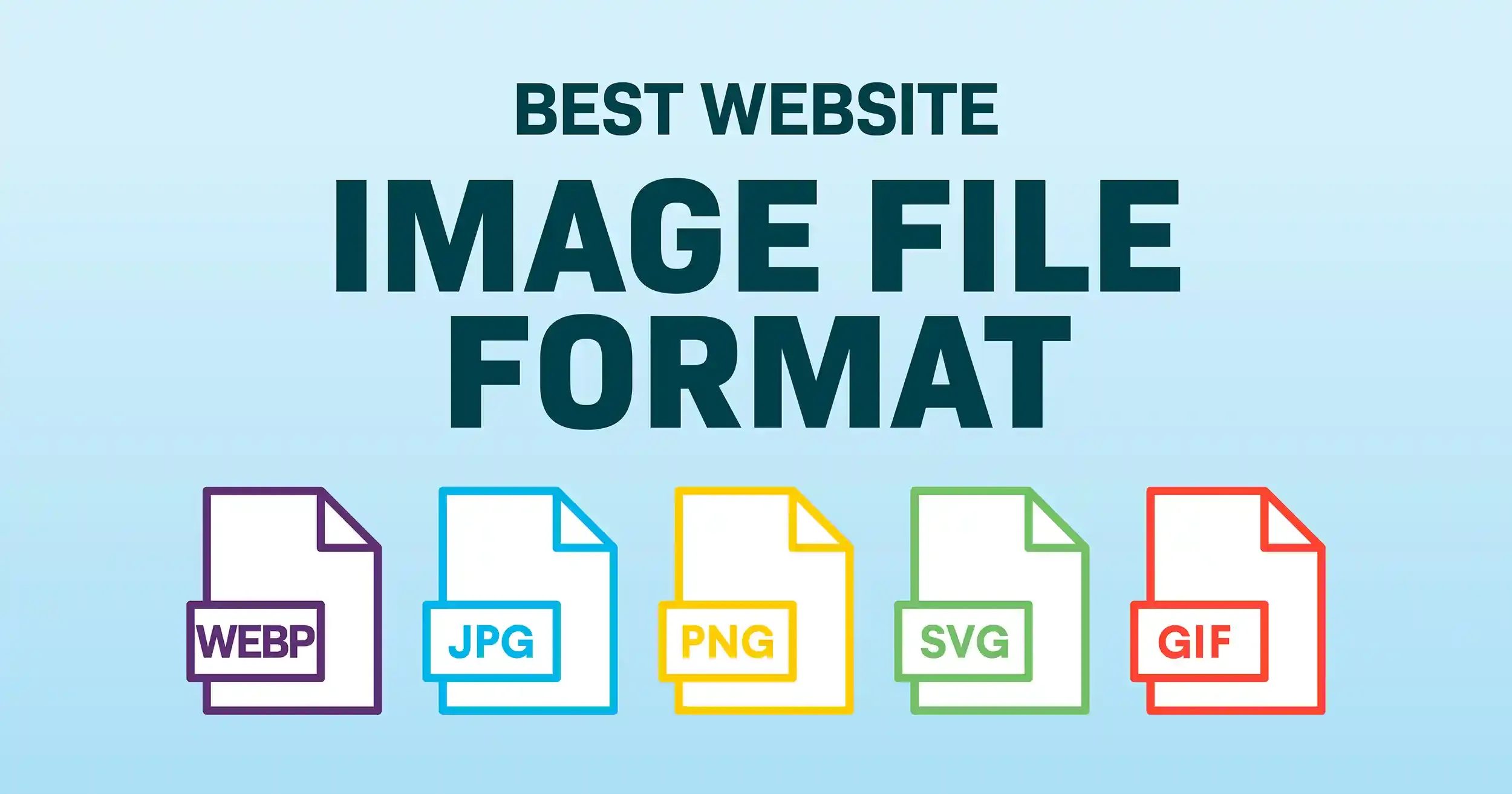
How to Choose the Best Image File Format for Your Website
Choosing the right image file format—WebP, JPEG, PNG, SVG, or GIF—ensures your website looks sharp, loads quickly, and provides a positive user experience. Learn about image file formats and how to optimize images to boost site performance and SEO while keeping visuals crisp across all devices.

What Makes a Great Website in 2025? The Do’s and Don’ts
You can do plenty to refresh your existing website and improve its user interaction. Learn our DO’s and DONT's for rebranding, restructuring, and revitalizing the tools you already have in your arsenal!

Branded Merch in B2B: Smart Strategy or Outdated Play?
Most branded merch ends up in a landfill, but it doesn’t have to be that way. Branded merch can delight, deepen client relationships, and reflect the quality of your brand. In this post, we share clever, sustainable ideas that get noticed, along with real-life gift stories. Ditch the boring swag and give your brand a glow-up.

Legal Policies for Websites (USA)
Website owners should carefully consider the personal information that their site collects, processes, and uses. Establish website legal policies to prevent privacy-related fines and lawsuits, protect users, and provide peace of mind (for both you and your users). This guide covers U.S. data privacy laws, what you need to know, and why.

How to Trademark Your Business Name and Logo Design
Your business name and logo aren’t just branding! They’re valuable intellectual property that represent your identity, values, and reputation. In this post, we’re diving into the essentials of trademarking, answering real questions from our community to help you protect what you’ve built.

Your Google Business Profile Got Disabled or Suspended. Now What?
A suspended Google Business Profile (GBP) can cause problems for your business. Learn what we did when our GBP was suspended and the strategies to take if that happened to your business.

WordPress vs Squarespace: How to Know Which One is Right For Your Business
There’s a core element to your website: the platform you build it with. What’s better—WordPress or Squarespace? The answer depends on what you need your website to do. Read our pros and cons to both website building platforms.

9 Tips to Prepare For a Fashion Photo Shoot
Evelyn had the opportunity to do a 40 Over 40 Fashion Photoshoot. Her first thought was, "NO WAY," but she reconsidered. Read about her motivations, preparation and trepidation! Plus, tips for getting ready to do your fashion shoot!
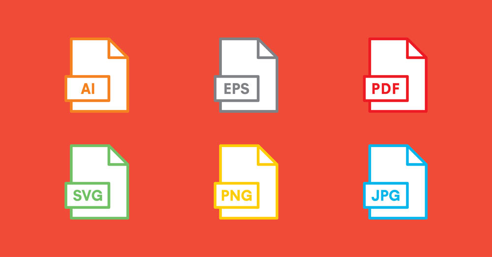
How to Choose the Right Logo File Format...Finally!
A guide to vector vs. raster graphics and logo file formats: what they mean, who needs them, where they should be used and why. Download our free Quick Guide to Logo File Formats PDF!

25 Questions to Ask Your Website Designer Before Hiring
Are you about to hire a web design firm? STOP and read this updated blog post about what to ask before hiring them. Many people have thanked us for this information, and some have even hired us after reading it. Get the confidence you need to move forward to fulfill your website needs.

Why a Good Logo Is Important For Your Small Business
Your logo is the visual foundation of your brand identity. Learn why it's important, what makes it good, and how to create one to empower your small business.
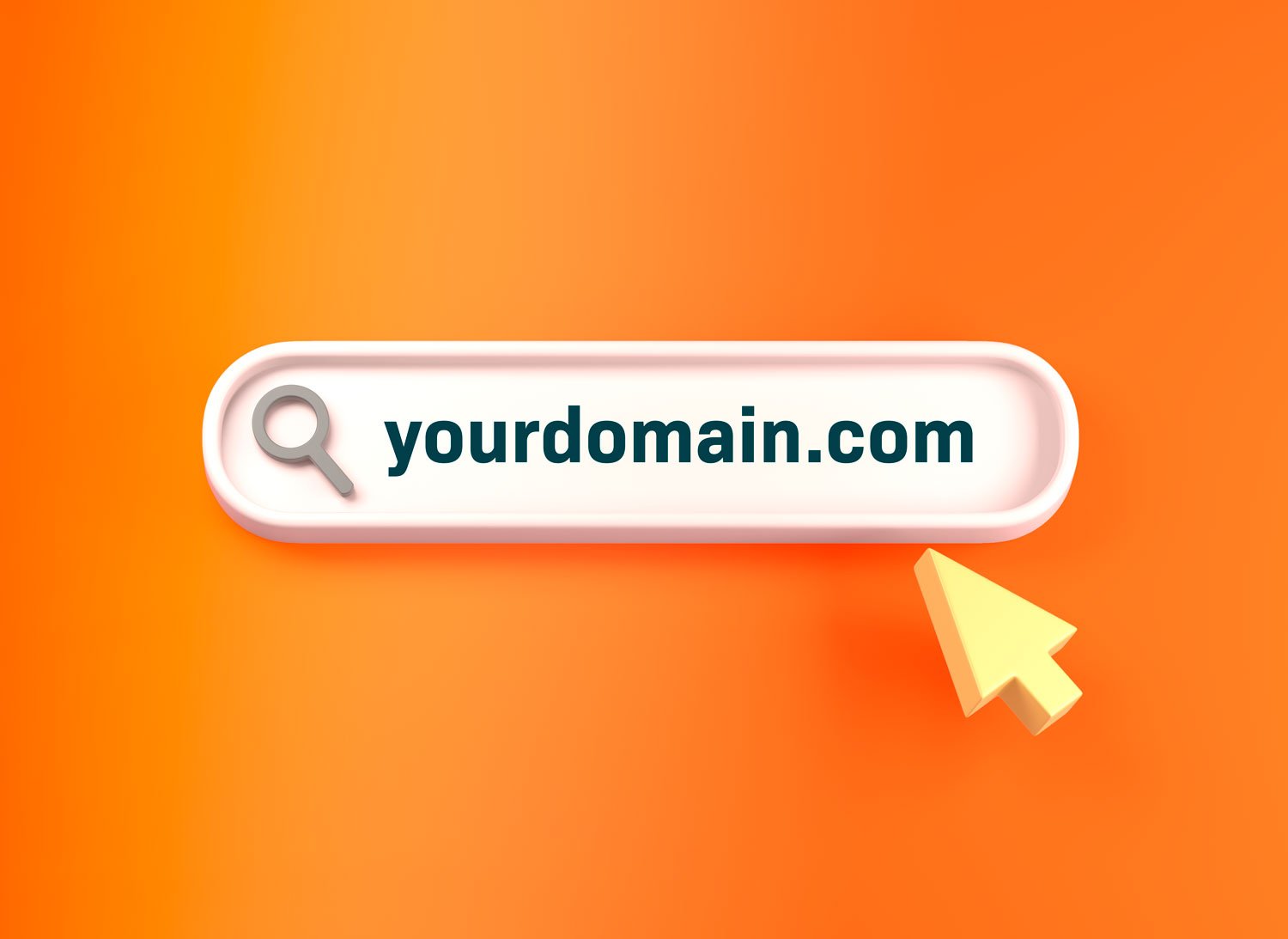
Understanding the Differences Between Domain Names, Registration, Hosting, Transfer and Connection
Learn how domain names and websites work together. Understand the differences between domain registration vs. hosting and transfer vs. connection. Learn about DNS records and read domain name FAQs.

How to Get Online Reviews and the 9 Reasons Why They're Important
In the age of the internet, we no longer have gatekeepers deciding what information we have access to. Nowadays, when selecting a service or a product, we’re more sophisticated and have more requirements and options. Learn more about how you can get more positive reviews for your business and why they're imperative for your online reputation and bottom line!

How We Discovered Our Signature Styles and Colors With House of Colour!
Read about our recent Design Powers team style session and color analysis with Melany Carlos from House of Colour!

7 Helpful Website Features in 2024: Elements For an Effective Business Website
When browsing a website, people need easy navigation, attractive design, and relevant content. Make these 7 helpful features a priority to increase your web traffic and create a great user experience.
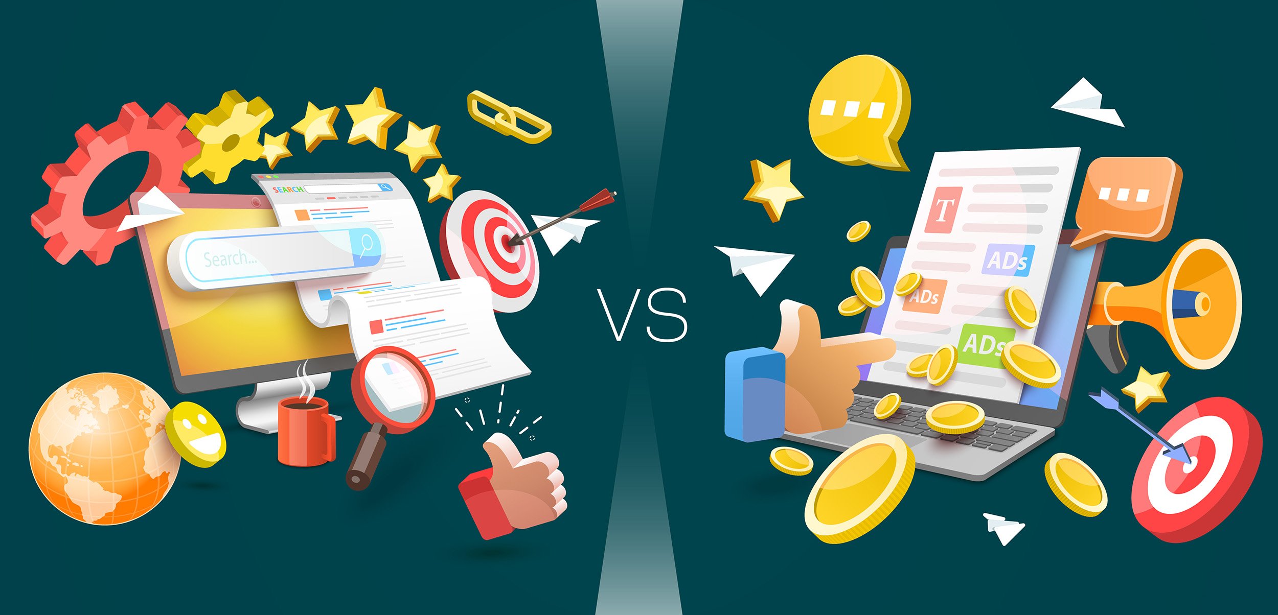
Organic vs Paid Search: A Guide to Understanding the Differences
Paid vs. Organic are the two ways to get traffic to your website on search engine results pages (SERPs). Each method involves different strategies, costs, and considerations.

5 Critical Elements for Optimizing Your A&E Firm’s Website Design
Elevate your A&E firm's online presence and establish a strong foundation for business growth by incorporating professional brand strategy, writing, photography, brand identity and web design into your site to achieve results.

How to Set Up Your Google Business Profile
Google Business Profile (GBP) is the best tool for businesses to manage their online presence across Google Search and Maps. Learn how to optimize your profile to build trust and boost website visits. Download our free GBP 20-page PDF with an interactive quick review checklist, bookmarks, and helpful links!

Your Professional Service Business Needs a Good Website. Why It’s Time to Rebrand.
Thinking it may be time to rebrand your company’s website? Not sure that it’s worth the investment of time and money? In this blog post, we explain: 3 reasons why your business might not have a website, 5 signs that are signaling your current website is outdated, and the top 7 benefits of having a well-designed website.

How a Successful Website Rebrand is a Second Chance at Happiness!
Learn the Top 7 Essential Steps to Establishing a Successful Web Design Relationship and how to maintain a long-term, profitable partnership once your website goes live!
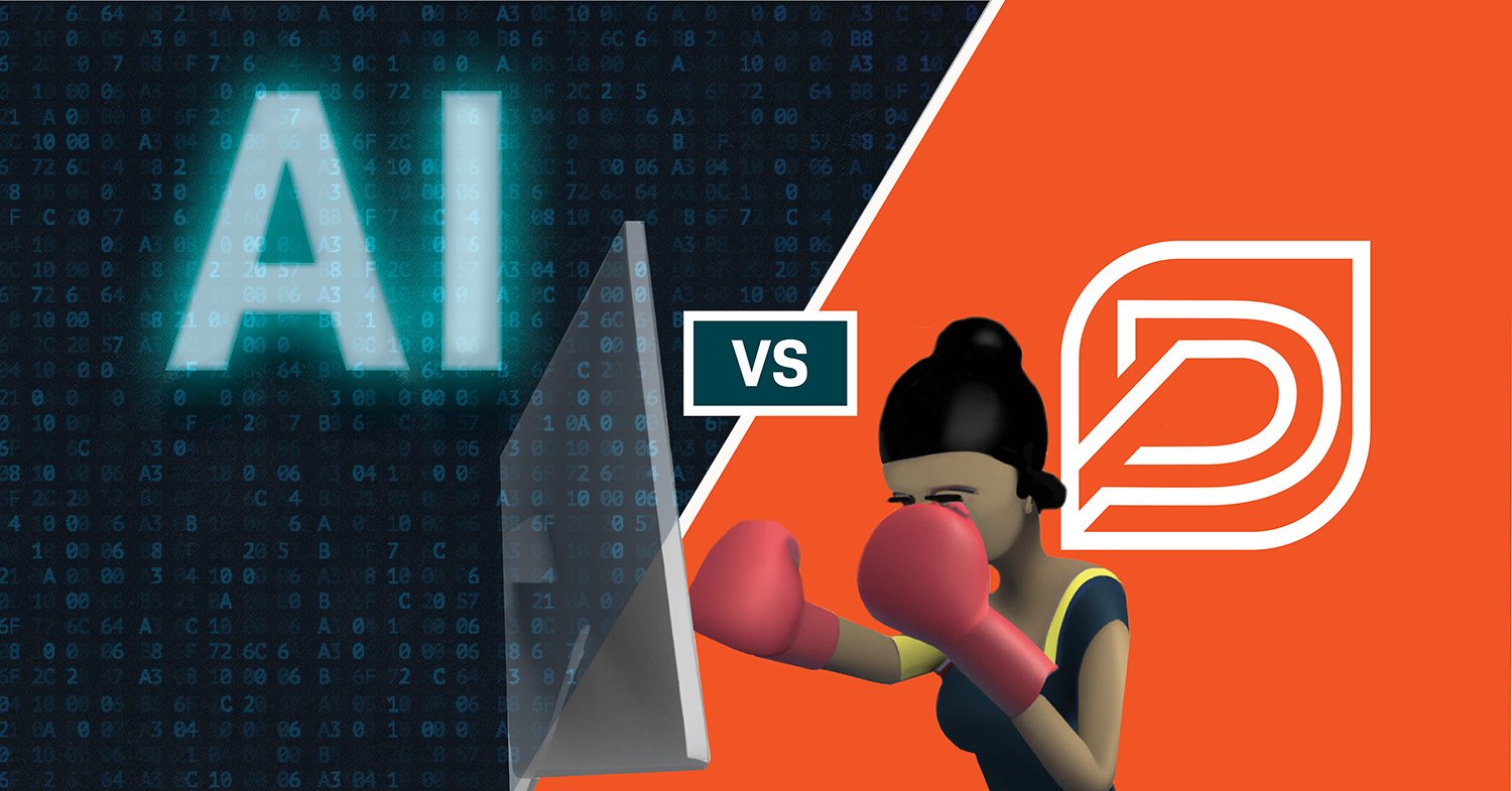
Can AI Create a Logo as Good as a Professional Graphic Designer?
With all the buzz about Artificial Intelligence (AI), we wanted to see what it could produce using a recent client creative brief for a logo design we just completed. Read our blog post to find out the results!

How Traveling Benefits Your Business
Traveling is an important part of life, especially if you own a business. Evelyn highlights 9 surprising reasons why every entrepreneur should travel and how they directly correlate to success in business!

Why We Recommend Squarespace For Small Business Owners
Squarespace is often the perfect solution for small business websites and online stores with limited product lines but it isn’t for every business. Here’s why we recommend Squarespace and why it may be the right platform for you.
5 Things Your Logo Should Say About Your Business
A well-designed logo isn’t the only indicator of a successful business, but a thoughtful, eye-catching logo design will help you establish yourself as a reputable brand in a competitive space.

7 Reasons Why Every Small Business Needs a Website!
Websites are essential to growing your business. We help small businesses create their online presence and functionalities to streamline and improve processes. We recommend you create a website or upgrade your website if it’s outdated. Read the 7 reasons why every small business needs a website.

Are You Ready to Rebrand? We Did! (Part Three)
We rebranded our content messaging, logo and web design and website. This covers our process and all the things leading up to it.

Are You Ready to Rebrand? We Did! (Part Two)
Personal branding photography and what you can expect when you hire a professional fashion stylist, brand photographer, hair stylist and makeup artist.

Are You Ready to Rebrand? We Did! (Part One)
Read the blog post to learn about Design Powers' rebranding strategy including redesigning our interior home office space!

Does Your Website Discriminate? Ours Does.
Web accessibility is making the internet accessible to ALL kinds of people. Learn about the huge impact and benefits of making your small business website accessible. Design your site with a focus on equity, accessibility and inclusion.

URL Structure: Best Practices for SEO-Friendly URLs
12 SEO best practices for URLs. URLs are the building blocks of your website. Learn how to optimize your URLs to increase your website traffic, appear more trustworthy, and make your links easier to share!

We Won the 2020 Best Home-Based Business of the Year Award
Design Powers won the 2020 Best Home-Based Business Award from Arlington Chamber of Commerce. We wouldn't be here without our wonderful clients and colleagues. Thank you.

How to Get Your SEO Started In 5 Easy Steps
Increase your small business website search engine ranking with these 5 basic SEO tips.

Everything You Need to Know About Organic SEO
Learn what it takes to improve your organic SEO. Want to know more about SEO & how to get to the top of Google? Find out now.

How I Pivoted From Graphic Design to Web Design
Pivoting from one career to another is never straightforward. Many classes, software, platforms, and mentors have helped me along the way, but I always kept the same goal in mind: to monetize my web design skills enough to build a sustainable business.

How To Make Your Website More Visible On Google
Your website is your 24/7 salesperson - it should be doing the selling for you. How do you get people on your website? Improve your visibility on Google.
Redesigning the Arlington Chamber of Commerce Logo
The Arlington Chamber of Commerce, a non-profit organization started in 1924, selected Design Powers to redesign their logo. This case study will give you an insight into the logo design process and what to expect when you hire a professional designer to create a lasting mark.