The Hidden Narrative
COACHING
Brand Identity / Website Design & Development
OVERVIEW
Alison Carroll provides coaching services for senior executives and military leaders transitioning to civilian life and supports high performers in work and life transitions. Through deep conversations and sustainable approaches, she helps people navigate their challenges as a trusted confidant, resource, and thought partner.
She founded her coaching business in 2012, rebranded in 2018, and was ready to pivot again with targeted messaging and a sophisticated visual brand that clearly expressed her holistic and bespoke coaching. She’d offer more to senior professional clients, increase her rates to align with her expertise, and associate her brand with an enduring value proposition.
We created a professional brand identity that looks and feels upscale to enhance Alison’s credibility and build trust in her ideal clients.
First, we reviewed her current digital presence and site and developed a new site plan for the assets we had in hand and what we needed to create.
Before we started designing, brand and copywriter Michelle Mercurio worked directly with Alison to clarify her brand identity and write strong on-page content that tells her story and connects with her audience. We suggested getting client testimonials to establish her reputation and provide social proof of her online services.
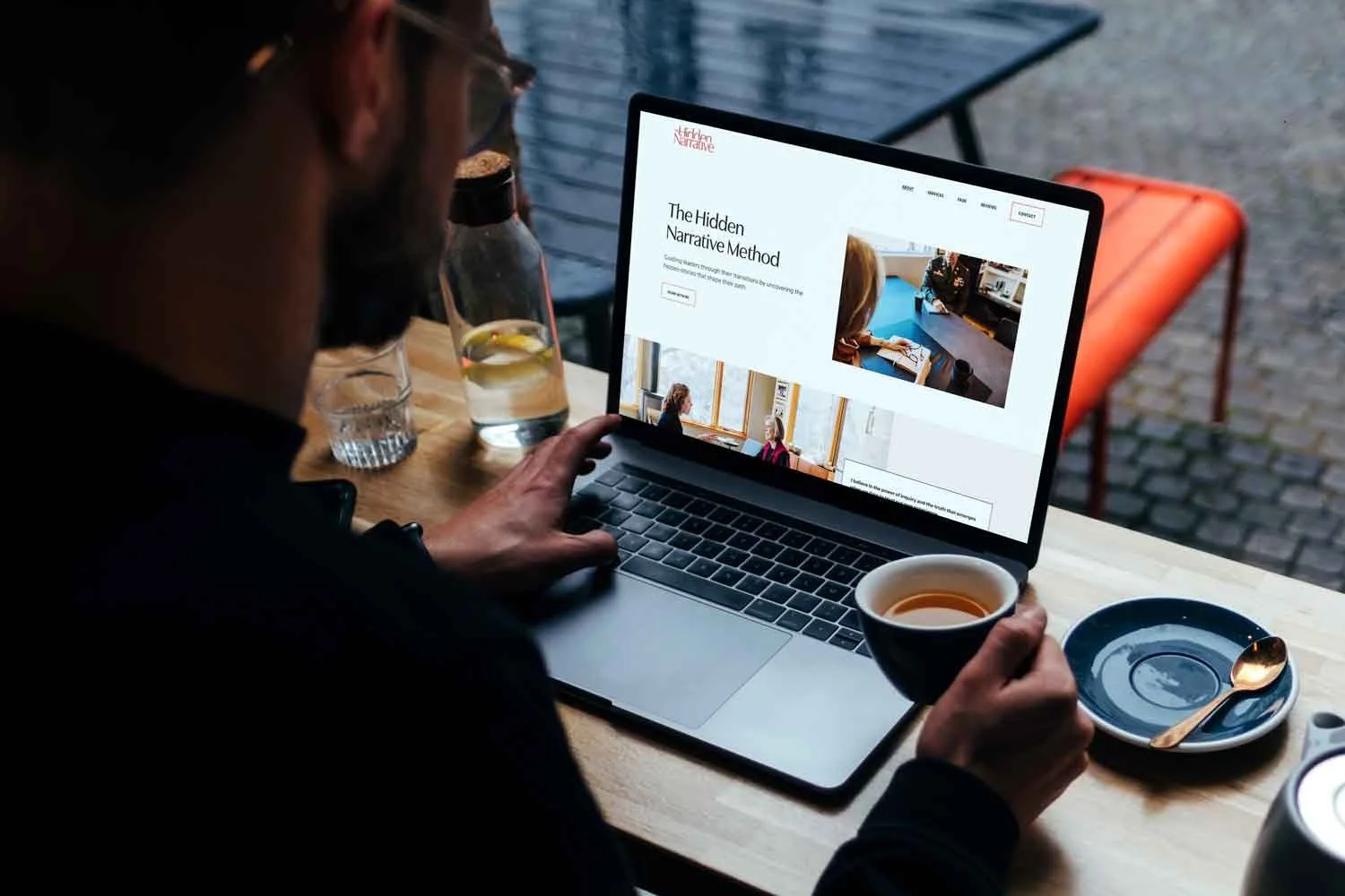
Next was custom brand photography by Julie Monticello, a local professional photographer. Evelyn created a photo guidebook, advised Alison to have clients in the images, gave wardrobe feedback, and attended the photoshoot to assist in the overall shot direction. Post-shoot, we did minor image touch-ups and editing and optimized the images for the web.
We designed an elegant typographic logo that visually hides the word “hidden” behind the word “narrative” in the business name. The” is deemphasized in all-caps letters in brown color and tucked above the “N” in a smaller point size. “Hidden” and “Narrative” are set in title case in fiery rich clay colors that sync with the brand photography, with letters kerned closely and linked in a tight lockup.
Its sophisticated tone of voice and chic style look premium and tailored, like her services, accentuating the key aspect of her coaching business: the hidden narrative coaching method.
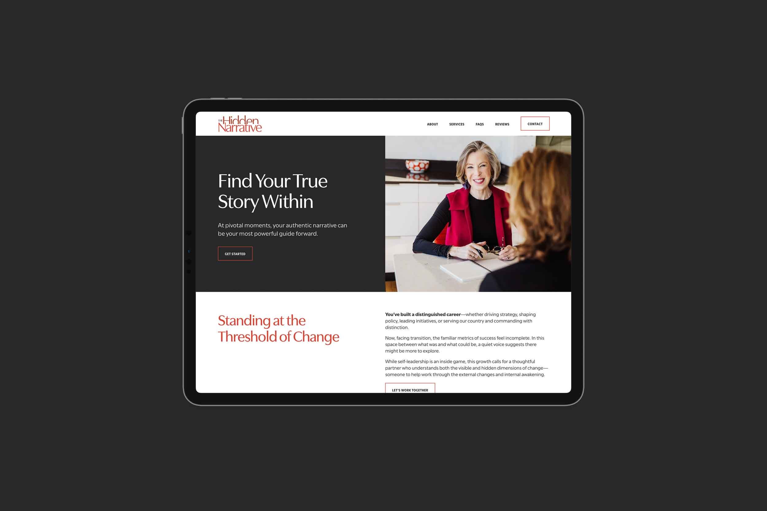
The logo icon is an HN that mirrors the full wordmark used for the website's browser tab icon. The website features six main pages: home, about, services, FAQs, reviews, and contact. Additional pages include legal pages, a custom 404 page, and a visual style guide.
The website layout is clean and readable. It showcases compelling content and photography effortlessly, guiding users to click the call-to-action buttons. The headings are punchy and pull readers into the copy. Using bold at the beginning of paragraphs makes the text stand out and attracts the reader visually to those parts.
Boxes and linear elements create structure, layers, and a visually appealing layout that subtly symbolizes depth and complexity. Hidden scrolling elements provide visual interest and intrigue as they scroll by, symbolizing movement and change. Big words grab attention and mesh seamlessly into sections, continuing the layered or hidden concept. As a user scrolls down the page, nuanced scroll effects occur: text blocks reveal and photos stick, visually communicating that “hidden stories” will emerge during coaching sessions. Alison will be your guide to work through change together.
The refined color palette mixes light and dark: white, off-white, a neutral tint of brown, bright and dark terra cotta, charcoal gray, and dark chocolate brown. The colors, paired with the brand typography, an elegantly flared sans serif type family suited for superb legibility and optical balance, produce a modern, warm, and polished feeling.
We redirected old links, connected the domain, embedded the third-party scheduler, set up website legal policies, wrote alt text, created a mailing list, and formatted the site for desktop, tablet and mobile. In addition to the site design and build, we made a Google Business Profile and wrote SEO page titles and descriptions to help with local SEO.
The branding is luxurious and functional. The site is easy to navigate, speaks clearly to its target audience, and motivates them to take action. The rebrand has created a fresh foundation for Alison to market her services confidently and showcase the investment in her coaching process.
Before & After
Move handle left (after) to right (before).
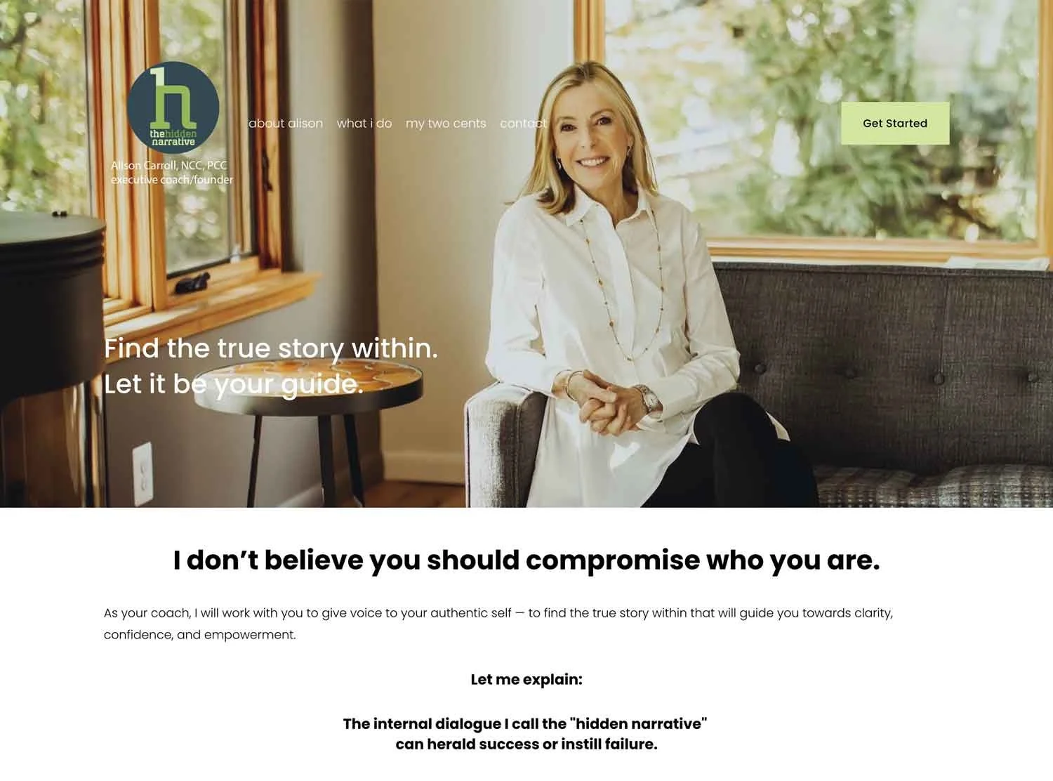
Before
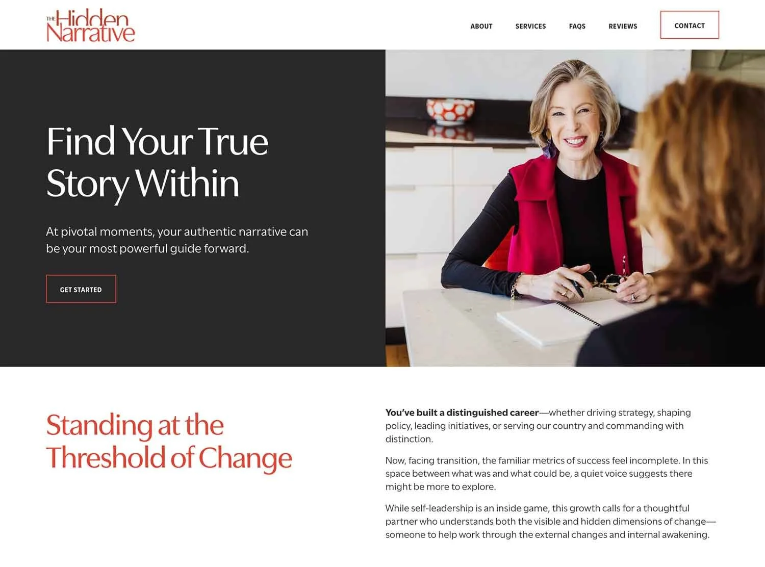
After