Damato Search Group
LEGAL RECRUITMENT
Brand Messaging and Identity / Website Design & Development
Damato Search Group
Damato is a boutique legal recruiting agency that provides strategic career advice and facilitates attorney moves to top US law firms in New York, California, Washington, DC, and Boston.
Damato’s founder and CEO, Stephen Damato, had been in business for a few years and was ready to rebrand the company with a new logo and website to position it as the trusted expert in legal recruiting for Biglaw attorneys and law firms.
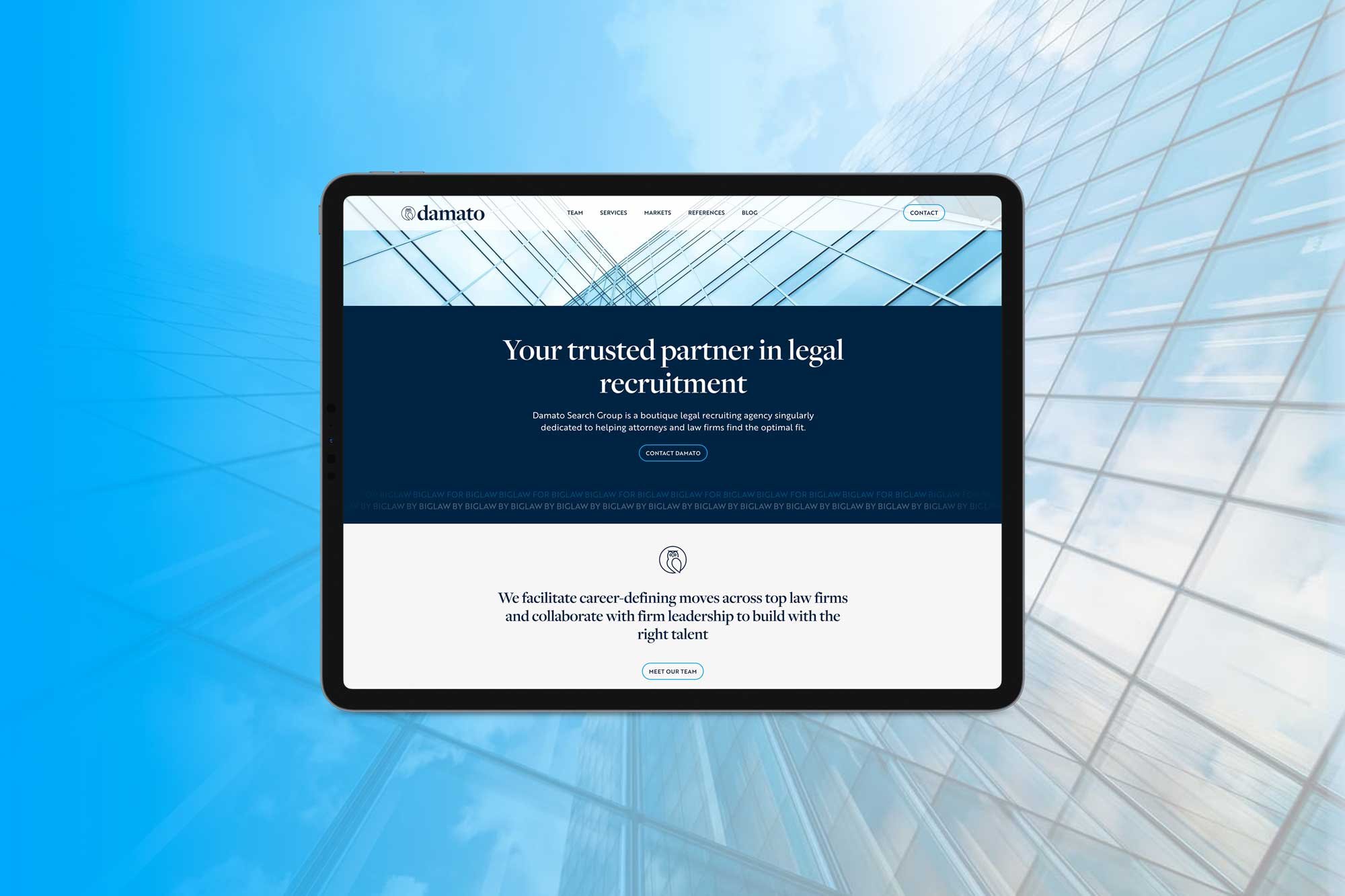
We created a professional brand identity and site that looks high-level, contemporary, and likable. This illustrates their commitment to modernizing the legal recruiting landscape while maintaining the traditional disposition lawyers expect.
STRATEGY AND CONTENT WRITING
Because their audience naturally referred to the company as “Damato” instead of their full name, there was a substantial opportunity to de-emphasize “Search Group” and capitalize on the already established name recognition they were building. This deliberate choice will strengthen their brand name over time—the shorthand of their name is much easier to remember, mention and use.
To promote this name recognition, the main logo in the website's header is the primary logo, which says “Damato,” while the footer logo at the bottom uses the full name. To help with this transition and avoid any confusion, the complete company name is referenced within the on-page copy.
The site’s client-focused content emphasizes the company's values of reliability, consistency, and attention to detail. It was essential to communicate that their foundation is built on authentic relationships and that they deliver results that align with their client's priorities, whether they are law firms looking to hire talent or attorneys considering a career change.
The site's content was bulked up and reorganized. Using our web writing template and site map, we wrote the first draft of the web copy to assist with content structure, keywords, call-to-actions, and page titles and descriptions. Stephen refined the copy using his brand voice, updated team bios and reviews and added additional information about their current services, markets, and steps to get started.
The website highlights the Damato team's legal backgrounds, personal outreach, market knowledge, and familiarity with attorneys' and law firms' needs and expectations. Incorporating these aspects into the brand story demonstrates that they are qualified experts and highly invested in partnering with clients to improve their legal practices and lives.
The reviews (intentionally called references) add social proof and establish trust in the company's online services. The references mention the employee they worked with, which is important in recruiting to give credit where credit is due and as they grow their team to show that they value their employees' client relationships.
The Wise Moves blog name originated to correlate with the owl logo concept and the recruiting aspect of the business. Adding helpful content to the website through blog posts will help increase organic traffic through AEO (answer engine optimization) and SEO (search engine optimization). Keyworded page titles, meta descriptions, and on-page content will further support the company's online presence.
WEB DESIGN AND BUILD
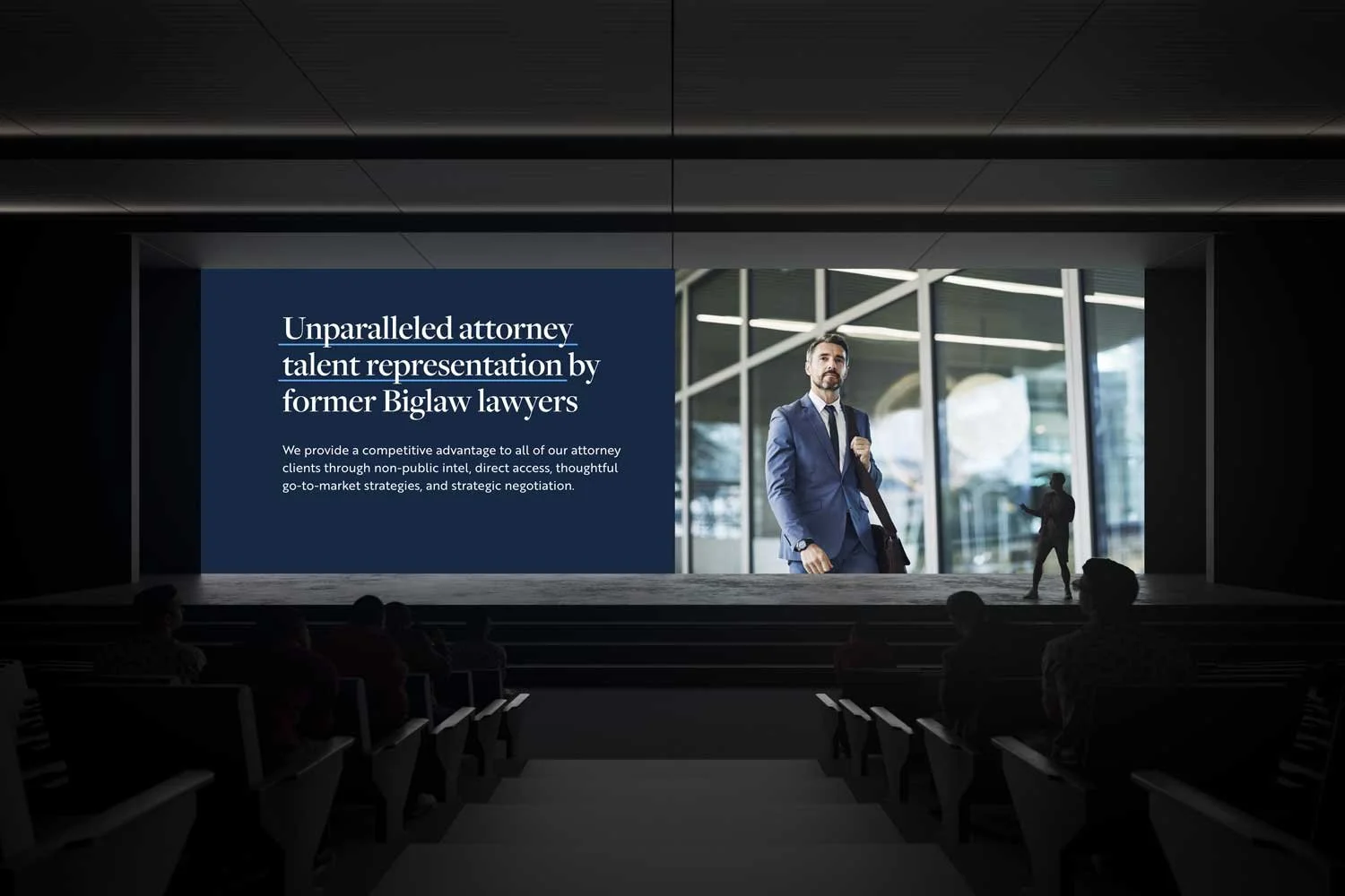
The website has a neat layout with plenty of white space, large background photos, and uncluttered design. The pages are easy to navigate but don’t sacrifice personality.
While the information is dense, the visual elements balance it with airy light blues, gradients, subtle parallax movement as you scroll, and customized, easy-to-process icons at a glance.
The colors, linear elements and intentional stock photography of tall glass building architecture, city-specific locations, and people working or commuting to work create a corporate atmosphere that speaks to lawyers and law firms.
The color palette consists of cool light gray, bright tech blue, medium blue for accessibility, dark navy blue, and almost black for paragraph text. The headlines are set in sentence case for a casual feel, and the paragraph font is a sharp geometric sans serif font that looks excellent on screens and is easy to read in all sizes.
The site is responsive and looks amazing on all devices and screen sizes. It loads fast, is aesthetically pleasing, and guides visitors with clear calls to action and helpful information that encourages engagement.
We formatted blog posts, set up legal policies, added site customizations via CSS, and guided Damato with design direction and strategy. We also set up search and analytics accounts and submitted the site map.
The website design helps the audience comprehend the company's services. The brand and visual design are essential in creating a strong, memorable identity that builds trust, enhances recognition, and communicates the company's value.
LOGO DESIGN
We created a clean, streamlined combination logo mark conveying professionalism and visually elevating the brand. For the wordmark, we used a modern serif font that’s bold and daring and contradictory quiet and unassuming, depending on usage. It has a classic and pragmatic tone of voice that connects with the legal industry's traditionality. At the same time, set in all lowercase letters to convey a sense of friendliness, approachability, and modernity. This mixture of serif and lowercase is appropriate and fits the recruiting industry while eliciting a welcoming, forward-thinking vibe with a personal touch.
The custom owl icon silhouette has a subtle drop-pin wing and two bullseyes perched within a circle branch. It symbolizes search, precision, focus and hitting the mark within the specialized recruiting space. Drawn in a bold, minimal line style and single color, the dynamic icon’s simplicity is highly recognizable, memorable, and scalable across digital and printed marketing collateral. The icon feels sleek, techy, and cool.
The icon works independently and pairs nicely with the company name's primary and full wordmarks, which is a tight lockup with “Search Group” tucked in. Together, the logo elements create an innovative design that feels warm and current, evokes the traits of a legal business, and produces the energy of stability during career transitions.
Before & After
Move handle left (after) to right (before).

Before

After