Byington Steel Treating
HEAT TREATING
Brand Messaging and Identity / Website Design & Development

Byington Steel Treating is a NADCAP-accredited metal heat-treating company in Northern California offering industry-leading quality, capacity, and consistency.
Founded in 1952 by current CEO Sean Byington's grandfather with $100 in his pocket, three generations later, the family business has grown to be the largest heat-treating company in the Bay Area.
Sean originally came to us because we work on the Squarespace platform. Their site was built in WordPress, and he was frustrated with it. Plus, the site was antiquated with old images and content. They wanted a new, modern brand and website that visually communicated their company’s expertise, high-quality products and services. The goal was to create an elevated brand synonymous with quality material processing: a parent brand under which their additional companies could live and be connected.
We evaluated the current website, documented content and page links, and spoke with Sean about website goals. We created a new site map and hired a B2B writer with experience in the manufacturing industry, as many industry-specific terms needed to be technically accurate.
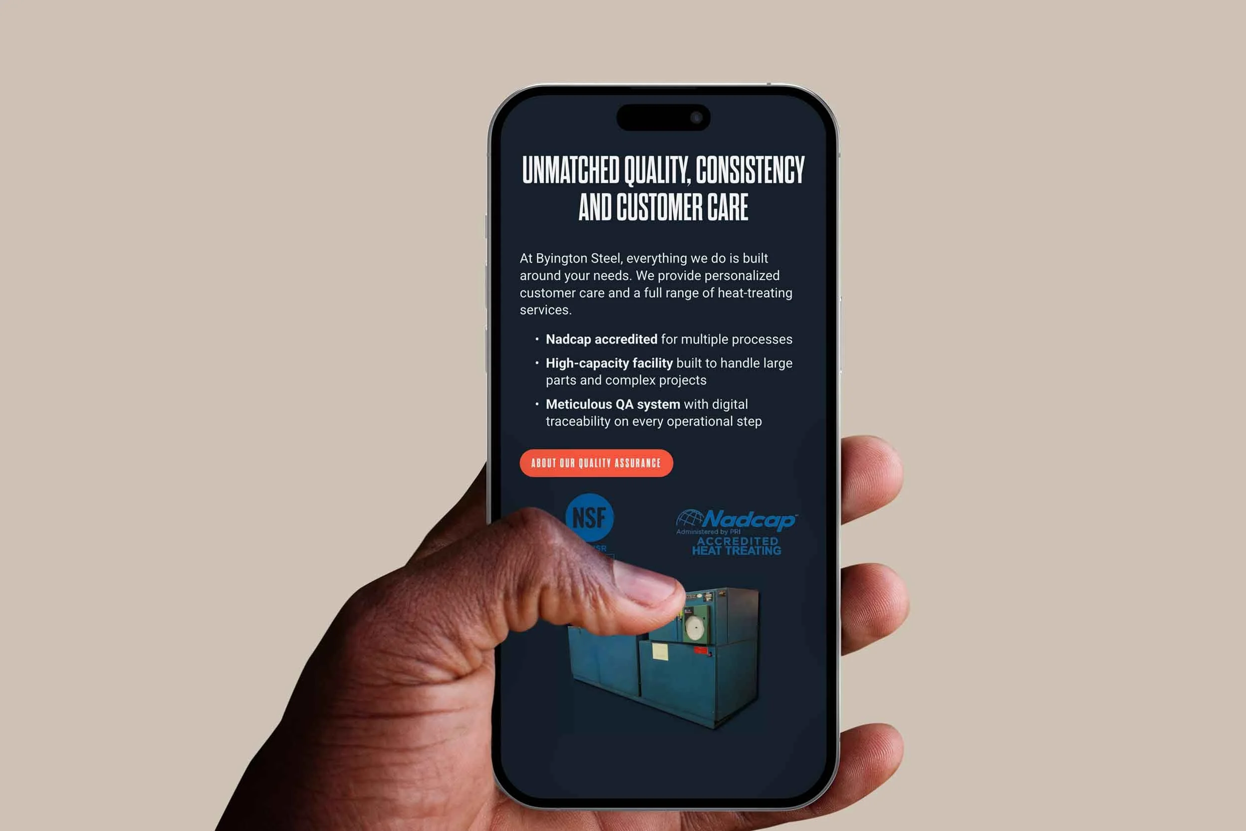
Using our strategic site map and plan, the content writer wrote keyword-rich on-page and off-page content optimized for search. The writer did an excellent job spotlighting the brand story, history, equipment, services, and team bios. We made minor edits as needed, including rewriting and adding a few headlines for clarity and interest.
Sean provided facility and history photos that hugely showcased the area, building, warehouse, and on-site equipment. We needed to use actual photographs because the equipment is highly specialized and supplemented with stock.
We designed custom page headers, prominently displayed their certification and accreditation logos, created custom background section art, customized icons, and redesigned their old and new anniversary logos.
Their new site has a logical primary navigation, looks crisp and professional, has helpful features like FAQs and a glossary page, and, most importantly, consistently has calls to action for people to request quotes.
Their contact information is easy to access, their new forms have anti-spam capabilities (as their old WordPress forms would get spammed in mass daily), and their new legal policies are up-to-date with current data privacy laws, protecting their business from fines and lawsuits.
We implemented URL redirects and analytics, and the site is responsive across desktop, tablet, and mobile.
Their online presence is now upscale, with enhanced brand messaging. They leverage their photography and historical assets to tell a compelling story.
Check out the logo redesign case study that elevates the brand and reinforces its industry expertise and trusted legacy.