KIPOS Botanicals®
KIPOS Botanicals® is a handcrafted herbal skincare brand rooted in Greek heritage and deep botanical knowledge. Founder Konstantina Zaras sought a modernized logo—one that could elevate the brand while preserving the authenticity, tradition, and artisanal essence that define her products.
Our logo and brand identity redesign honors the original spirit of the brand while introducing a stronger, more contemporary visual foundation.
Brand Background
The brand is rooted in Konstantina’s lifelong relationship with herbs, shaped by her Greek heritage and years of botanical experience. It’s built on her commitment to heritage, intentional craftsmanship, and high-quality, plant-based skincare. These values guide the visual identity, resulting in a look that is organic, approachable, and grounded in botanical integrity.
The Challenge
KIPOS Botanicals already had a logo, but its form lacked scalability, clarity, and consistency across applications. As the brand expands digitally and in print, a more refined and modern mark was needed—one that:
Preserves brand recognition
Feels handcrafted, classic and professional
Scales cleanly from packaging labels to social icons
Aligns with the story of the brand
Our Approach
1. Redrawing the Icon: A Modern Calendula
At the heart of the KIPOS Botanicals identity is the calendula flower—a plant celebrated for its soothing, healing properties and a foundational ingredient in many of the brand’s formulations.
To honor this symbolism while elevating the brand, we created a new calendula icon. Key goals for the redesigned icon:
Modernize the form while maintaining botanical authenticity
Improve legibility and balance, especially at small sizes
Strengthen the feeling of joy through thoughtful color application
Ensure versatility for print, packaging, and digital use
The result is a distinctive, contemporary flower mark that feels both artisanal and refined.
2. Refining the Wordmark
In tandem with the new icon, we refreshed the wordmark to create a cohesive, elevated identity. The updated typography:
Offers improved readability, clarity, and a classical skincare feel
Complements the organic shapes of the calendula icon
Conveys warmth, trust, and approachability
Provides a more balanced and intentional structure
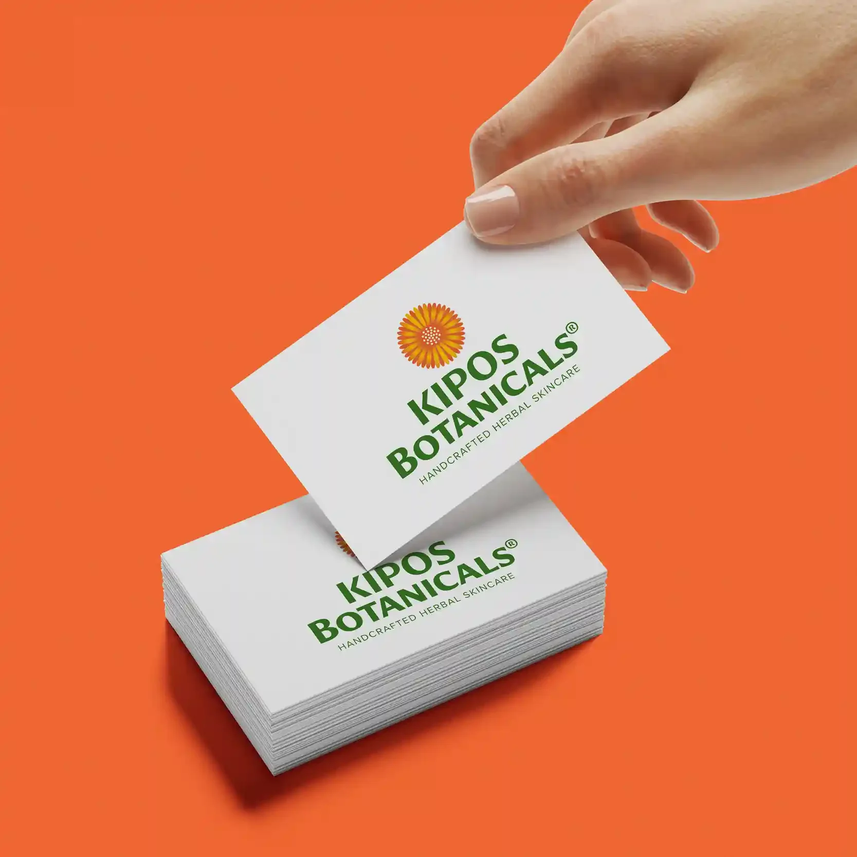
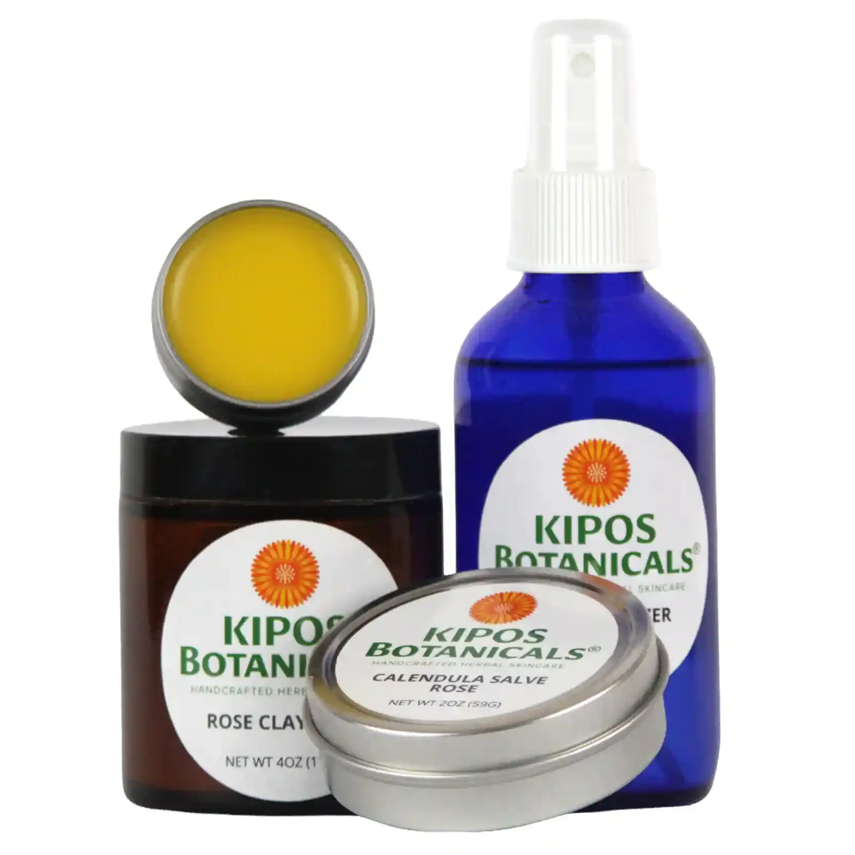
This typographic refinement ensures the logo feels unified and versatile across contexts. We provided the logo in multiple color variations, lockups (stacked, horizontal, with and without the tagline) and file formats.
3. Establishing a Cohesive Visual System
While the focus remained on the logo itself, consistency across brand touchpoints was essential. We aligned supporting elements—such as color, spacing, and typographic hierarchy—with the refreshed mark to build a unified visual experience. These refinements create cohesion without overwhelming the brand’s natural, simple, and handcrafted character.
The Outcome
The redesigned KIPOS Botanicals logo preserves the emotional and visual familiarity of the original while providing the clarity, elegance, and scalability needed for the brand’s next chapter. The new calendula icon captures the essence of authentic herbal healing, while the refined wordmark and supporting elements create a polished, modern identity system.
The result is a logo that feels fresh, rooted in heritage, crafted with care, and ready for growth.