NON-PROFIT
Kitchen of Purpose
Brand Identity and Signage Design
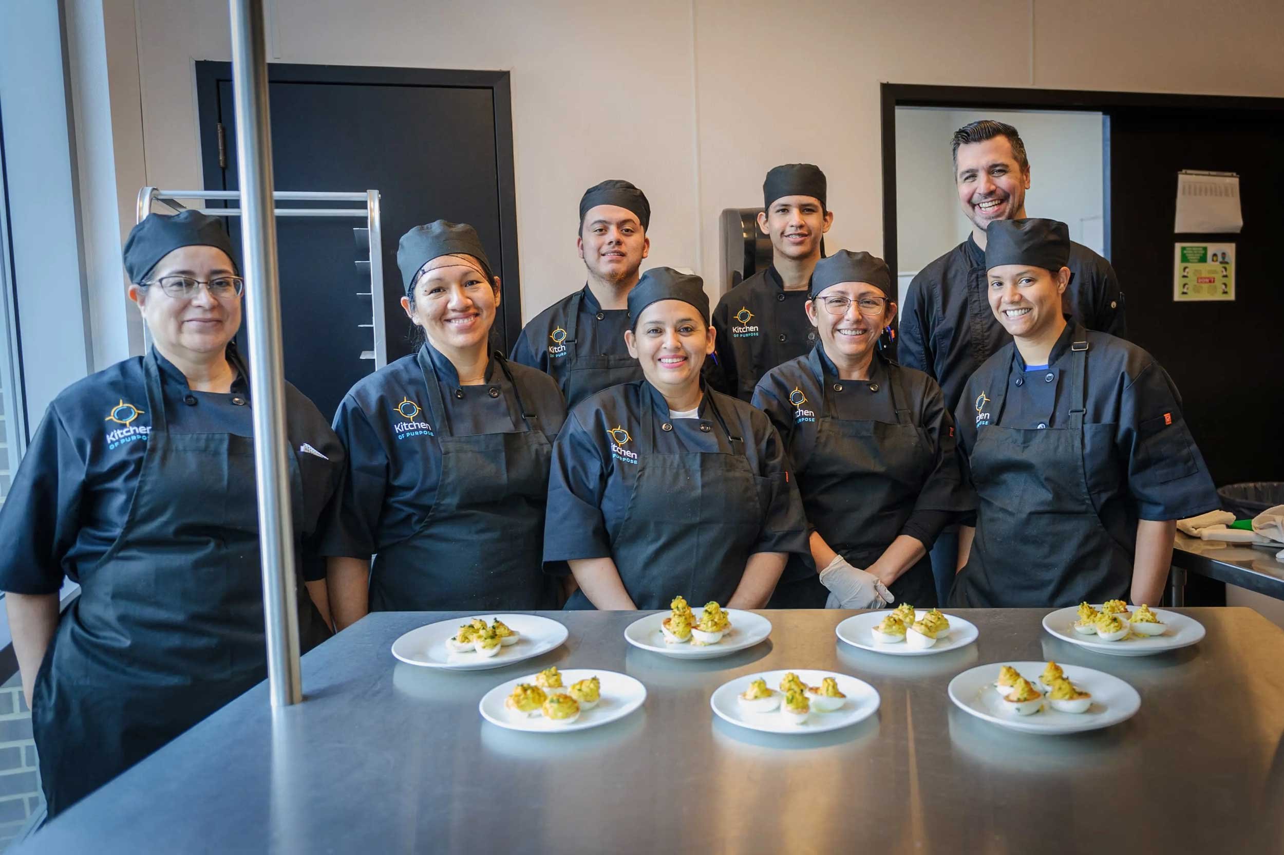
Kitchen of Purpose (formerly La Cocina VA) is a nonprofit organization that empowers unemployed immigrants to be agents of change through food by preparing them for culinary careers and entrepreneurship through educational training programs.
We redesigned their logo and designed brand guidelines, storefront signage, a PowerPoint template, and letterhead.
Logo Design
Kitchen of Purpose (formerly La Cocina VA) has uniquely served the DC metro area since 2014, by empowering women, immigrants, and the underemployed. They connect budding culinary creators and entrepreneurs to meaningful job opportunities, and provide neighbors with access to healthy meals.
The final logo cleanly conveys multiple facets of the organization. The orange outline represents a compass, highlighting how they guide their clientele toward a brighter future. The blue lines in the center represent a plate, communicating service, healthy fare, and the importance of food in bringing people together.
We mocked up varied ways the logo can be applied to the packaged products in their café, uniforms in their culinary school, and finally outdoor signage to attract pedestrians and commuters.
We are excited to continue implementing the rebrand of Kitchen of Purpose and to see all of the ways they positively impact our community!


