ENGINEERING CONSULTANTS
FMC Structural
Structured Content. Custom Photography. Website Design & Development.
Overview
FMC Structural Design Group is a structural design and engineering consulting firm in the Washington, D.C., metro area. They specialize in structural engineering, repair, and restoration services for architects and developers.
The Back Story
FMC Structural’s sister company, FMC & Associates, provides specialty engineering consulting, construction, and third-party testing and inspection services. We worked with FMC & Associates to rebrand their company and build a custom website. After that project launched, FMC Structural decided they needed to build their online presence as well.
They had been using FMC & Associates’ old logo and had been sending potential clients a PDF of their capabilities.
They had many past projects to showcase their vast expertise. They wanted a unique brand and website to communicate and support their services and to establish independent digital marketing efforts.
They were ready to rebrand, build trust, and get higher-quality leads to increase revenue. We were excited to help them do that with their brand identity and website.
Starts With Strategy
We started the project with a strategy session and a kick-off call. We then organized the project management board in Asana to keep everyone on task and meet deadlines.
We outlined all the written content needed to be gathered, edited, and created for the website pages: home page, three main service pages, about, team, 13 staff bios, career, contact, main portfolio page, and 87 portfolio project pages.
Content planning is a massive part of web design, especially when you have a gigantic portfolio of projects to categorize and showcase with straightforward navigation and user experience.
Before we start the design, the brand messaging and page hierarchy structure must be thought through. Site strategy and high-quality content generation are crucial for website SEO, and getting this right helps businesses rank higher in search engine results.
Brand Photoshoot
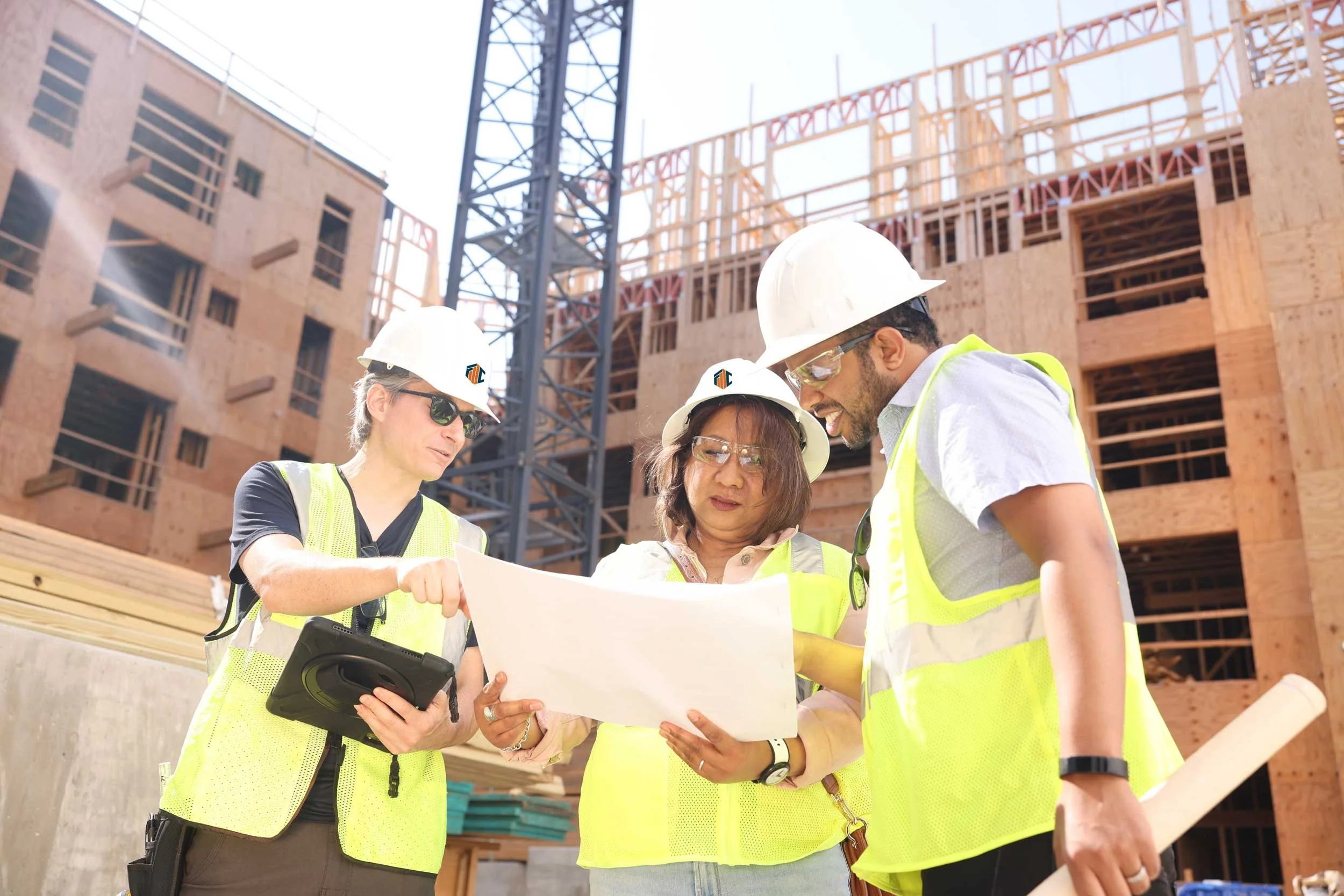
While all the written content was being created and refined, we coordinated a brand photoshoot to get new headshots and team photos of all the employees in their office and on-site at a job location.
To get the best imagery that works well on desktop and mobile devices, we planned and scheduled the shoot, provided a photo shoot guide, and attended the shoot to art direct and assist the photographer, Mike, an employee of FMC Structural.
After the shoot, we compiled everyone’s preferred portraits, selected the images that best showcased the team, edited and retouched them to achieve flawless results, and then optimized all the image files for the website.
Custom imagery makes the business stand out, represents their personality, and showcases who their clients will interact with, which is crucial for B2B consulting firms.
Now FMC Structural has imagery that can be used across all their marketing initiatives, including the Google Business Profile we set up for them!
Logo Design
Their brand identity and logo design needed to complement their sister company while remaining visually distinct to establish themselves as a reputable structural engineering firm in their own right.
They had no previous visual assets except the old sister company logo they borrowed and the new FMC & Associates logo we designed.
Considering this, we designed four FMC monogram logos in a similar minimalistic modern style. The colors were related but denser and more saturated, and the fonts were close but had distinct personalities.
We intentionally designed the logo's core elements to be kindred but not twins. This same design thinking was applied to the website design.
They wanted the monogram to be in 2 colors and to look like a corner city block of high-rise buildings, while keeping the “FMC” letters readable. This logo tells a story, is executed well with illustrative and typographic elements, and will make the company stand out.
It’s professional, reflects the brand’s foundation, speaks to its ideal audience of architects and developers, is modern and up to date, and is recognizable and memorable. It works great across all digital marketing materials thanks to its square lockup, and we created a horizontal layout for the logo to fit the website header proportionally.
Web Design and Build
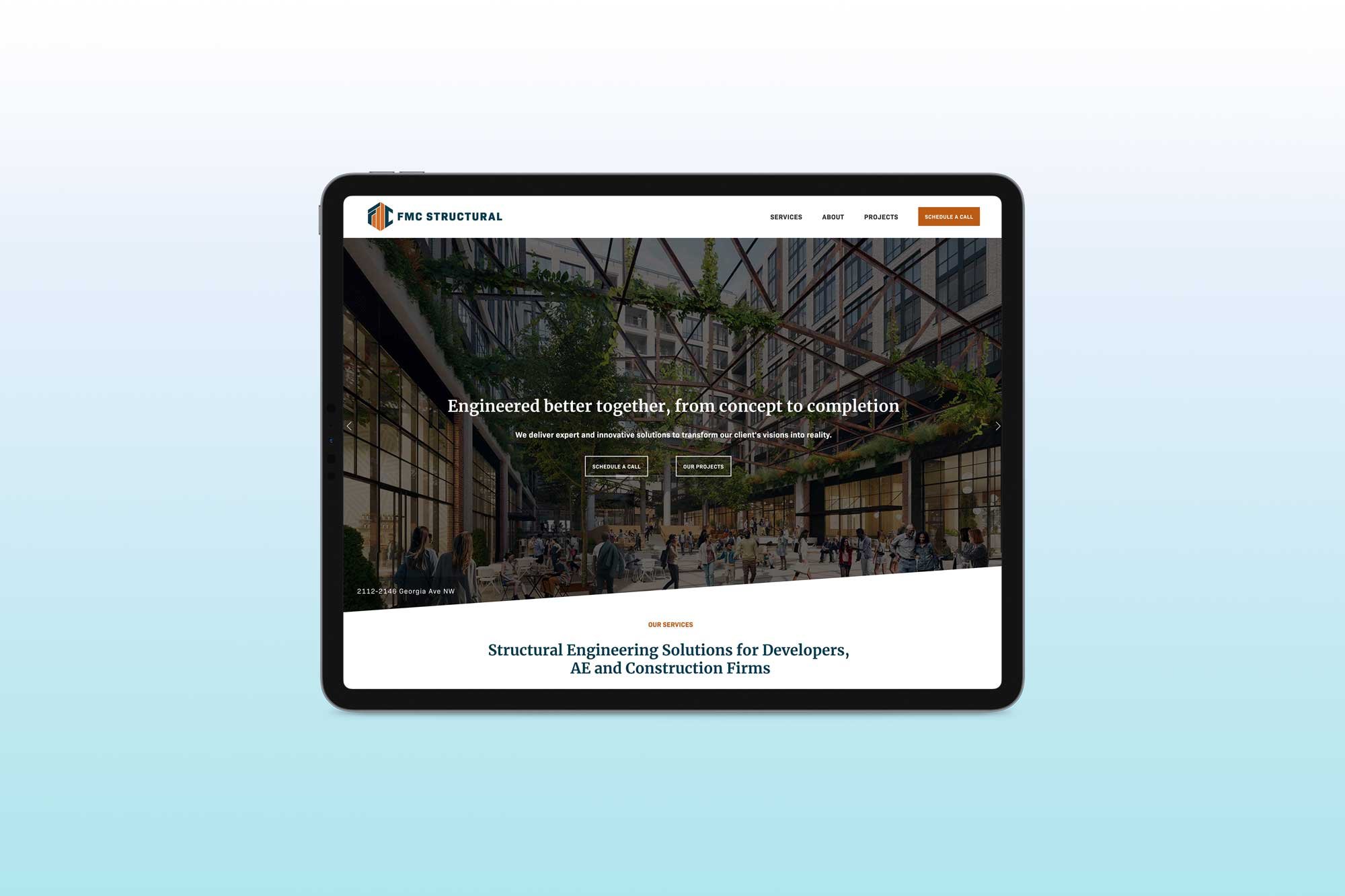
Once the writing and photography were completed, we designed multiple mockups with custom-branded elements, including colors, fonts, gradients and graphic icons.
After the design was approved, we built an easy-to-navigate, professional website that clearly explains FMC Structural’s services, highlights their fantastic portfolio of high-profile buildings and sites, and showcases their expert team.
Their site is designed to attract A&E firms and developers needing structural engineering services in the DC area.
Over time, their site will gain authority through organic content creation on their blog (forthcoming). They can grow their leads using the contact form and their email lists using the newsletter form. When ready, they can quickly launch email marketing campaigns.
The website is simple to use and manage, complete with on-and off-page SEO, legal pages, essential accessibility, analytics, consent tools, and responsive design.
We also train our clients to use and manage the website and offer a done-for-you membership service for post-launch support.
We’re proud of this project! Check it out!
Website Before & After


