ENGINEERING CONSULTANTS
FMC & Associates Capital
Structured Content. Custom Photography. Website Design and Development.
Overview
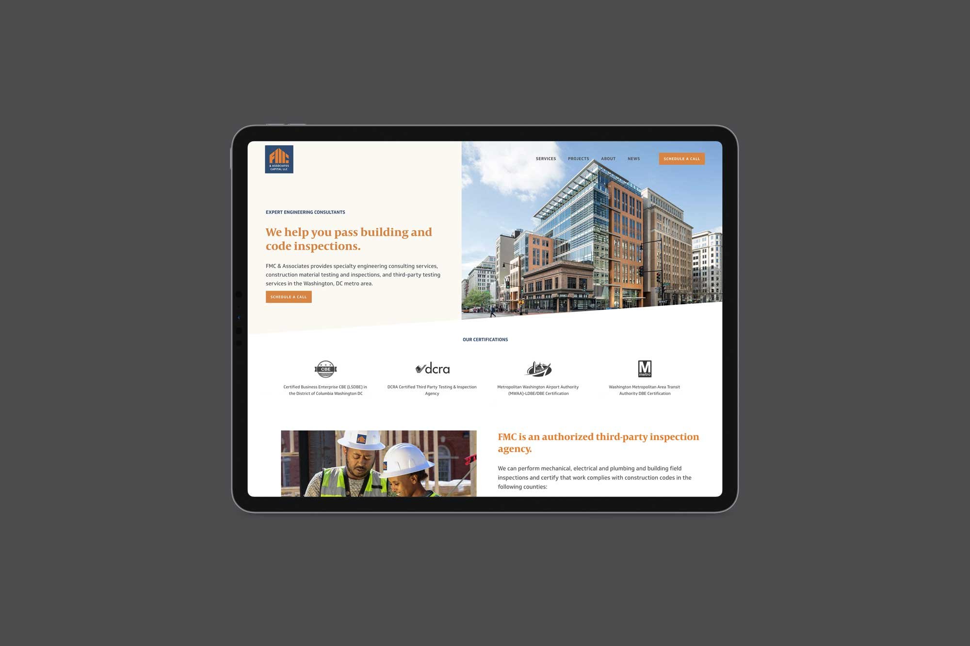
FMC & Associates Capital LLC provides specialty engineering consulting services, construction material testing and inspections, and third-party testing services in the Washington, DC metro area.
The Back Story
Founded in 2008, FMC & Associates Capital has built a reputation for dependability, flexibility and quality with their experienced construction material testing and third-party inspections teams and their exceptional portfolio of high-profile buildings and sites.
FMC & Associates Capital had a WordPress website with outdated content and design that didn’t reflect their current services, portfolio, and team. They were ready to rebrand and invest in content writing, a brand identity (logo, colors, typography), headshots and on-site photography, and a completely new website!
Starts With Strategy
We started the project off with a strategy session, The Power Plan, to gain valuable insights, strategize, and outline the direction of the brand and website in order to stand out from the competition and connect with clientele.
When a client comes to us with an existing website, we do a full audit of their current website pages (sitemap) and tech stack to fully understand what they're working with now to accurately propose the best path forward.
After we have the page structure outlined and approved (site navigation wireframe) for the new website, we dive into the top-level page content, working with our web content writer consultant, Monika Jansen.
Logo Design and Visual Identity
At this stage, we present several varied design directions on a home page mockup—our clients love being able to visually see how the content writing will be incorporated into the website and make a decision on a direction.
Based on the website direction chosen, we began the logo design process, creating several options to choose from. Often, when we get a new professional services client with a logo that needs updating, we start with the website design. The reason is that consultancy firms are a lot different from, say, companies that sell products.
If there is an existing logo, we decide on the palette and web design direction and then apply that to the logo design. In the case of FMC, we knew that the typography would need to be updated as well as colors, but we wanted to see if we could make the existing shape work.
We created several concepts, they chose a direction, and we refined the final mark. It works nicely on hard hats, safety vests, mugs, signage, and of course, the FMC & Associates website!
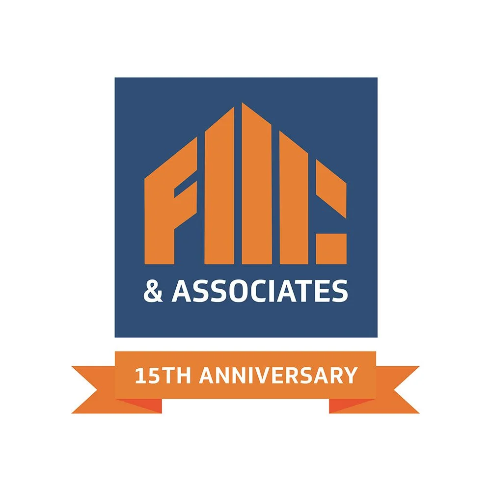
We created a milestone logo to commemorate FMC & Associates’ 15th Anniversary. In 2024, FMC & Associates became FMC & Associates Capital and needed an updated logo to reflect the name change.
Old logo
New logo
Anniversary logo
FMC & Associates Capital Logo
Brand Photoshoots
While the website content was getting written, we coordinated two photo shoots! This included a custom photo shoot guide with color and styling direction, headshot, team, and on-location photo examples—the photo guide is provided to the FMC staff and photographer to achieve the best results.
Evelyn, ready and willing to be an engineer for a day!
Evelyn worked alongside the photographer posing the team, and even jumped in as a model! We did 2 shoots—one in the office to get headshots, team interactions, and downtown office photos.
Then a week later on location to capture various services on a very active job site. We selected the best shots and executed retouching services. Both shoots were highly successful and FMC now has a high-quality set of on-brand custom images.
An Instagram reel featuring the FMC employees getting headshots and team photos. The photographer, Mike Tesema, is an engineer who works for FMC’s sister company.
Web Build
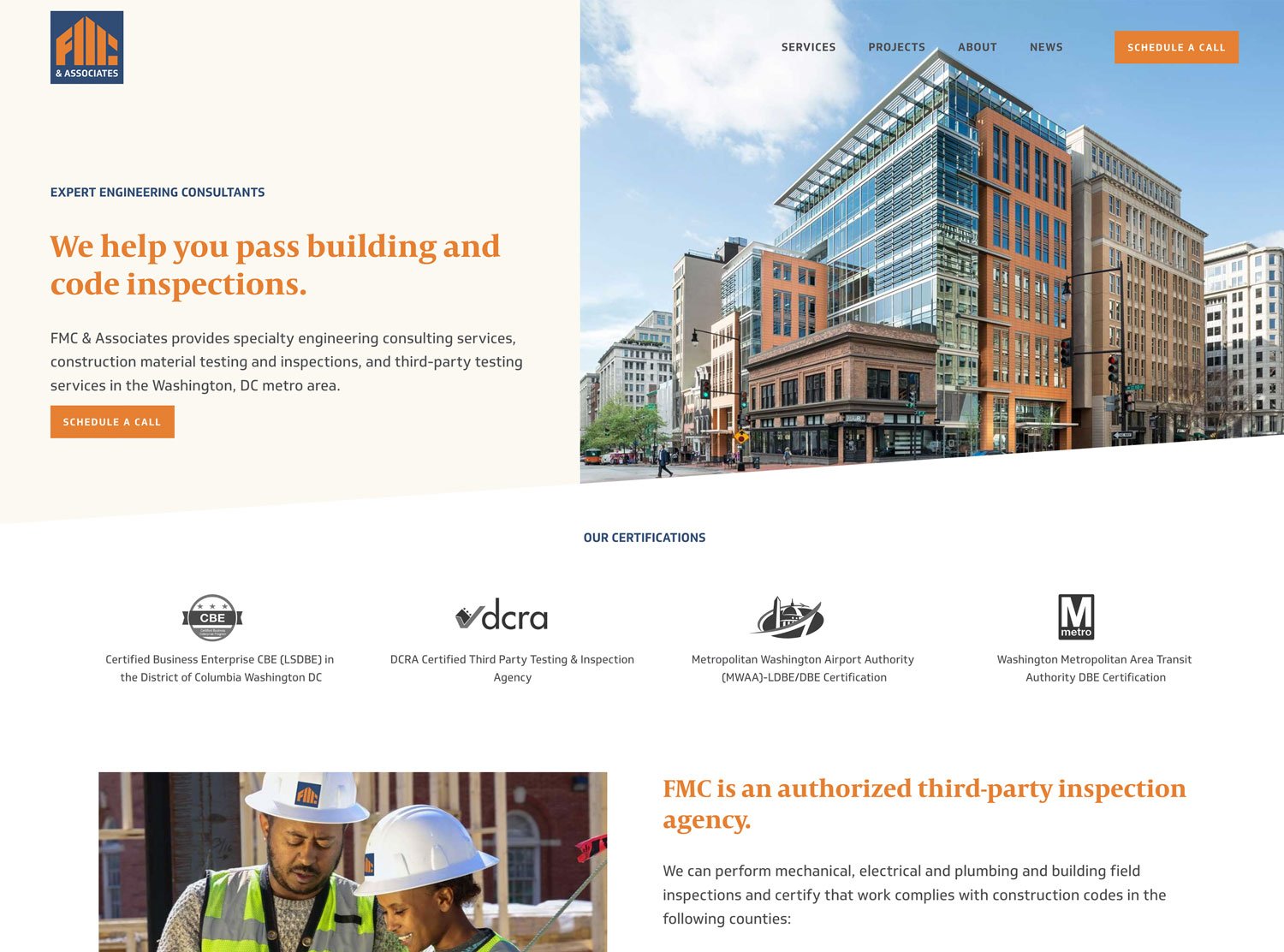
Once the writing, photography, and design were approved we built a polished, easy-to-navigate professional website that clearly explains FMC’s services, shows off their portfolio of multi-million dollar projects, and highlights their expert team. It also builds their online authority through organic content creation on the news page (blog), and connects with their clients and colleagues through email marketing campaigns.
The website is simple to use and manage, complete with on-and-off page SEO, legal pages, basic accessibility, and analytics tools. We also train our clients on how to use and manage the website AND set up the scheduling features to help them streamline and manage their appointments, availability and calendar.
We’re really proud of this project!
Website Before & After


