HEALTH & WELLNESS
Expand Psychology
Structured Content. Brand Photography Direction. Website Design & Development.
Overview
Expand Psychology, formerly known as The Center for Cognitive Therapy and Assessment (CCTA), is a mental health psychology group practice located in Northern Virginia. After two decades of growth, the founder sought to rebrand the business to reflect their expanded services.
As part of their rebrand, they were changing the name of their practice. They needed a new brand identity and website to transition from a niche focus on CBT (cognitive behavioral therapy) for children to the comprehensive offerings the practice now provides, including therapy and testing for children, adolescents, and adults.
The Challenge
The existing website was outdated, difficult to navigate, and did not align with the practice’s goals of attracting more adult clients and showcasing its testing services. The new website needed to present the rebrand effectively, including a comprehensive overhaul of content and visual assets.
The website needed to communicate the shift from CBT-only and mostly children, to a full complement of therapy services for adolescents, adults, and parents. The redesign aimed to educate and build trust. It also had to differentiate its practice by emphasizing clinician expertise, client-therapist fit, and collaborative care.
The Approach
Kickoff, Strategy and Sitemap
Since Expand Psychology has been in business for 20 years and had an existing website and online presence, we did a local SEO audit to review their current rankings in the DMV area, which informed the new site architecture. We restructured the website pages and developed a new site map, which guided the content writing.
Content Development
We reviewed all existing written content from the old website. We hired Michelle Zlakowski, a content writer specializing in the health and wellness industry, to write the home and primary service pages based on our site map and content document. We wrote and edited the content for the remaining pages, creating page titles and descriptions for SEO/AIO. The content was rewritten to highlight services by age group and treatment type, infused with relevant keywords, and updated to include helpful content that aligns with the brand strategy.
Visual Direction and Brand Photography
When planning out the visual content for the website, Evelyn suggested a custom photoshoot to showcase their staff and how they interact with clients. Since many of their clients are children, we also ask them to consider hiring models. Often, clients are unaware that this is a viable option when actual clients are unavailable or not amenable to being photographed.
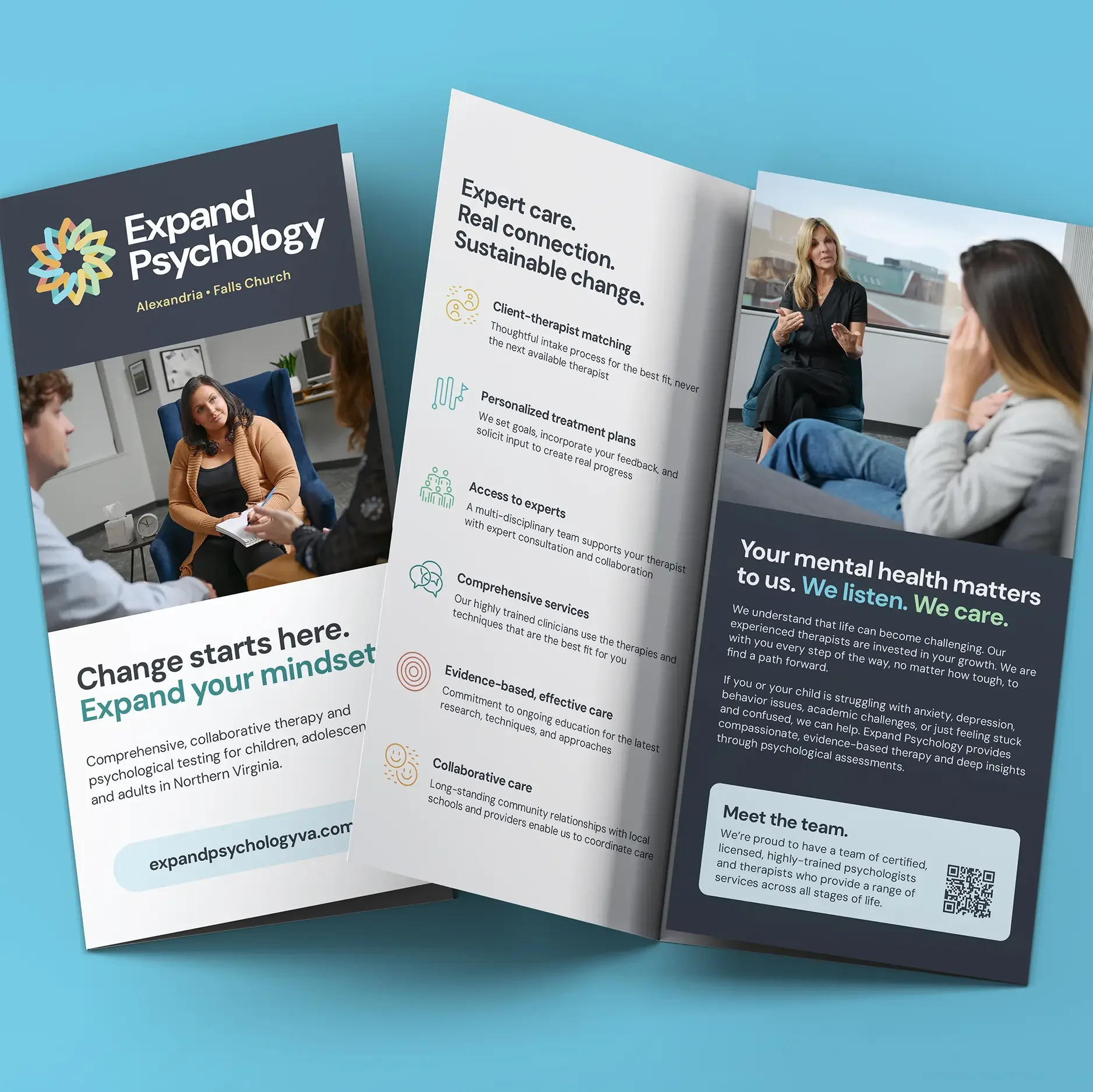
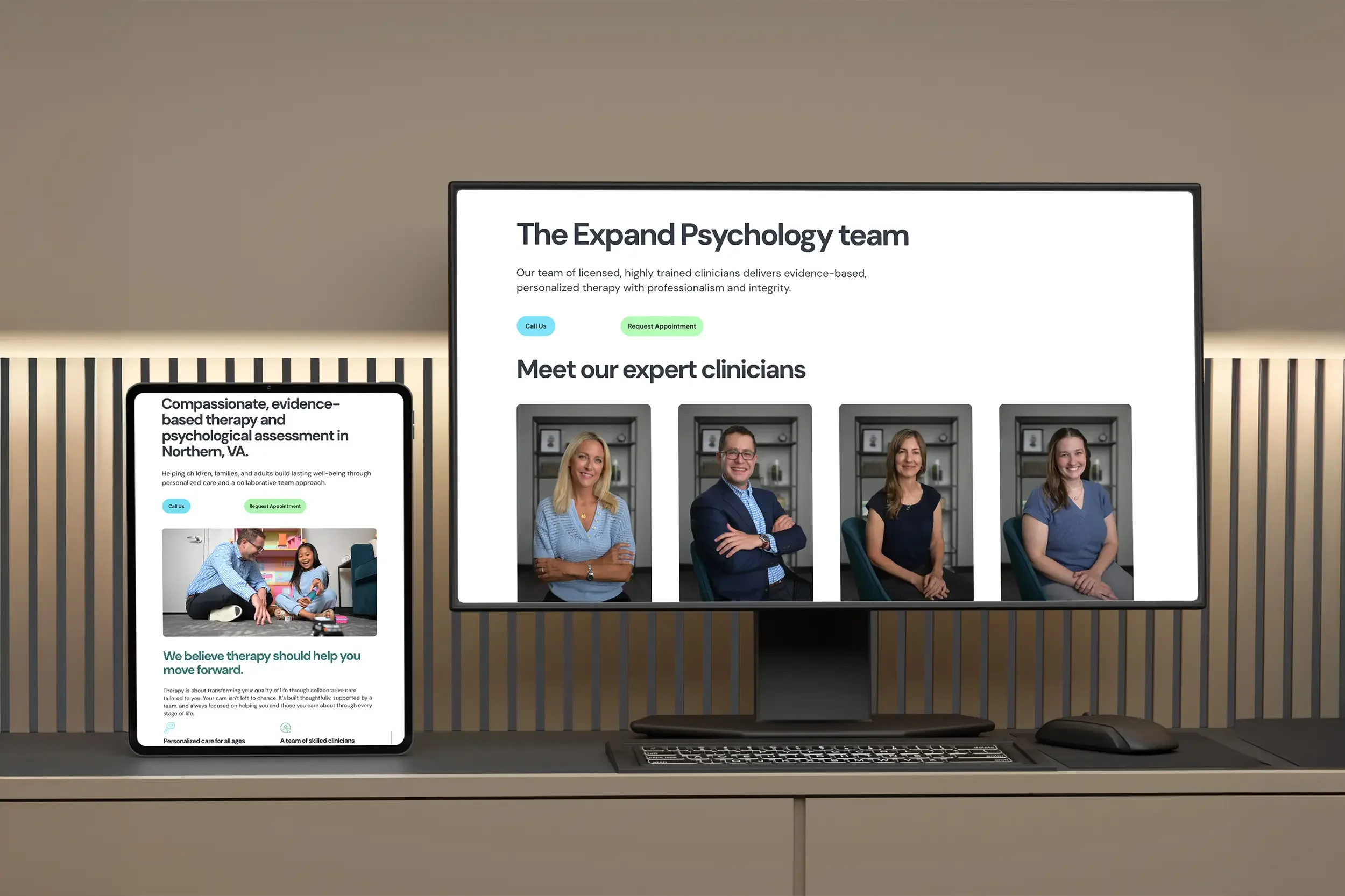
While the content was getting written, we planned and art-directed a custom brand photoshoot. We collaborated with photographer Sam Levitan to capture authentic, professional imagery, comprising clinician headshots, team photos, office spaces, and client photos, ensuring the visuals conveyed warmth and professionalism.
Using real imagery versus generic stock or AI-generated images makes a significant difference because potential clients can genuinely connect with the actual therapists they will be working with.
The photoshoot involved extensive pre-planning, including a guide for their employees on color, wardrobe, and office location, as well as an in-person office scout meeting to discuss optimal lighting conditions, therapy tools and layout.
The all-day shoot involved rearranging furniture, setting up lighting, art directing shots, working with three child models and the Expand team, and transitioning to four different office environments. We did all post-photoshoot tasks, including selecting the best shots, editing, retouching, cropping, and image optimization. If you'd like to read all the details and get tips on doing your own custom photo shoot, we've written a comprehensive blog post about it.
Logo Design and Visual Identity
From Niche to Expansive Services
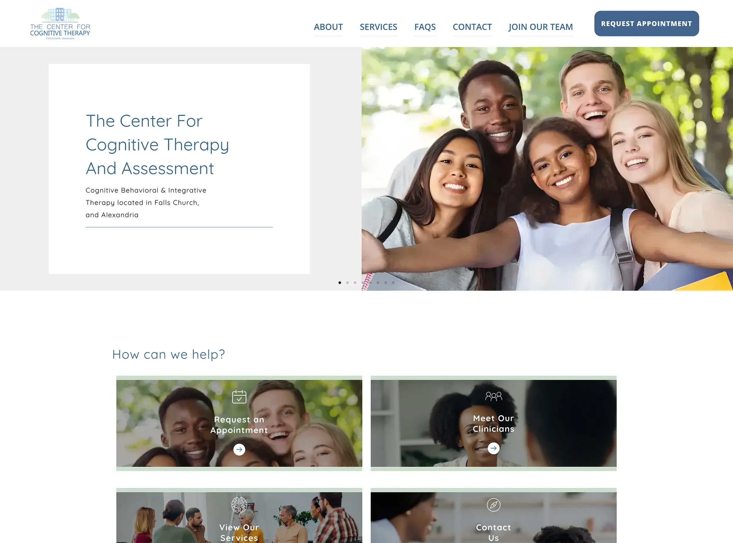
CCTA Old Logo
Expand Psychology, formerly known as The Center for Cognitive Therapy and Assessment (CCTA), is a group practice in Northern Virginia that has served its community for more than two decades. Focused initially on CBT (Cognitive Behavioral Therapy) for children, the practice evolved into a comprehensive provider offering therapy and testing for children, adolescents, and adults.
This shift demanded more than just a new name—it required a brand identity that reflected its breadth of services, professional credibility, and human warmth.
The Challenge: Outgrowing an Old Identity
The old CCTA logo featured a clinical design with a building and trees—symbols that felt outdated and limited in scope. While functional in its early years, the mark no longer reflected the practice’s values or its modern, holistic approach to care.
The challenge: design a logo that conveyed trust, collaboration, growth, and approachability while standing apart from large, impersonal mental health organizations.
Discovery: Values at the Core
We facilitated a brand discovery session with Expand’s leadership team to surface their values, audience insights, and long-term goals. Out of these conversations emerged the themes of:
Growth – representing both client progress and organizational expansion.
Community & Collaboration – the practice’s team-based approach.
Trust – essential in mental health services.
Individualized Care – honoring each client’s unique needs.
These themes guided every design decision.
Creative Concepts: Exploring Visual Directions
We presented three distinct logo concepts, each with its own color palette, typographic style, and symbolic foundation. The chosen direction centered on the Hoberman sphere—a tool whose expansion and contraction serve as a point of focus, for mindful breathing and can be used to support calmer, slower and deeper breathing.
This metaphor resonated deeply with the team, capturing the essence of their name and philosophy.
Design Details: Balancing Professionalism and Warmth
The refined logo paired the Hoberman-inspired icon with a modern geometric sans-serif typeface, chosen for its readability, friendliness, and versatility across digital and print applications.
Color selections were bright, cheerful, yet sophisticated—conveying optimism without losing the gravity of professional mental health care.
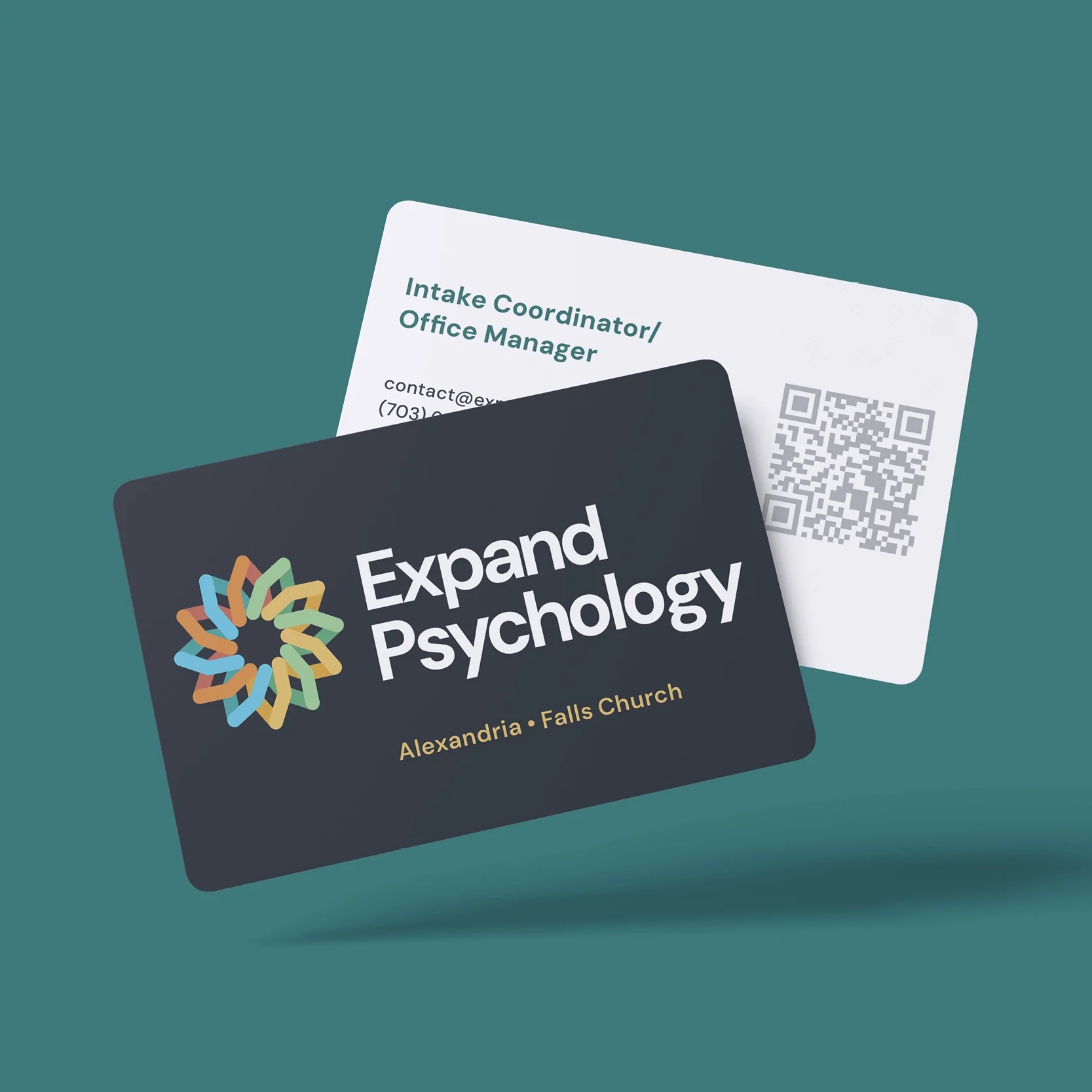
Deliverables: Building a Usable System
To ensure seamless implementation, we delivered a comprehensive logo package including:
Three logo lockups for responsive use cases
Multiple color variations
A full suite of file formats
Usage guidelines for consistency across platforms
The Result: A Foundation for the Future
The new identity positions Expand Psychology as a trusted, approachable, and forward-thinking practice. The logo now serves as the cornerstone of their rebrand, anchoring collateral, digital assets, and the website redesign.
By investing in a modern, strategic brand identity, Expand Psychology signals to clients, families, and the broader community that it is committed to growth, collaboration, and compassionate care for the next decade and beyond.
Website Build and Testing
After the final content and photos were in hand, we designed three web design concepts along with logo concepts. After they chose their favorites, we refined them further, produced the final visual assets, and started the website build.
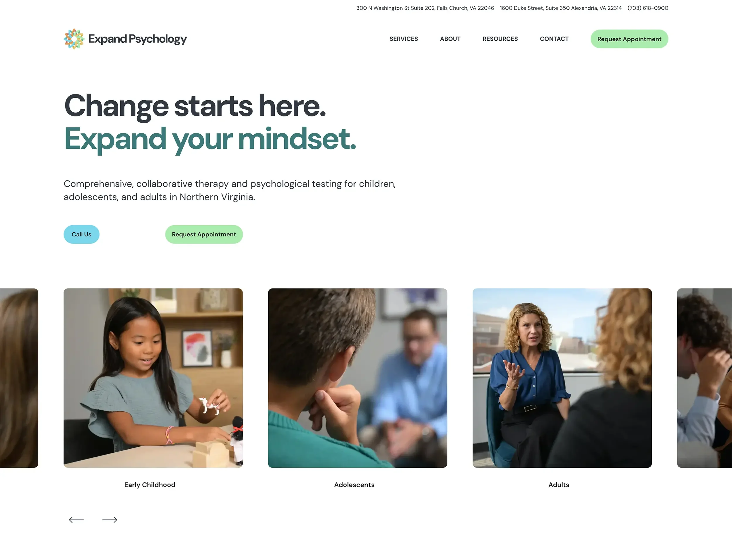
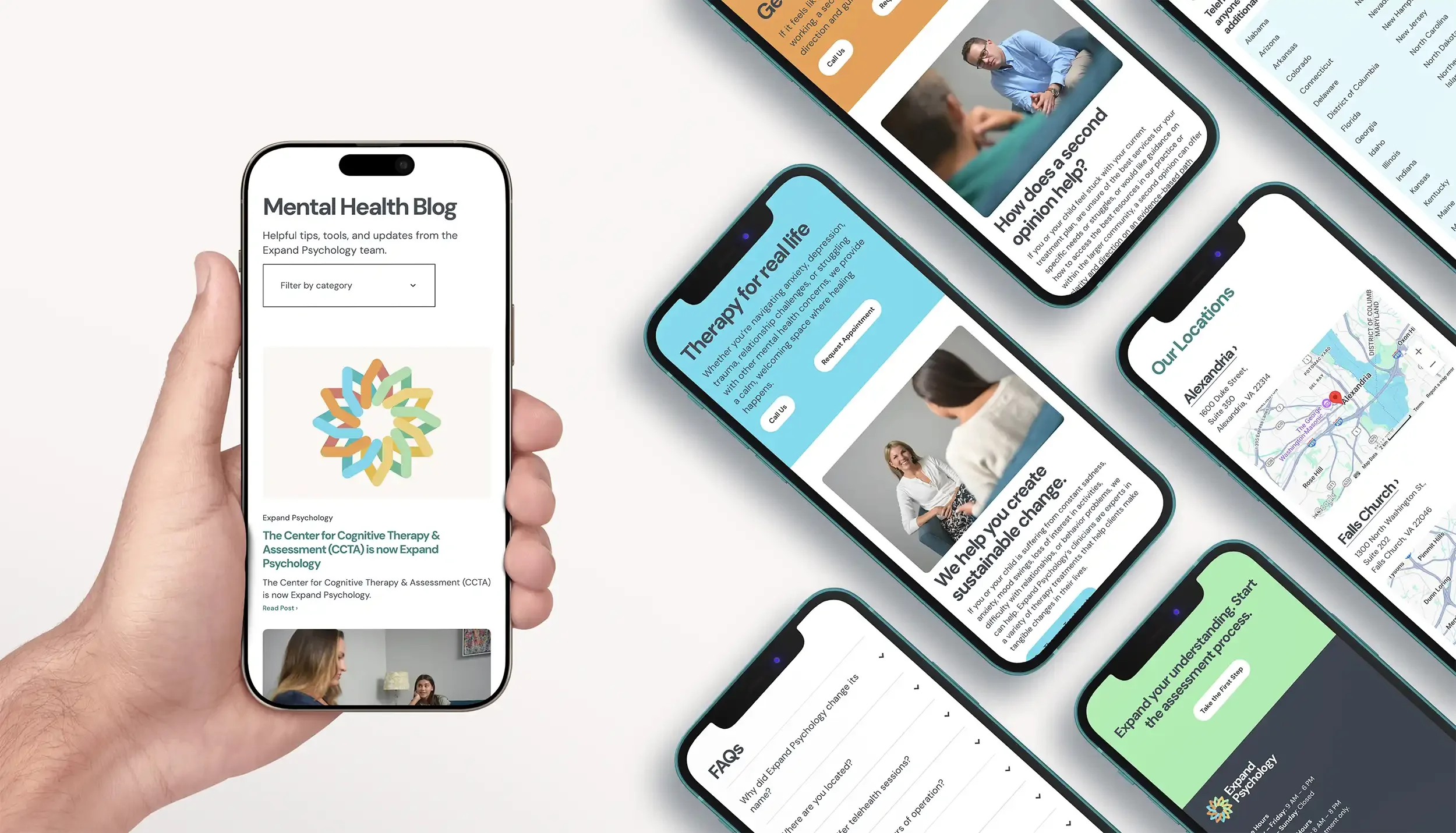
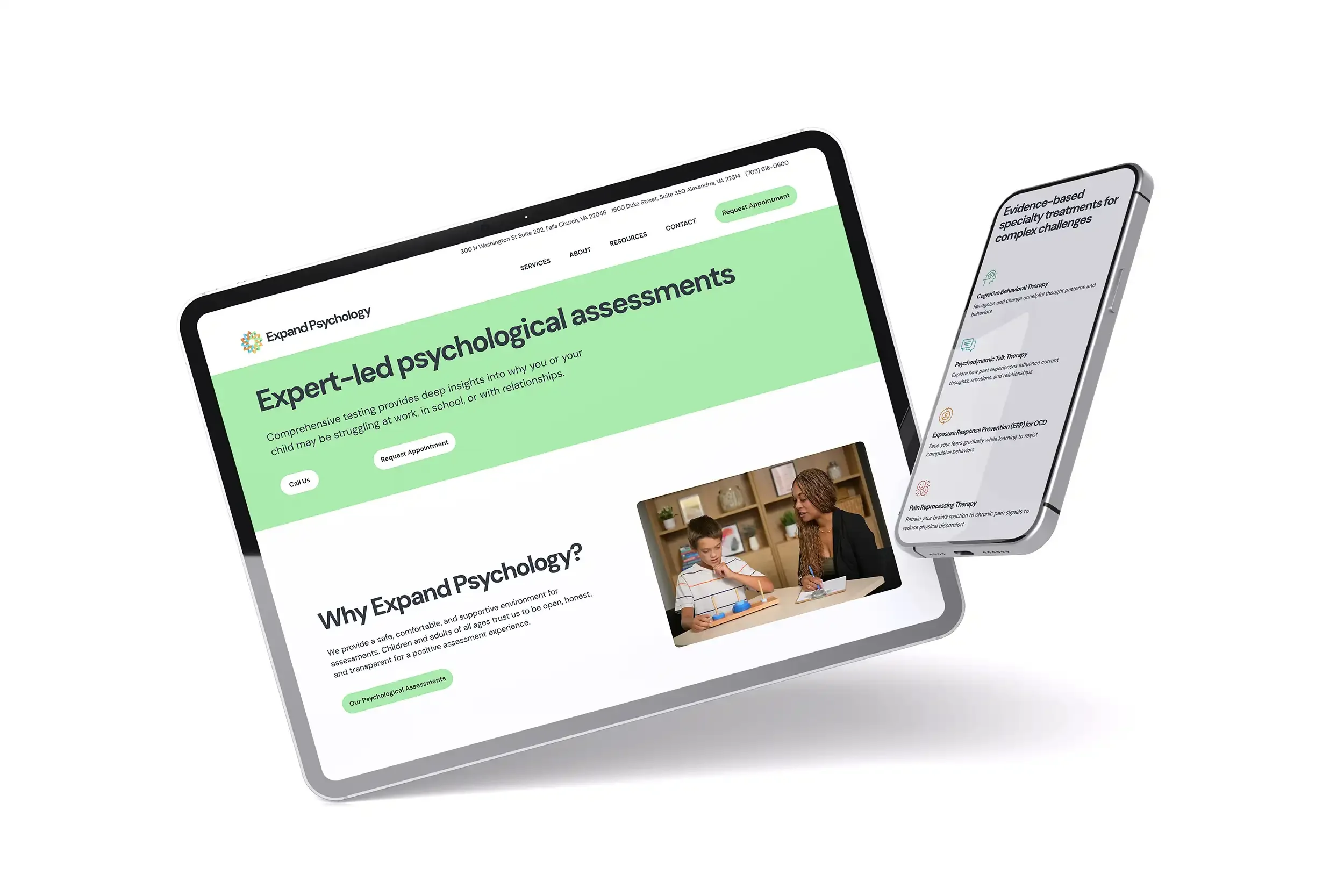
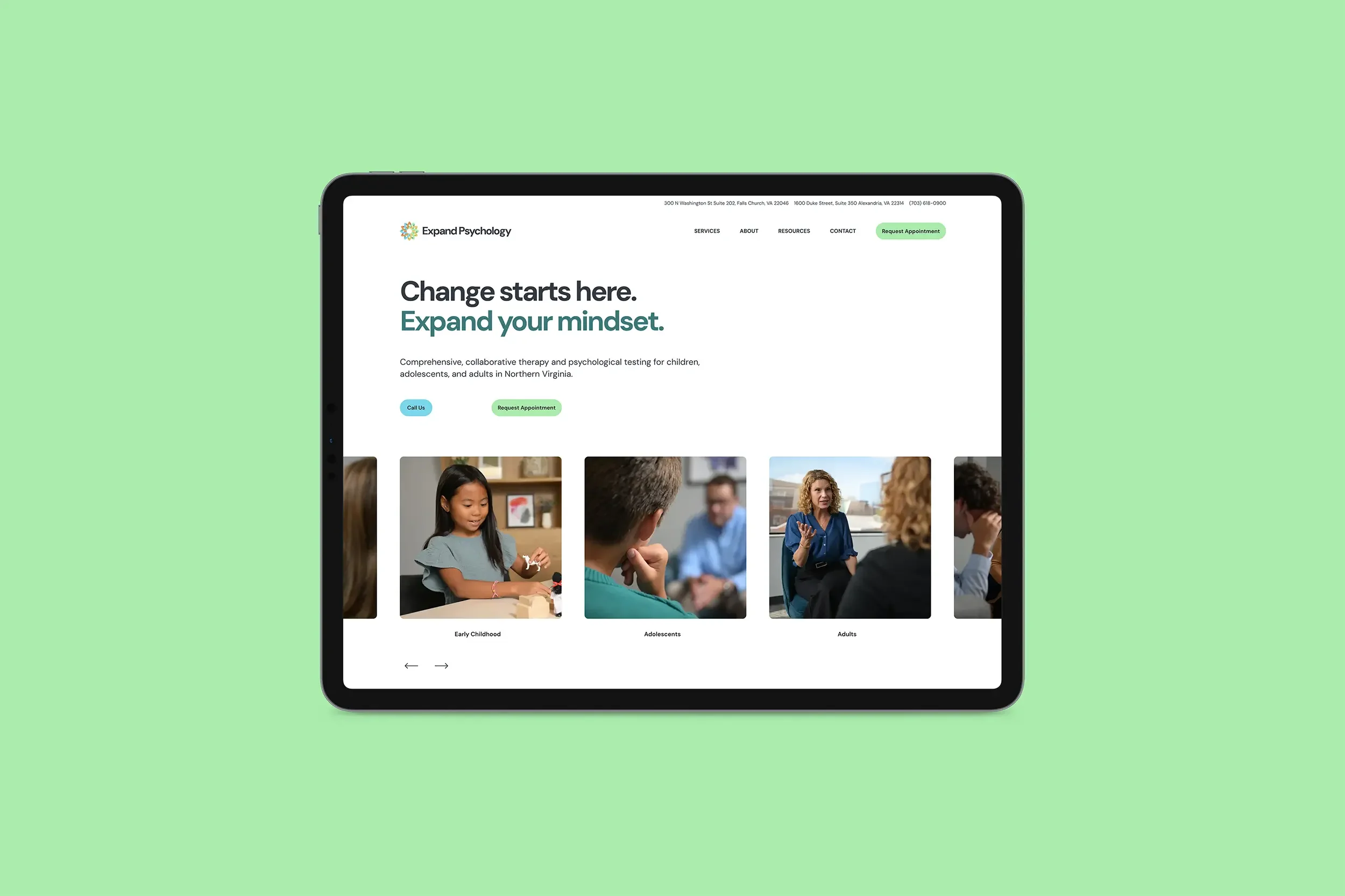
We built a responsive, SEO/AIO optimized site that's easy to navigate, clarifies their services, audience, hours, locations, and highlights their team. It’s authentic, accessible, has a clean design and organized content. The font, colors, and button styles sync perfectly with the logo, creating consistency across all touchpoints, including printed collateral materials.
Custom elements include a secondary navigation, rotating word headline, customized icons and optimized brand photography. We helped them set up and embed Google Forms, which are HIPAA compliant, until they are ready to revamp their client CRM portal.
We connected their new and old domains, walked them through setting up their website's legal policy, implemented URL redirects, reformatted their blog, created email mailing lists, and post-launch connected analytics and submitted their sitemap to ensure search engine indexing. We also guided them with a strategy for announcing the rebrand and designed collateral for their launch party.
The Outcome
The new brand identity and website showcase modern design and branded content, which builds trust through clear services, clinician bios, blog content, and FAQs. The improved navigation helps visitors find exactly what they’re looking for. The calls to action provide clear pathways to drive increased inquiries, supporting their growth. Over time, the site will organically grow its local presence in the Falls Church and Alexandria region.
The website serves as both a marketing tool and educational space, positioning Expand Psychology as a trusted, mid-sized, psychologist-led practice in Northern Virginia.
Website Before & After