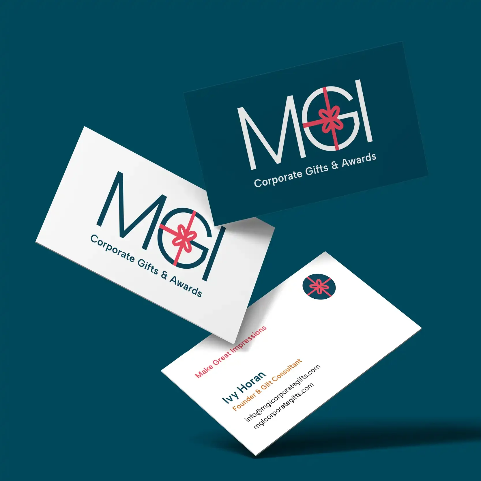
MGI Corporate Gifts
The MGI Corporate Gifts logo redesign was part of a broader brand evolution aimed at elevating founder Ivy Horan’s gift-consulting expertise. The refreshed identity sets a joyful tone for a brand that celebrates the emotional impact of meaningful recognition—positioning MGI as the trusted consultant who designs and delivers impactful experiences, not just custom gifts and awards.
Brand Background
MGI, which stands for Make Great Impressions, is built on Ivy’s passion for helping businesses and organizations celebrate people in thoughtful, memorable ways. With roots in fine retail and decades of experience partnering with institutions, Ivy brings both creative vision and logistical expertise to her clients.
While MGI’s reputation and word-of-mouth marketing were strong, the existing brand identity did not visually reflect the emotion, high quality, sophistication, and value MGI provides.
The Challenge
The primary challenge was shifting the brand away from a catalog-style, transactional perception and toward a story rooted in remarkable celebration, human connection, and the exclusive value of working with a dedicated gift and awards expert.
The visual identity also needed to align seamlessly with new website copy, page strategy, and photography.
Our Approach
We created a refined, minimal logo that highlights the MGI letterforms, reinforcing brand recognition while introducing a contemporary feeling. The “G” was thoughtfully customized with a stylized pink gift bow, integrating the concept of gifting directly into the wordmark.
In addition to the wordmark, we created a circle icon featuring the gift bow to use as a standalone icon where needed, such as the website browser icon, social media profile photos, or merch. The gift bow adds a pop of color that stands out, is memorable, and symbolizes joy, celebration, and, of course, gifts.
We chose a modern sans-serif typeface that’s highly readable, aligns with the website fonts, and supports a feeling of clarity, warmth and professionalism across all brand touchpoints. The updated tagline adds the word “Awards” to “Corporate Gifts & Awards,” making it crystal clear that this is also a core service.
The new primary color palette balances trust and sophistication with energy and celebration. Paired with custom pattern backgrounds and a generous amount of secondary brand colors, the brand has a strong visual foundation for future marketing campaigns.
The Outcome
The rebranded logo positions MGI as an elevated, expert-led brand that celebrates people first.
The logo reflects Ivy’s expertise through its simplicity, memorability, and professionalism—using quality typography and color to convey trust, unique value, and a scalable design that builds recognition and stands out. It serves as a visual mark that conveys credibility and signals that MGI is a reliable authority in its field.
Together with a strategically redesigned website, the new identity helps attract clients seeking more than just products—clients who value a partner that delivers thoughtful recognition done beautifully, within budget, and executed effortlessly.


