NON-PROFIT
Arlington County Fair
Visual Identity. Graphic Design.
The Arlington County Fair (ACF) was founded in 1976 and is a free event that brings the community together through food and drinks, rides, games, concerts, vendor booths, shopping, and local traditions. It is one of the largest free events on the East Coast and has been providing quality entertainment for over 40 years. The board that puts it on every year is a non-profit volunteer-driven organization.
The first goal for our team was to create an evergreen logo to serve as the visual foundation and recognition of the Fair. The new logo would be used on all marketing materials, both digital and print, and would continue to be the core mark for the fair for years to come. Check out our logo case study to find out more about our process!
Logo Design.
The old logo
The Fair Board engaged us to redesign their old logo and create a logo usage guide. At the start of the project, the board was envisioning a light modification of their old logo and retaining the flag element in the new design. However, they were also open to a full reimagination of the logo sans flag.
The main goal was to create an evergreen logo to serve as the visual foundation and recognition of the Fair. The new logo would be used on all marketing materials, both digital and print, and would continue to be the core mark for the fair for years to come.
After a quick kick-off call, and another more in-depth discussion on Zoom, we developed 5 different designs, each with their own distinct style. The main marketing team on the board voted on the top 3 choices to then present to the entire board. From their vote, they selected the top 2 choices to move forward with.
We then created multiple refined iterations of the top 2 selections. After deliberations and voting, the board decided this logo was their favorite!
The design features friendly bright colors, a decorative all-caps curved lettering referencing metal marquee light signs in a vintage style, combined with a retro drop shadow for depth, and a punchy ribbon reminiscent of the previous flag element, with a modern sans serif font that’s whimsy and fun (plus two cute yellow stars!). Similar to the lively fair full of activities, there is a lot of action happening in this dynamic logo—designed to energize and entertain the participants!
In addition to the full-color logo, we created an icon that works well in small sizes, a reversed version (for dark backgrounds), a modified version (sans dots and the set date) for very small use cases, and a fully cut-out one color logo (black and white) for when one color or no color is available. Our logo usage guide fully explains how to and how not to use the logo, and provides the non-profit with specific brand color codes and fonts used. And of course, we gave them our quick guide to logo file formats PDF so they’ll know what file they need, where to use it, who uses it, and why it’s right for the job.
Now the fair has a professional, effective, eye-catching logo to help establish them as a reputable community event that’s educational and entertaining for everyone; A fair for all committed to showcasing the best of Arlington!
In addition to redesigning their old logo and creating a logo usage guide, the board asked us to create a logo for the pie-eating championship t-shirt and for the souvenir beer glasses.


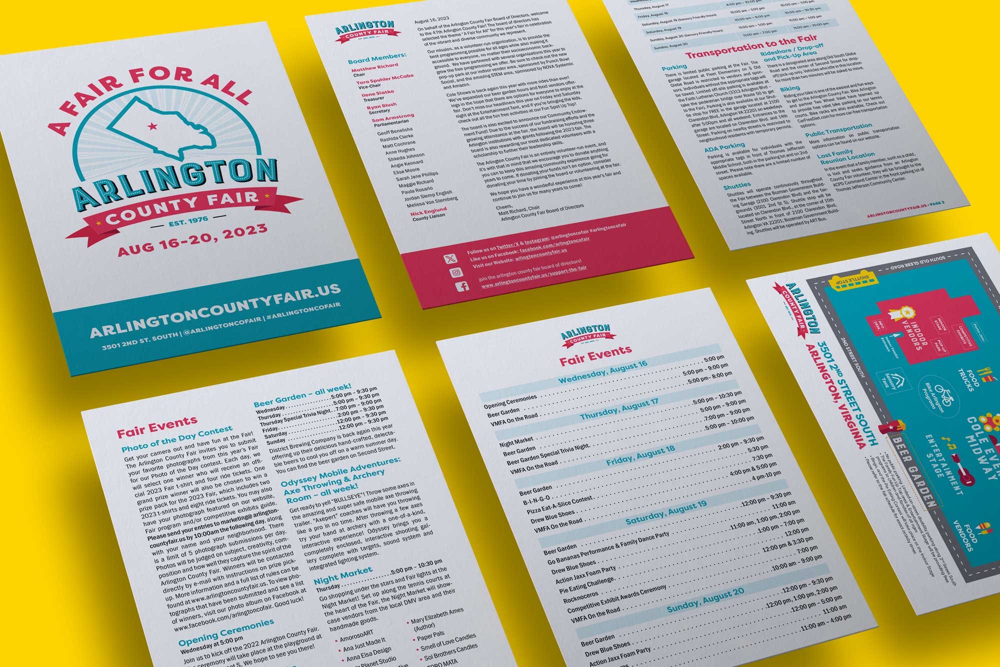
We also created a program that highlighted all of the events that they were going to have at the fair, complete with a full schedule and maps of the venue (and outdoor area). The ACF board used the brand identity that we created for them to place advertisements in the Gazette and that they sent out to Arlington residents in the mail.
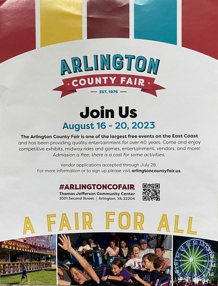
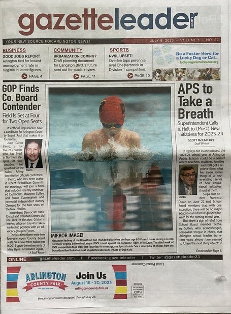
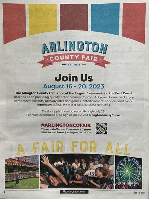
The Arlington County Fair uses our branding in action in their mail print collateral and ad in the Gazette!
We had so much fun creating all of these materials for the ACF board. Evelyn and Vanessa are both longtime residents of Arlington County, so this was a personal project as well as a professional one. The DP team relishes any local branding that we get to do! We love seeing our work around Arlington.
2024 Arlington County Fair Designs
We’re back in 2024 with new designs for this year’s Arlington County Fair! This year’s fair theme is Kaleidoscope of Fun. The board once again asked us to create a logo for their fair t-shirt, pie-eating championship t-shirt, and souvenir beer glasses. They wanted a design based on a kaleidoscope's fun colors and shapes. We continued using the brand font Filson Pro and the color palette we created for them last year, with some new color additions of dark blue and orange!
They won’t be using the evergreen Arlington County Fair logo we created for them in the new merchandise, but rest assured, you will still see it plastered all over the fair and on their marketing materials. We love clients who continue to come back to us year after year, and we feel so special to have such an integral part in the artwork for the Arlington County Fair.
What our client says…

