Are You Ready to Rebrand? We Did! (Part Three)

How We Rebranded Our Content, Logo and Website
Part One of our rebrand highlighted the Design Powers home-based office transformation. In Part Two we covered our day of personal branding photography.
Part Three is the final post in our rebranding series where we cover what it was all leading up to—niching down our business offering, defining our web build process and redesigning our logo and website.
This Actually Started a Decade Ago...
By 2012, I was tired of working by myself. I had been working solo since I started my home-based business in 1996 and missed collaborating with other people. My children were in middle school and fully immersed in their own activities and friends during the school day. Having another’s skills, insights and company would make for more interesting projects and solutions and be more fun and interactive. My first thought was to hire an intern as it seemed a low-risk way to ease into it.
I had worked with interns before in previous jobs and had had good experiences. My niece Amanda, Emily’s older sister, suggested Jason, a fellow student who was attending Northern Virginia Community College (NOVA) and had some tech skills, a basic understanding of design and the desire to learn. He was also super cool and fun.
Right about the same time I got a new client that was an association who asked me to redesign their logo, create print design and build a very basic website. It was my very first web design gig for a paying client and I was tentative to say the least. But working with Jason and his can-do attitude, we agreed, no time like the present!
The logo and graphic design work were solid, the client still uses the logo today, but our web build—uh, I’ll give it a C. Two reasons—we had no idea what we were doing and the platform we chose to use, Squarespace, was still relatively rudimentary.
The client was satisfied with the end result but from that experience, I knew that there was a tremendous amount I needed to learn. After a couple of months, Jason went on to work a full-time job. I missed him immediately and hired another intern but we mostly stuck to print work.
In 2013, I enrolled in a web design course that jump-started my business pivoting to web design. I knew I wanted something different but I didn’t know what exactly. I spent the next couple of years figuring it out…
Becoming a Leader and Partner
I began to explore working with colleagues. In 2014, Karen Bate, a friend and work colleague of mine started AWE, a women’s entrepreneurial networking group. I offered to help by designing a logo, setting up a simple WordPress site and taking photos of the monthly networking meetings.
In 2015, I formed a joint venture, Nice Work, with Tara Claeys, a friend and colleague who is a Word Press developer. This partnership gave me the opportunity to design more complex websites for non-profits and mid-size companies and become better at strategy and discovery.

A proud graduate of the Leadership Arlington Class of 2016. It was a wonderful, educational experience and gave me the opportunity to understand the inner workings of what it takes to run and operate the justice, policing and school systems as well as a better understanding of urban planning, affordable housing and commercial zones within Arlington County, Virginia. I worked with my “neighborhoods” team for 7 months. Ironically, I did a lot of graphic design for our final presentation to the entire class of 90 people but for the most part, it was about stretching my mind to think about the community in which I live and the greater whole.
Finally, in 2015, I enrolled in Leadership Arlington, a year-long program that promised to transform me into a highly motivated leader with the knowledge and commitment to benefit our community. When it’s time for a change, I don’t mess around!
After my Leadership class concluded, I became a co-founder in AWE and we grew it into a six-chapter regional networking organization with 150 members, a WordPress membership site, a live radio interview show repurposed to a podcast, monthly meetings, and organized a yearly in-person, half-day educational summit with 20+ speakers and over 100 attendees. In 2020, AWE became a women-networking program of our local Chamber of Commerce.
All of these varied experiences happened concurrently while I was taking on more web design jobs. The collaborations informed my business acumen, helped build my authority and expand my network… exactly what I needed!
Occasionally I meet designers who are my vintage, that still do graphic design the old school way. Not that there is anything wrong with it, but I’m happy that I took the initiative to take risks, uplevel my skills and continue to grow my business beyond my comfort level. Nothing ventured, nothing gained.
Picking a Niche
When Emily began interning with me at the end of 2015, I was fully immersed in all the aforementioned activities. She was learning not just graphic and web design, but had a front-row seat to all the varied leadership activities, giving her additional skills and knowledge as well.
After Emily graduated from GMU in 2018 and started working with me full-time, we began discussing the type of work we enjoy doing and for whom. It has taken us a couple of years of trial and error, working with different types of clients and all the collective experiences of the last decade to get to this point.
We’ve come to realize that we love working with seasoned professionals who know their service and industry inside and out but need a consistent and compelling brand identity and website to convey their hard-won expertise and a deeply-held conviction. They’re more than ready to start their own business to own that conviction. It’s a very exciting type of client to work with.
You Can't Read the Label From Inside the Jar
Now that we had a defined ideal client with like problems that we could solve efficiently and expertly, we decided this time to take our own medicine and write the content messaging first. We tell clients to do that but we never did that ourselves! Until now.
We asked content writer, Michelle Mercurio, who participated in our mastermind to help us. Based on our input, she crafted our brand story, speaking to the type of client we want to work with, and the web build intensive process that we are refining and putting into practice.
We also defined three tiers of service. Blair Enns, author of Win Without Pitching said it best “You can’t read the label from inside the jar.” It was a revelation and a relief to have an outside perspective and prose to work with.
Designing Our Logo…Again

Some of our logos throughout the last 25 years. Color, (mostly) the literal or abstraction of the letters d & p, and/or a lightning bolt have been the consistencies throughout.
Throughout the 25 years in business, Design Powers has had several logos. Being a service-based company (vs. product-based) and also a graphic designer, I’ve changed my logo every 3-5 years. Early on, the only place I used my logo was on my business card and client invoices.
I played with the usual themes: lightning bolt, the d & p and abstracting it in some way. The last row got close to being the final concept but it felt too much like a religious symbol. We did like the outer rounded and pointed square though.
In 2009, when I finally had a web presence, I began spelling out Design Powers, instead of solely relying on the DP.
Vermilion red has been a consistent brand color, although we did go with fuschia and indigo blue for a hot minute.
Vermilion red has been a favorite color of mine since when I was originally a painting major in art school. I loved that just a tiny dot of it at the tip of my brush could pop and define whatever was around it.
For use on screens, it’s bold, readable and aligns nicely with ‘Powers’ which happens to be my last name.
For the rebrand, I noodled around and thought I had finally come up with a final logo. The lower case ascender of the ‘d’ intersecting with the descender of the lower case ‘p’ creates a lightning bolt. It was clean and readable but something about it wasn’t working.
I decided to leave the logo alone and get started on the design of our website. On our client sites, we sometimes work on the website design and build first before creating the logo concepts. Often, it’s a more cohesive way to design both in tandem. When we present the website, we’re able to show the client the varied concepts and how they relate to the whole.
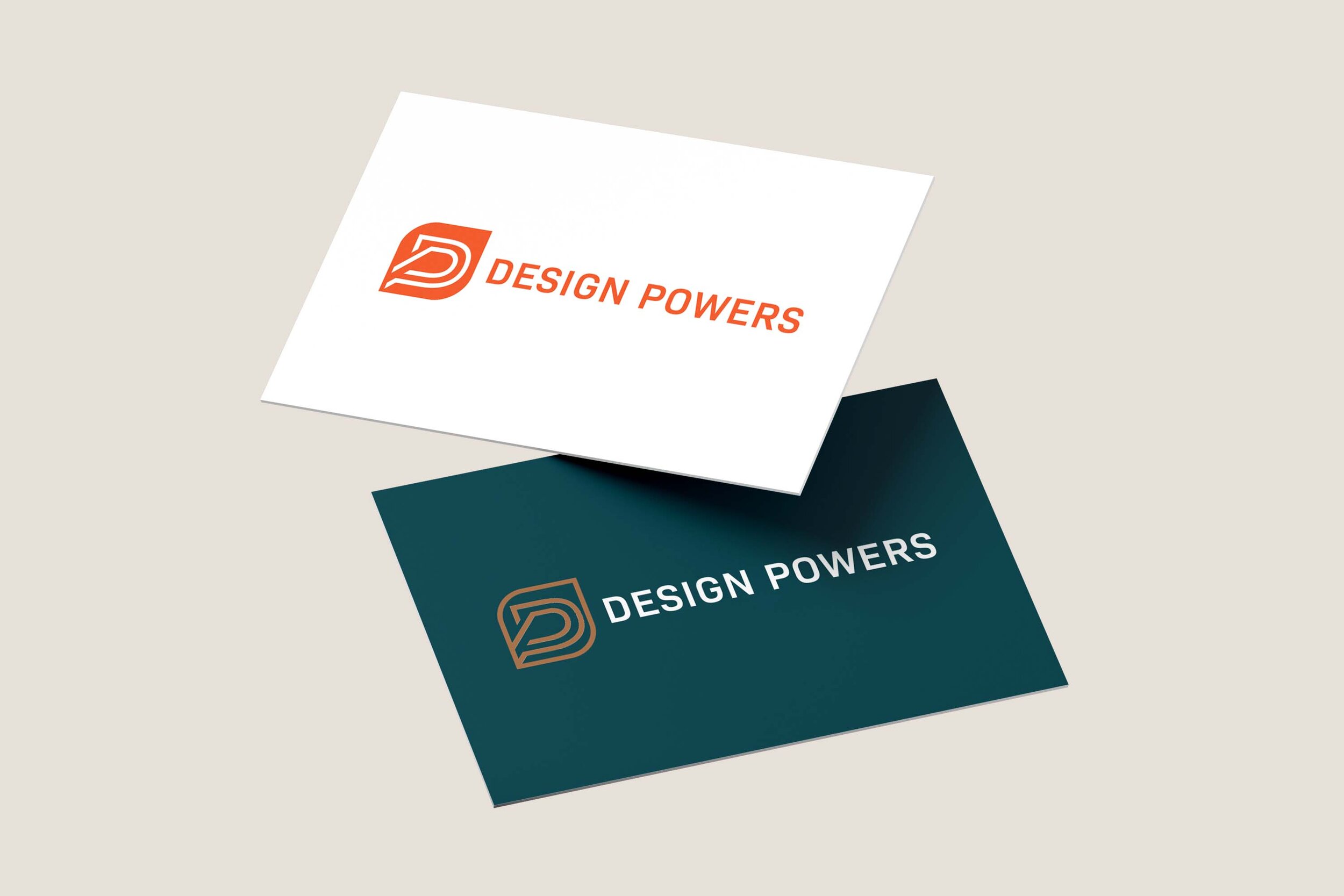
After working on our site design I came back to the logo, reworked it, and it finally felt right. I wanted uppercase letters not lower case and created a forward, upward uniform trajectory of the D & P within the pointy-rounded square. We could use that shape in other ways to create consistencies too.
Type Geek
What drove the final logo design was choosing the type family Bio Sans while designing the website. Originally, I was using Ivymode a crisp, flared sans serif with lots of ligatures from a Danish font designer, Ivy Foundry. It reads luxury and upscale and is beautiful. Since our strategy is leveling up our brand, it felt like the right direction to go in.
But ultimately, my minimal sensibilities kicked in. IvyMode felt too…fancy.
Perhaps it’s my inherent pragmatism but I gravitate towards typefaces with lots of varied weights where the letterform is designed geometrically (no thicks and thins). The letterforms have neutrality and a sense of unity and the large x-heights make it super readable even on small size screens. Our previous brand font Geomanist, from Italian font house, Atipo, had a similar feel albeit the letterforms were more round and open.
Ultimately, Bio Sans aligned beautifully with our imagery, palette and content. People who are not designers often have no idea how important the selection of typography is in expressing brand values, look and feel. Since so much of my career is working with type, the nuance, utility, what it conveys and how it reads are all very important.

Easy Peasy Web Design
The design of our website came about easily as everything leading up to it defined the parameters: defined niche, brand story and page content written, and custom photography (in that order).
Since I’ve been a designer forever, designing is the fun part. I mocked up the home page and one sub-page in Indesign. Ordinarily, for client sites, we mockup in Figma but for our own site, we simply built it out directly in Squarespace once we had the basic concept dialed in.
Going From Squarespace 7.0 to 7.1
We launched our previous Squarespace 7.0 website in June of 2019. November of that year Squarespace version 7.1 was released. Since we were just beginning to learn the platform and wanted to give the Squarespace community time to beta test 7.1, we held off switching immediately.
We also learned that Squarespace didn’t and still doesn’t have a way to directly move all the content from 7.0 to 7.1—we’d have to completely rebuild the site. We had 40 pages, 30+ blog posts, business and marketing settings, scheduling, email campaigns with mailing lists, automated email sequences and custom-designed newsletter templates, as well as site styles, CSS and plugins.
It’s a lot of work and took quite a bit of time to rebuild. It’s why we were deliberate and strategic about how we were going to proceed.
Time-Saving Extensions
Although we didn’t transition our site right away, we began building all our new client websites in 7.1 at the start of 2021. Although many features are identical in 7.0 and 7.1., 7.1 has new, streamlined options for adding content and styling a site that we love.
To save time on client sites, we use a paid browser extension by developer Michael Mashay, Squarespace Websites Tools Extension PRO—an import/export tool that supports moving pages and certain content collection types between sites, and also has some great UI tweaks. It helped us on our web build as well.
We also tried SquareKicker for the first time. It’s a design and animation extension for Squarespace 7.1. It allowed us to add background angles and make other custom design adjustments without having to write CSS (cascading style sheets). We liked it and will use it again.
Ultimately waiting to redo the site was a good decision because it allowed us to learn the ins and outs of both 7.0 and 7.1. and gave us time to get clear on who we are ideally suited to work with and how.
Back to the Future
Before any game of sport is played there is a plan. The coaches and staff create it based on the team history, that season’s opponents, current conditions and/or injuries, and finally, the ultimate goal for the season. Are the players young and it’s a building season? Or are the players veterans and the team needs to work within its strengths? Or the team has everything in place for success, it just needs to consistently execute. The coaches work with the players during practice and refer to the plan throughout the game and the season. In our industry, the same principles apply. It’s called discovery and we call the Power Plan.
Strategy is the first and the most critical part of the website design and build process. Afterward comes the brand story, content and custom photography. All are necessary to design and build a solid online presence to build your authority, market your business and own your conviction!
Everything we did to get to this point was deliberate and planned. It started in January and here we are in October. It was a lot of time and effort but worth it because we now have a game plan for the near future, one that has been “battle-tested” and going in a direction we love.
We Did It! Now, Are You Ready to Rebrand?
I hope you’ve enjoyed reading our three-part series on rebranding our office space, brand photography and finally our website. Has it spurred any ideas about your own business’ online presence?
If you’d like to read more about building authority, owning your convictions, or geeking out on all things design and web build related for small businesses, please subscribe to our monthly blog, the Power Play.
If we can help you with your own business website, book a call with me. Strategizing on how to market your services professionally online and then being a collaborator and supporter for your business after launch is our zone of genius!
Please leave comments or ask questions... would love your feedback and insights!

BEFORE

AFTER