Arlington Co.’s Epic Logo Design Fail
Arlington County goes back to being part of the original 10-miles square boundary of the District of Columbia!
My husband, Stephen Powers, (aka DC Stones) has been documenting the Boundary Stones for 16 years. Ironic.
$50K for this?
This blog post starts from the most recent results and goes back in time to when the first logos were unveiled. The back story on why Arlington County is redesigning its logo.
9/18/2021: I Listened to the Final Presentation and County Board Vote Today…
One of the primary goals of redesigning the county logo according to the logo committee spokeswomen today was to engage as many people as possible in the community.
Don't we have the county fair and property taxes for that? ba dum cha
Both women mentioned several times throughout their explanation of the process to the County Board how much “engagement and input they got from the community!"
Apparently, getting a lot of engagement justifies spending $50K to crowdsource our logo design only to end up with this.
I’d also like to know how much of this engagement was actually negative comments? From what I saw, I’d say 99.9% of it. No really, nary did I read a positive comment from anyone, anywhere, ever. There are always some haters, but this was off-the-charts hate.
I also heard all the County Board members claim their lack of expertise in judging what is worthy because after all, "it's subjective so..."
Design is NOT an Exercise in Engagement or Subjectivity!
Before we start a design project we ask a lot of questions. Based on the answers, we focus on building a brand that reflects a belief system, core values, purpose, mission and vision.
A logo is a combination of text and imagery that creates a visual symbol that represents that vision. A professional designer will establish the visual parameters needed to convey that brand.
Crowdsourcing is guaranteed to produce lackluster results because the aforementioned hasn't been done. As a matter of fact, the logo committee was disingenuous about its intentions from the start.
When the request for submissions went out in March, they said "think about the images, symbols, and feelings unique to Arlington and shared by people across neighborhoods." It was not stated to NOT use our landmarks or anything representational.
What they really wanted were concepts that show diversity, inclusivity and connection. Not only is this not “unique to Arlington”, but it’s also an incredibly nuanced and complex concept to convey in a logo, even for a professional designer.
This Didn’t Have To Be So Painful and End So… Meh.
The lack of understanding of the strategic process needed to create a compelling logo is shocking. I don't understand why a professional design firm wasn't paid to create concepts.
This was such an incredible waste of taxpayer money and time. And the County Board back slapping the logo committee commending them for their efforts and the "heavy load" they carried was laughable. Trust me, this wouldn’t have been hard had they engaged a professional designer.
Ask Greg Hamilton and Kate Bates from the Arlington Chamber of Commerce logo committee. I designed the Chamber’s logo in 2 months (3 meetings) in 2019. It did not cost anywhere near 50K. The process was strategic, fun and everyone is thrilled with the end result. (at least to my face)
But anywho, here we are.
Tips to Improve This:
1. Get rid of the rounded edges in the diamond - it should be sharp and crisp like the original 40-mile square and it’ll complement the soft curving river. A board member liked the rounded edges and suggested rounded typography... DEAR GAWD NO-DON'T!
2. Change the Confederate Blue/Colonial Grey(ish) palette. It's dated, boring, and just plain ugly. It's also problematic given why we became Virginians again in 1847 and what happened in 1861 as a result of that.
3. Change the typography so it's not so Helvetica/Arial(ish). There are so many beautiful typefaces optimized for screens these days. This typeface is as appealing as the current colors. I suggest setting “Arlington” in upper and lower case to convey friendliness and improve readability and comprehension but based on the propensity for uppercase, I won't hold my breath.
JUST IN:
County Proves Crowdsourcing Logo Concepts Don’t Work.
Final Concepts as of September 13, 2021

😒 THESE ARE THE WINNERS?
#1 Arlington County colored Confederate Blue, after 1847 when DC retroceded the land back to Virginia. #2 is the Key Bridge and the Key Bridge is NOT in Arlington, Virginia. #3 Arlington, a quickie rest stop off the highway. #4 shows that the north is colorful and desirable, but south of the dividing line, no bueno.
ERG, NOT a graphic design firm but an out-of-state environmental firm with an office in Courthouse that had their in-house designer produced the generic, insipid, lackluster marks under the guiding hand of a committee of volunteers.
And you know what? That’s exactly what the end results look like!
Big thanks to Arlington County for NOT listening to the public outcry back in April when we all said “HIRE A PRO!” A local graphic design firm could have created something compelling and exceptional for half the cost.
I went to noun project and typed in “logo.” These are more visually interesting than what we just paid $50,000 for…let that sink in $50,000! WOW!
Heck, you could’ve gone on noun project and typed in “logo” and gotten “images, symbols and feelings unique to…” absolutely nowhere but who cares, it’s free!
Or you could’ve gone to fivver and hired a freelancer who’d have googled the internet to rip off concepts that we all could’ve rejected! But who cares, we just saved $49,995!

Arlington County could’ve gone to fivver and saved us taxpayers $49,995!
The only thing left to say is that no matter which logo the County Board picks, we’ll have a crappy logo. Why? Because somebody thought this was the perfect way to engage the community—incredibly misguided.
But even worse is, once it was obvious this way wouldn’t produce the desired results, they doubled down and proceeded along with this failed process anyway.
Revised Concepts as of July 26, 2021
Back in February, when the County sent out its first request for concepts from the public, they asked us to “think about the images, symbols and feelings unique to Arlington and shared by people across neighborhoods.” But after the first concepts were presented, it was revealed that the real goal of the new Arlington County logo is to show inclusivity, diversity and connection. That’s actually pretty nuanced and complex.
Crowdsourcing the public to create concepts that could be turned into a sophisticated, abstract logo mark is a big ask. Most towns/cities use historical landmarks, memorials, and/or tourist destinations because representational ideas are much easier for people to identify with and embrace. That’s the approach I took. (see below)
Of all the new/revised concepts just presented this week, most of the positive comments are for the Key Bridge. Why? It’s a beautiful bridge and we understand it.
BUT
The Key Bridge is NOT in Arlington…
…nor is the Potomac River and isn’t the fact that Francis Scott Key was a slaveholder just as problematic as Arlington House, our current logo? The Key Bridge does show connection in the most literal sense but how does it signify diversity and inclusivity?
The other one that seems to be getting a semi-thumbs up is the map… it’s got the same vibe as Arlington Economic Development logo that’s been around for a while so there is familiarity AND people know what it is. At least the AED logo has some movement and visual interest. The new concept is too reductive and the colors depressing. Heck, I don’t want to visit there.
ONCE AGAIN….
….the response is as tepid as before because these latest concepts are bland and underwhelming. The color combinations are neither modern or appealing and the typography is pedestrian and boring. I won't even bother to critique the clipart-like art.
As I concluded in my post below written in May after the County Board asked the logo committee to request more crowdsourced logo concepts:
“It’s painfully clear there is an underlying lack of understanding of the strategic process needed to create a compelling logo mark. Receiving more concepts from the general public isn’t the answer and there is no benefit to be gained from spending any more time on this.”
I stand by what I said. I didn’t resubmit anything based on the revised requirement to not use any landmarks.
As a seasoned pro, coming up with an abstract mark showing diversity, inclusivity and connection would take time to execute. Do that for free and then have an in-house designer “clean it up?” Uh, no thanks.

New, or reworked concepts presented to the public on July 26, 2021
Time To Go Back to the Drawing Board Arlington County
Crowdsourcing was a bad idea at the onset not to mention all the man-hours wasted on this flawed process. Had the County just hired a professional graphic design firm, we wouldn’t be stuck again voting for least awful. Nothing above reflects “feelings unique to Arlington and shared by people across neighborhoods.” These concepts are not unique and the only feeling I have is disdain and embarrassment.
Hire a professional design firm and do this the right way or don’t do it all.
What follows is my perspective of the logo process started March of 2021
The Original Concept I Submitted in March 2021

Concept 230 A

Concept 230 B

The five refined logo concepts that Arlington County presented to the public end of April 2021.
After Viewing the 5 Logo Concepts Selected I Wrote to the County:
As a formally-trained professional graphic designer who has lived in Arlington County for 30 years and runs a design firm here for 25 years, it's been disheartening to witness the County logo process that just unfolded over the last couple of months. Why Arlington County decided to crowdsource design concepts is baffling.
This logo will be around at least 20 years and will cost well over six figures to reproduce and implement over time. And with so many of us small businesses here in Arlington trying to muddle through this past year, this could've been a plum assignment.
Also, it would've been more effective to have had panelists who have an understanding of branding, design and marketing principles. Professionals who can evaluate concepts strategically not panelists who "took an art appreciation class in college" and gave opinions based on personal preference.
I was at Central Library when the last Arlington County logo was unveiled 20 years ago and remember how maligned it was afterward. For this reason, I committed several hours to create a concept even though it is verboten in my profession to do free work.
Also, I've been a design consultant for DPR, designing the class and summer camp catalogs for 19 years and created other county logos and collateral for Powhatan Skate Park, Barcroft Sports & Fitness Center, and Long Bridge Park. I have a solid understanding of the County's brand values and mission and felt I could create something worthy of consideration.
After Seeing the Five Options Chosen, I Watched the March Panel Discussion on Youtube to Understand the Criteria and How They Came to Fruition.
Some of the points made by the panelists:
Everyone likes the Key Bridge but since the Key Bridge and the Potomac aren't in Arlington, it has to be abstracted to be "connection and inclusivity." This also morphed into a horizon concept.
One person said he didn't want a skyline because skylines change and only show one part of Arlington. He also felt that other cities do skylines and it's played out so all the skyline concepts were thrown out.
Another person mentioned that she didn't want Arlington Cemetery to be the primary focus. I get that but it is the one thing that defines Arlington, Virginia all over the world.
Someone else said that she didn't want the Airforce Memorial because it doesn't represent all the military. The Airforce Memorial is a beautiful, iconic memorial–to not use it in our logo is a missed opportunity.
My Concept Did Get Votes, Just Not Enough.
My original concept gave the appearance of a skyline but was actually varied landmarks that represented different parts of Arlington. I included buildings that were visually dynamic and would speak to our future. My concept did get 4-5 votes in the final tally but didn't make the final cut.

I Then Watched the April discussion With the Designer and That's When, Admittedly, I Got a Little Upset That My Concept Didn't Make the Final Five.
Two of the concepts, the heart and the A as a bridge, weren't even liked by 95% of the panelists. I cringed a little when the designer* acting as an order taker, made changes real-time while people threw out suggestions like "I wonder what a head on top of the A would look like?"
The Reason People Aren't Receptive to the Five concepts Is…
they're all a singular concept, and generic. (we've had that the last 20 years.) It could be a petroleum company or healthcare or any corp. frankly. After this incredibly isolating year, we need to trust in something tangible, a relationship between place and the collective feelings of belonging, identity, our history and a connection to one another and nature. We want to be delighted too.


I posted my initial concepts on FB and ArlNow and received a lot of positive feedback. I also got constructive criticism. Below is my revised concept based on what I originally submitted but modified by taking in everything I learned from the two youtube panel discussions PLUS reading all the comments in the varied media.
The Revised Concept is Representational and Countywide.
Nothing shown in it will be torn down or changed in the next two decades (I hope). Nothing is controversial or debatable. Everything is Arlington-specific. It highlights our uniqueness, momentum and history. I give a full explanation below it and include typographic options. I've shown it to a couple of people in the know and they concur it's on the right track.
I'd appreciate it if you would reconsider my revised concept in place of one of the aforementioned concepts that most of the panelists didn't even like and that the public at large doesn't like either.
I hope you take my above criticisms to be productive discourse. I mean no disrespect and know that everyone who has taken part is trying their very best. Ultimately the goal is to have a logo that represents our world-class, amazing County that all can be proud of.
Thank you for your consideration,
Evelyn Powers
Revised Concept
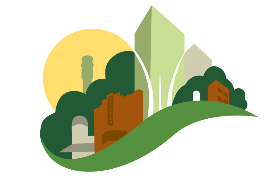
A Relationship Between Place and the Collective Feelings of Belonging, Identity, Our History and a Connection to One Another and Nature. We Want to Be Delighted too.
Left: The yellow sun represents our welcoming County.
In the distance is the DCA Air Traffic Control Tower, highlighting Arlington County’s importance and proximity to the federal city and the region.
The green expanse represents the historic African American neighborhood Green Valley’ or ‘the Valley’ as well as our lush tree canopy.
Village at Shirlington Historic Art Deco Building represent the vibrant main street of restaurants, boutiques and the arts in our most southern neighborhood.
Arlington Cinema & Draft House Historic Building represents Columbia Pike, one of the oldest thoroughfares in Arlington connecting the nation’s capital to Northern Virginia.
The green swoosh is a nod to our beloved parks and trails which many use to commute, exercise and enjoy. It also is in the shape of a bridge in perspective as Arlington is the connection to many places and people.
The tall buildings represent our burgeoning urban density in Crystal City, Rosslyn, Courthouse, Ballston, Columbia Pike and Shirlington. The center building also represents dynamic growth and momentum.
The majestic Air Force Memorial elegantly reflects the many military personnel who live and work here as well as the tourists who visit our monuments and attractions. The beautiful arabesques radiate upward with outstretched movement that is welcoming, inspiring and expressive.
A solitary headstone represents Arlington Cemetary which honors those who sacrificed for our freedom and brings many people from throughout the world here. It is hallowed ground and incredibly important to our country and to our County.
A brick colonial house and/or garden style apartment building represents both single-family and multifamily neighborhoods that are found in all parts of the County. Although gentrification has ripped many down, they are what gives Arlington it’s uniqueness and often times the first place newcomers live when they come to Arlington.
The palette is friendly-a warm sun, the beautiful varied greens in our parks and trails, a brilliant blue and a terracotta that conveys earth and brick/stone structures.
Green convey health, good luck, renewal, generosity, and forward thinking about sustainability.
Blue is trust, peace, tranquility, calm, stability, harmony, unity, confidence, security, cleanliness, sky, water.
Yellow is joy, happiness, optimism, idealism, imagination, hope, sunshine, friendship.

Revised Concepts with Type, Favicon and Line Art

Final Note
Design shouldn’t be based on just subjective aesthetic preferences but driven by a well-developed brand strategy. This includes research with developing the brand through vision, mission, values, purpose, personality, archetype, story, positioning and so forth.
The above artwork is a concept and is by no means, final art. The initial direction given by the County was to “think about the images, symbols and feelings unique to Arlington and shared by people across neighborhoods.” It’s been through one round of revision without any input from the “client”. (Logo art usually goes through several revision rounds.)
Since posting my revised concept on Facebook, I’ve received a ton of positive feedback from many County residents and commentators in Arl Now. (see below) I also received a couple of suggestions worth considering and would be willing to explore but at this point, it’s not worth my time.
Why?
I listened to the May 18th logo review process and the next steps by the County Board. (starts @1:20 on the youtube timeline). The conclusion is they want more submissions to be considered without ever acknowledging that crowdsourcing design concepts are inherently flawed and guaranteed to produce mediocre results.
It’s obvious by the latest announcement that they don’t want a logo that features recognizable landmarks but a conceptualize rendition of inclusivity, diversity and connection. That’s actually pretty nuanced and complex. (as they’ve already found out).
It’s painfully clear there is an underlying lack of understanding of the strategic process needed to create a compelling logomark. Receiving more concepts from the general public isn’t the answer and there is no benefit to be gained from spending any more time on this.
The Arlington Way…
Is the Arlington Way that we crowdsource design for school buildings, roads, parks, etc? Asking the general public for concepts is demeaning to the profession of graphic design. I’ve spent 65k hours of my life solving visual communication problems for clients.
If my County is that hard up for cash don’t redo the logo. As I stated at the beginning of this post, implementing and executing a new logo is going to be well over 6 figures. The least Arlington County, one of the richest counties in the country can do, is to be responsible with my tax dollars and hire a professional graphic design firm to create a well-thought-out design. This brings me to my last point…
Why can’t Arlington County hire a small business design firm based right here in Arlington County?
*The graphic designer who did the refinements is an in-house designer for ERG, a national environmental firm headquartered in Massachusetts with offices all over the country. The county either allocated less than $5k for the “refinement” or had a no-bid contract b/c there was nothing posted in eVA portal.
Truly a missed opportunity from every angle for a County that loves to pat itself on the back for being all that.
Responses to the Revised Concept Submitted…
“By Jove, I think she’s got it! Thank you for your serious work. Your even-handed and even-tempered approach also exhibits the best kind of earnest Arlingtonian-ness. ”