PODCAST
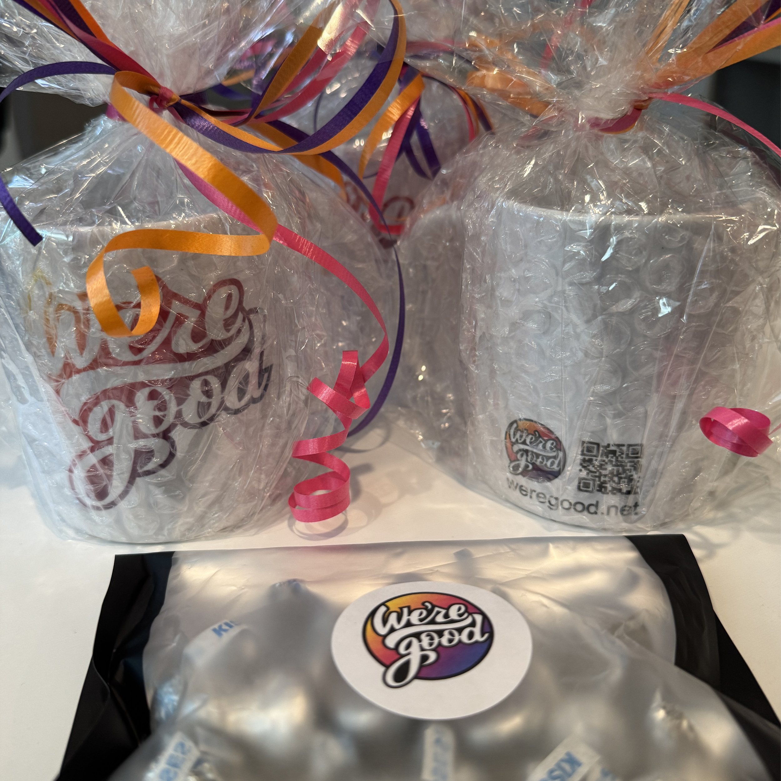
We’re Good
Structured Content. Website Design and Development.
We’re Good is a podcast that lets listeners discover and plug into all the good happening in the Washington, D.C., Maryland, and Virginia (DMV) region! Host and former television news reporter Lee Ann Necessary interviews people and organizations working to make a positive difference in our world. Additional founders Tanya La Force and Mary Ellen Matheson help keep everything running smoothly behind the scenes.
Logo Design and Visual Identity
The logo is uplifting, fun, approachable and professional. It expresses the podcast's optimistic tone in a bold design that stands out in a crowded digital space.
Lee Ann speaks to their guests, who share stories of growth, overcoming obstacles, and finding strength in vulnerability. Due to the personal nature of their show, a hand-drawn logo was perfect for We're Good. Hand-drawn elements are associated with authenticity and creativity. They convey that the brand is genuine, has a human touch behind the content and gives the logo that same sense of personal connection and relatability.
To maintain that cursive script feel, the letters were drawn to have a playful, free-flowing quality, with variation in line thickness. At the same time, the words must be legible in all sizes. This was a challenge, and the letterforms were fine-tuned to ensure that they were readable at a glance.
Another critical element of the logo is the circle shape. The logo had to look and feel powerful in digital formats such as podcast directories, social media profiles, and marketing graphics and on printed merchandise. The simplicity of a circle made it the perfect container to unify the name and gradient. The ‘g’ in ‘good’ expands outside the circle for balance and style. Depending on usage, the logo mark also works without the circle for versatility.
We chose bright, energetic colors for the brand color palette to bring the logo to life. Black is also a primary color that provides contrast and is the main color used in their podcast studio. Since they record their episodes on audio and video, their brand colors must harmonize with their recording space. These saturated colors immediately grab attention and communicate cheer, joy, and positivity. The gradient that transitions from a lively, warm yellow into a vibrant magenta into cool, crisp purple mirrors the concept of a sunrise or sunset, symbolizing new beginnings, personal growth, and moments of reflection. These visual cues align perfectly with the podcast’s tone.
The logo serves as a visual representation of the podcast’s values and helps listeners connect with the uplifting, supportive message that the founders work to convey. In a world where getting lost in bad news is easy, We’re Good’s logo reminds us that we are indeed “good.”
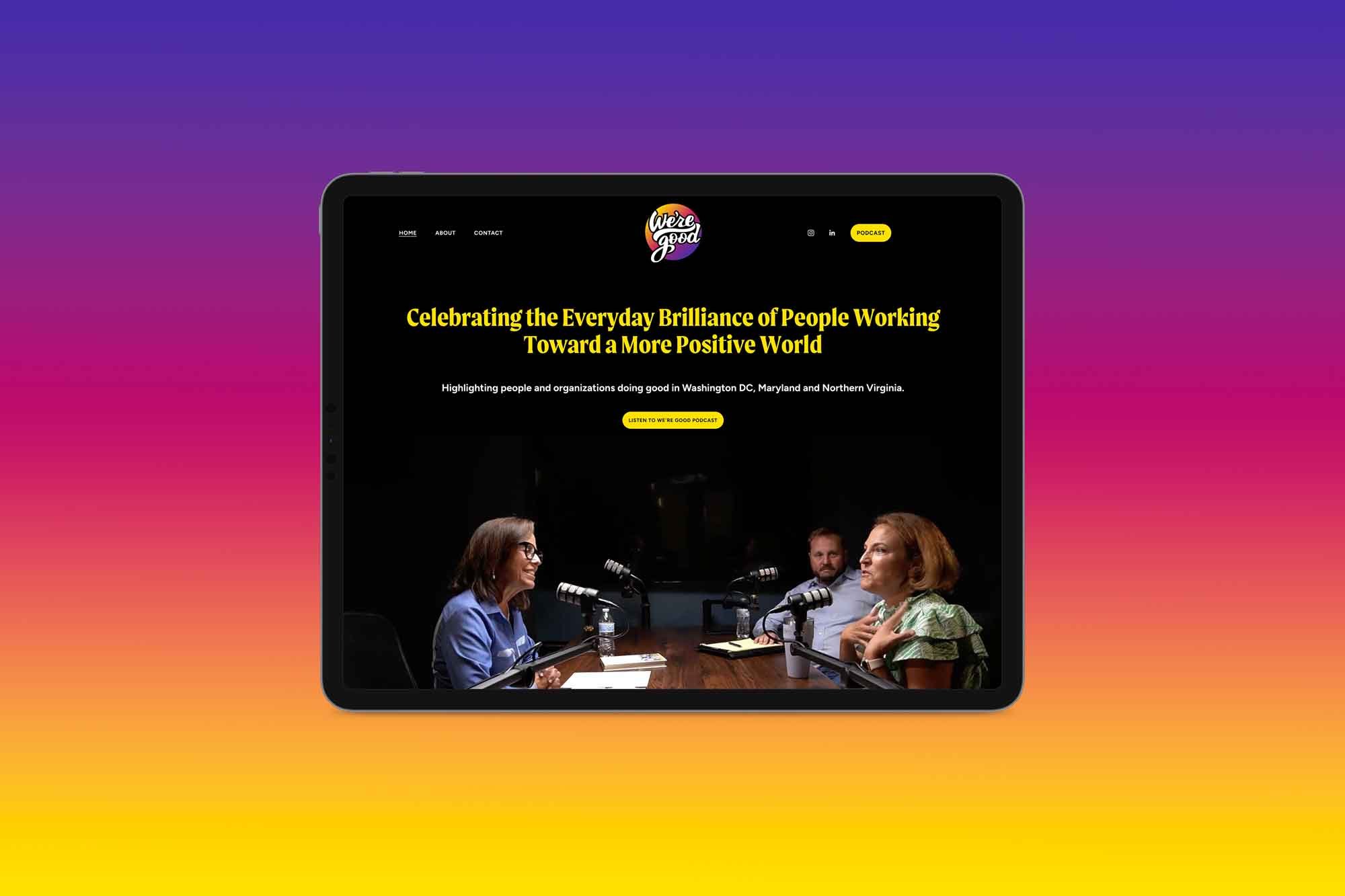
Web Design & Build
The website captures the essence of the podcast—hope, celebration, and community. It’s engaging, with background video, black-and-white photography, satisfying colors, and personality-packed heading typography.
It’s easy to navigate pages, learn about the podcast's mission, listen to episodes, connect with the impactful individuals and organizations featured in each show, get links to their podcast directory and social media, and sign up for their newsletter.
The site is a vital marketing tool for the podcast, helping it gain loyal listeners, future guests, and potential sponsors. Showing who the team is with professional headshots and bios gives the podcast credibility.
Most importantly, the site is cohesive and clear and communicates the podcast’s core value of celebrating the everyday brilliance of people working toward a more positive world.
The home page immediately conveys the podcast’s message while guiding users to the content they’re most interested in. It features a compilation video of Lee Ann in action—hosting interviews and engaging with guests—presenting visitors with an immediate sense of the podcast’s energy and focus.
To match the podcast’s upbeat tone, we chose a vibrant color palette of optimistic colors, yellow, magenta, and purple, complemented by black type and backgrounds for contrast and readability. We selected Moret and Figtree for the fonts for their whimsical yet professional qualities, reflecting the show’s approachable yet polished vibe.
We designed the site’s contact and newsletter forms with a custom confetti pop after form submission. We included personal positive reviews from our team, who listened to their pilot episodes, to build trust and engagement on the site until We’re Good starts to get other honest reviews.
We created a custom 404 page, a visual style guide, and legal pages. Additionally, we helped the client decide on their top-level domain name (.net), connected the domain to their site, set up paid Google Workspace accounts (custom domain emails), created a logo into/outro sequence for their videos and provided site training so they can manage their site and continue uploading episodes.
Overall…
The new website focuses on simplicity, accessibility, and clear communication. It offers listeners a welcoming space to connect with the podcast team, explore inspiring content, and get involved in the positive changes in their communities. So much good is happening in the DMV—it’s just a click away!